Tag Archives: User-Friendly Designs

Norman Doors (Counter-Intuitive Designs)

I’ve written before about Donald Norman and his book, “The Design of Everyday Things”; he emphasizes the need for products to have user-centred designs. The term “Norman Door” comes from the typical example he uses about doors – an everyday item that can often lead to confusion for the user simply by putting pull handles on a push door.

I was thinking about it this week, wondering what the opposite term should be, as I was opening a container of whipping cream. The tetra package for whipping cream is a prime example of a poorly designed item for me: It inevitably oozes out while I try to rip it open along the perforated line. If they made the perforation easier to tear or put a scissor symbol making it clear that that would be the preferred method from the outset… but no. Other items that come to mind are the flip-tops of products, such as hand creams or shampoos, that nearly require a knife to open. What happens? You simply stop buying that product, which might be perfectly fine, because of the poorly designed packaging.

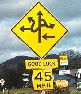
Tell me your ideas for a good term for bad designs – something catchy and catch-all (Norman Doors refers to doors only, but so far it’s worked in a pinch). In the meantime, here are a few examples of non-user-centred designs.

1 Comment

Filed under How It's Made, Humanity Highlights, Humor, Musings

Design Undusted: Norman Doors

You have all come in contact with a Norman Door, even if you might not have known that’s what it was called. Remember the last time you tried to go through a push door by pulling on it? That’s a Norman Door. The name comes from Donald Norman who, after spending time in the UK, wrote a book called, “The Psychology of Everyday Things“, later changed to, “The Design of Everyday Things“. Doors are a prevalent example: Every building has them, but they are not necessarily put through any stringent tests of user-friendliness; if the hinges are hung straight, and the door swings one way or the other, that’s usually enough to pass. Donald Norman’s point is that if people are using a product the wrong way, it’s not their fault – it’s poorly designed. He popularized the term “user-centred design” – designs based on the needs of the users, whoever and however many they might be. Below are a few examples of failed designs – either inconvenient to use or just downright impossible. Next time you come across an object with poor usability, you’ll at least know what to call it.

This slideshow requires JavaScript.

3 Comments

Filed under Articles, History Undusted, Images, Science & Technology, Videos