Back in January, I wrote about the phenomenon of the Hum, something that occurs around the world.
Another global phenomenon is that of “ghost lights,” also known as fata morgana, mirages (both inferior and superior), will-o’-the-wisps, fairy fires, or ignis fatuus (“foolish flame”).
I grew up in a climate zone with hot, dry summers and wide, flat highways that stretched to the horizon. On a hot summer day, you could see the cab of a semi-truck floating mid-air for some distance before you actually saw the truck finally touch the ground. Sometimes the highway would look flooded – this kind of water mirage is also a danger in desert regions. Death Valley is dangerous, not only because of the heat but also because of disorienting mirages.
Ghost Lights can have a variety of natural causes: methane gas combustion or other organic decay which can cause photon emissions (these lights often appear over swamp or boggy areas); light refraction in certain atmospheric conditions that cause the lights of cars on distant roads or firelights from campfires to “float” midair (like the semi-truck cab above); it may also be caused by the bioluminescence of various micro-organisms and insects.
For a fun dive into these phenomena, the Why Files has a video covering the topic (the actual content starts at 4:15); I enjoy his videos because the author in me likes the way he sets stories up as real – as if reporting facts – before he debunks them or offers probable explanations. While he knows that many people likely believe in the stories he eventually debunks, he goes about it in a respectful, tongue-in-cheek way.
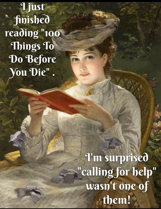
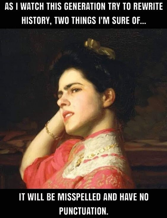
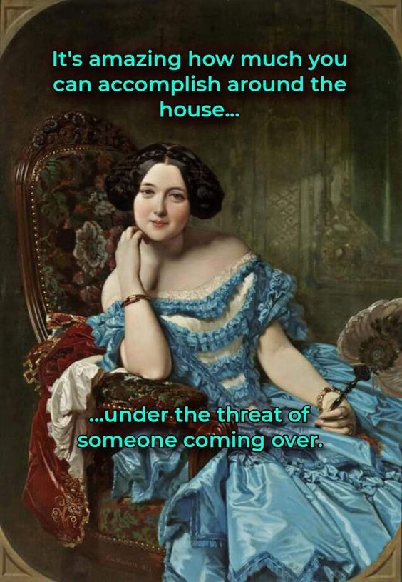
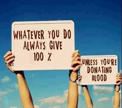
People’s creativity in seeing the world with a sense of humour is a beautiful thing. One form that creativity takes is memes – images with superimposed texts. Antique portraits – paintings from artists of the 18th and 19th centuries – have regained popularity through their use in what I refer to as vintage memes.
Here are a few that somehow hit a funny bone in me; I hope you enjoy them, too!
All of us can relate to having some form of ruts in our lives: Favourite meals, restaurants, seats in places we visit often, clothes we prefer, products we buy, food brands or makeup brands (if you wear it); all, patterns of movement or place or things. Recently, I heard of an app that made me curious to try it out; when I did, it was an eye-opener about how many things I use that I’ve taken for granted that their claims are accurate – I know that’s naïve, but part of that naivety is that greatest of marketing tools, willful ignorance.
Case in point: Speaking to the women out there, you probably have favourite makeup products or brands that you’re used to. But what if you found out that half of their ingredients build up in your system, damaging your liver, your thyroid, and the environment? That’s exactly what I have learned lately, and it’s shaken me awake: the app I cannot recommend highly enough is called Yuka. If I had known years ago what I know now, perhaps I would still have a thyroid; tumours put an end to that several years ago – but I can prevent further damage to my body by being aware of what’s in a product and buying safe alternatives.
The app works like this: You scan a product’s barcode – anything from food items to makeup to body products such as shampoos and hand creams; the app then ranks the products on a set list of 100 points and tells you whether it’s excellent, good, poor or bad; it then lists the ingredients and gives you the option to read more about each one, ranking the ingredients (colour-coded) as hazardous, moderate risk, low risk, or risk-free. If the products rank as poor or bad, below them will be a list of alternative products, with their rankings and ingredients for further information. The recommendations are unbiased as they are not supported by any company. The app also keeps a record of products I’ve already scanned; if I’m at the store, and scan products I don’t buy because of their rating, I can then delete one or several items from the list to keep it streamlined to my products/foods.
There are things that this app is NOT: It is not a substitute for medical or nutritional advice; it is not the be-all and end-all for telling you what to buy. But what it IS: A good guide to weighing the benefits vs. the disadvantages of using one product over another. Some of my products may clock in as “poor” – but when I consider why that rating is given, I may decide to continue its use until something better becomes available in my area.
For me, I’ve found that one ingredient pops up in most makeup and hair products: Phenoxyethanol; it is listed as a potential endocrine disruptor, potential allergen, and irritant. In the EU its use in cosmetics is regulated – but not in the USA or in Canada. In itself it may be within regulatory limits in a product; but accumulatively (several products, from shower gel to lip balm to foundation) it exceeds the limit and becomes a health concern. Knowing this has helped me find new, healthier products. Even within a product range, the ingredients may vary; for example, one lip balm may be good, but another colour of the same brand differs to produce the colour or gloss and ends up being listed as bad. Honestly, I won’t buy a product now without knowing it’s healthy. It’s not that I can’t and won’t think for myself and let an app tell me what to do, but I can use it to weigh a decision.
This past week, I wanted to find a lip gloss to replace the one I’d been using which was marked as “hazardous”; but the store I was in didn’t have customer wi-fi, so I bought a small Vaseline, thinking, “This has been around for ages, so it must be simple and safe”. Wrong. When I got home, I scanned it: Petrolatum is the mineral oil used, which has a moderate risk with a big BUT: this oil may contain problematic residues, such as MOAHs (genotoxic carcinogens which promote cancers and damage DNA) and MOSHs (these accumulate in the body, particularly lymph nodes and the liver). These oils should be avoided, especially in products that may be ingested… such as lip balms (and these two residues were present in half of all tested lip balms!) So now, that little jar is in my craft room to be used as a lubricant for my tools.
We all need to take steps to protect ourselves; big companies are not putting customers first, but customers’ wallets. If we don’t shake ourselves awake and work against our own willful ignorance, we shouldn’t be surprised when health issues pop up; but who would associate lip balms and blush and hand creams or canned foods and pre-made packaged food with those bigger issues? We need to start looking into it for our own sakes.
This word is doubly obscure, at least for me: Whilom (c. 1200), means having once been; former; once upon a time, erewhile, or at times past. It comes from the Old English hwilum, meaning at times, and is related to today’s while. It is doubly obscure for me because it has a similar formation to an equally obscure German word, weiland, meaning formerly, of yore. This German word is related to the modern weil, which is a false friend to the English word; the German word means because. The relation between the two is not a far stretch, as because implies that something happened in times past, once upon a time.
What do you think? Should we bring back whilom? I think, at any rate, we should start using of yore every chance we get!
I’ve written before about Donald Norman and his book, “The Design of Everyday Things”; he emphasizes the need for products to have user-centred designs. The term “Norman Door” comes from the typical example he uses about doors – an everyday item that can often lead to confusion for the user simply by putting pull handles on a push door.
I was thinking about it this week, wondering what the opposite term should be, as I was opening a container of whipping cream. The tetra package for whipping cream is a prime example of a poorly designed item for me: It inevitably oozes out while I try to rip it open along the perforated line. If they made the perforation easier to tear or put a scissor symbol making it clear that that would be the preferred method from the outset… but no. Other items that come to mind are the flip-tops of products, such as hand creams or shampoos, that nearly require a knife to open. What happens? You simply stop buying that product, which might be perfectly fine, because of the poorly designed packaging.
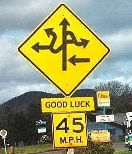
Tell me your ideas for a good term for bad designs – something catchy and catch-all (Norman Doors refers to doors only, but so far it’s worked in a pinch). In the meantime, here are a few examples of non-user-centred designs.
The baroque town of Solothurn, though only an hour away from our home, was unfamiliar to us until my husband and I took a day trip this week. It has a beautiful historical centre and is known as the “city of elevens”: It was the 11th canton to join the Swiss Confederation; there are 11 towers in the fortification walls of the city; there are 11 churches and chapels, and 11 historical fountains throughout the city; the stairs leading up to the St. Ursus Cathedral have landings every 11 steps; the cathedral itself has 11 altars and 11 bells; the local brewery, producing an eponymous beer, is even called Oeufi – which is a Swiss dialectical word for eleven. 11:00 is the most “auspicious” time to set appointments in the town, and there is even a clock, hanging on the wall of a local bank, which is segmented into 11 hours; it has 11 cogs and 11 bells, which are chimed by a metalwork sculpture of a harlequin on the hours of 11:00, 12:00, 17:00 and 18:00. The bells chime to the tune of the city’s unofficial anthem, the Solothurner Lied.
Solothurn’s history dates back to the palaeolithic era, and its Roman era is dated to around AD 15-25; it was first mentioned in AD 219 as vico saloduro, and may have referred to a Celtic settlement, possibly meaning “Salo’s fort/stronghold”. In the Battle of Sempach, July 1386, the Habsburgs attacked Solothurn; it was a decisive Swiss victory, and even more importantly, it helped to solidify the loosely allied Swiss Confederation cantons into a more unified nation and is seen as a turning point in the growing strength of Switzerland as a nation. Today, it is largely bypassed by tourists due to its proximity to Bern, the Swiss capital, so it remains a hidden gem.
Another interesting clock is the clock tower, the “Zeitglockenturm”, a tower built in 1152 and first mentioned as a “clock tower” in 1406. If you look closely, you’ll see typical rain spouts coming off of the corners of the tower’s spire and roof, shaped like dragon’s heads. The 24-hour astronomical clock was built by Lorenz Liechti and Joachim Habrecht in 1545. The sun and moon hands both run counterclockwise; the moon makes one complete rotation every 27 days, while the sun makes one complete rotation every 365 days.
According to the Roter Turm website, there’s a humorous story connected to the upper, 12-hour clock: By 1753 the hour hand and the bells were no longer in sync; a commission contacted the watchmaker Niklaus Pfluger, reminding him of his gild’s oath, i.e. his responsibility to correct the clock. He suggested to the local government council that they add a minute hand; but minutes were not so important in the 18th century, apparently – they told him to leave it as it had always been. He took matters into his own hands (I guess it was easier to ask for forgiveness than permission…) and in 1756, he added a minute hand. He justified it as the “warning hand of God” – but he made it smaller, less noticeable than the hour hand, so on this clock, the small hand shows the minutes, not the hours.
Because the clock tower was built and added to over time, you’ll see four dates on the full image of the tower: 1411 and 2022 on the highest, 12-hour clock; and 1545 and 1883 on the central tableau; the latter dates usually refer to restorations.
The three figures in the central tableau above the clock are a knight, king, and skeleton (Death), which perform every hour: The knight holds a battleaxe in his right hand, and a sword in his left; every quarter-hour, he turns his head toward Death and strikes his breast, signifying his loyalty to the central figure, the king. On the right stands Death; in its right hand is a hourglass, which is turned on the hour, symbolizing the contradictions of life – good, bad, life, death. In the other hand is an arrow, showing that one could be struck down at any moment. On the hour, its head turns toward the knight.
On the throne between these two figures is the king: In his right hand is a sceptre, which he lifts on the hour. His jaw moves in rhythm with the hour hand, and his beard represents wisdom. However, notice that he’s wearing red and white fool’s garb: If the king does not rule with wisdom and the humour of a fool, his reign will become a tyranny. It tells us that life should have moments of both wisdom and a jester’s humour.
While Death announces the hours, the king swings his sceptre. At the same time, Death nods with each stroke and confirms the relentless passing of the hours. The king with his fool’s garb reminds us of the memento mori. When death or illness reigns, even the power of a wise king can do little (Solothurn was hit by the plague, e.g. in 1348). Though the Freudian era banished death from contact with the living in many Western cultures, death personified as a skeleton is still a symbol seen in many countries around the world. Having death constantly before your eyes encourages you to savour each moment of life.
I hope you’ve enjoyed this brief glimpse into a beautiful city with an ancient history!
Most English-speaking people have heard the term whitewashing: Literally, it means to paint a surface with a diluted white paint to lighten the surface and conceal blemishes. Figuratively, it means to downplay the negative aspects by emphasizing the positive ones of a person, event, or situation.
Greenwashing is a term related to environmental issues: It is the deliberate dissemination of a false or misleading impression of environmentally friendly practices used to conceal or obscure damaging practices.
Blackwashing is the use of public campaigns and advertising funded by the coal industry to draw attention away from environmentally unsustainable practices or to justify exclusion from carbon taxes.
Bluewashing is to tout a business or organization’s commitment to social responsibility while using this perception for public relations and economic gain; to present a humanitarian front while obscuring actual practices.
Redwashing is the practice of a state, organization, political party, politician or company presenting itself as progressive and concerned about social equality and justice, in order to use this perception for public relations or economic gain.
There are other colours of X-washing, but they all stem from greed: In marketing, these tactics are a way to charge customers more, because the higher price leads people to think, in connection with the misleading information or imagery, that the extra money spent is going to a good cause, e.g. schools for the workers’ children or working children, when in fact it’s likely going toward a CEO’s yacht.
On holiday recently, we’d forgotten to bring towels from home into the motorhome, so we went into a houseware store; I thought the towels would be a bit more expensive than another store I usually buy our towels from, but it was a whopping 50.- per towel more! On each towel was a tag; here’s the translation (the company name withheld):
“Cotton (name)® Made in green, inspiring confidence. Tested for polluting ingredients and sustainably produced according to (name)® guidelines. The label “made in green” gives you the assurance that this textile product has been made by pollutant-free materials in environmentally friendly factories in protected and socially acceptable work environments.”
Nowhere is it mentioned where this product was made; their testing agency, for accountability, is them. Inspires confidence? On what grounds? Price? Notice that they don’t claim to have passed those tests or what they were testing exactly, nor do they state what their guidelines were supposed to be.
These schemes prey on first-world people’s sense of guilt, or of wanting to pay a bit extra to help those less privileged. Yet their concept of “environmentally friendly factories in protected and socially acceptable work environments” might have nothing to do with your or my concepts – would the company’s execs be willing to work in those factories? I doubt it. This is also an example of bluewashing.
An E-Talk was given to show the marketing tactics in connection with the foods we eat. The disclosures made in the short talk are enough to leave the audience in stunned silence. I challenge you to watch the video (less than 7 minutes long) here. Marketing’s most effective, secret weapon is you. They bank on willful ignorance (the avoidance of making undesirable decisions or taking actions that accurate information might prompt).
All of these wash-tactics boil down to hogwash. So the next time you find yourself looking at the claims of a label, or seeing the sunny kitchen in a perfect home with perfect families on a commercial, take a moment to challenge what you’re reading or seeing, and use your purchasing power wisely. Research; see if the company is on any blacklist by organisations that actually care (WEF, Greenpeace, or any from a long list of NGOs). Search the topic online – there are a lot of informative articles out there with practical tips for making informed decisions. Here’s a website for checking a brand’s ratings: https://directory.goodonyou.eco/. If you find that a company is making bogus claims, stop buying their products; make the effort to blow the whistle on them – social media can be a positive tool in that aspect.
This brings us back to that secret weapon of marketers, our willful ignorance: The tragic factor in all of these tactics is that, like water, humans usually choose the path of least resistance… least effort… least active involvement, least time required; and so willful ignorance prevails. However, since we’re making an average of 35,000 decisions a day anyway, (automatic, habitual, emotional, stress-related, worry-related, or environment-related) let’s neutralise that ignorance one wise, informed choice at a time.
Just For Fun: Beware of Zombies
1 Comment
July 17, 2024 · 6:52 PM