
Last Sunday at church, a friend filled an entire room with her late father’s books, setting up an impromptu book shop. I chose several books, most of which are in Fraktur typeface, known to some people as “Gothic” or “Old German”. I enjoy reading such books because they offer a snapshot of a cultural way of thinking. The books I chose were printed between 1877 and 1940. The latter date is significant, as you’ll soon see.
First of all, let’s clarify a few terms: Though many people think of font and typeface as interchangeable, in fact, they refer to two different aspects of a writing style. Typeface refers to a particular style of lettering (e.g. Times New Roman), while font refers to the variations within that style, such as size and weight (CAPS, bold, italic, etc.). Another term we know but may not fully understand is Serif: This refers to the small stroke or line attached to the larger stroke of a letter; an example would be an A with “feet” at the bottom of each down-stroke. Sans Serif simply means “without Serif”.
The first moveable-type printing press, designed by Johannes Gutenberg in Germany around 1440, was based on the ancient Roman design of a screw press used to press wine or oil, which in turn went on to be used to press designs into cloths. He was likely familiar with intaglio printing and may have done some work himself in copper engraving. These designs and uses likely fermented in his inventor’s mind into what became the revolutionary turning point of literacy. Gutenberg’s original typeface was called Donatus-Kalender; the metal type design was itself a form of Textura (more on that in a moment).

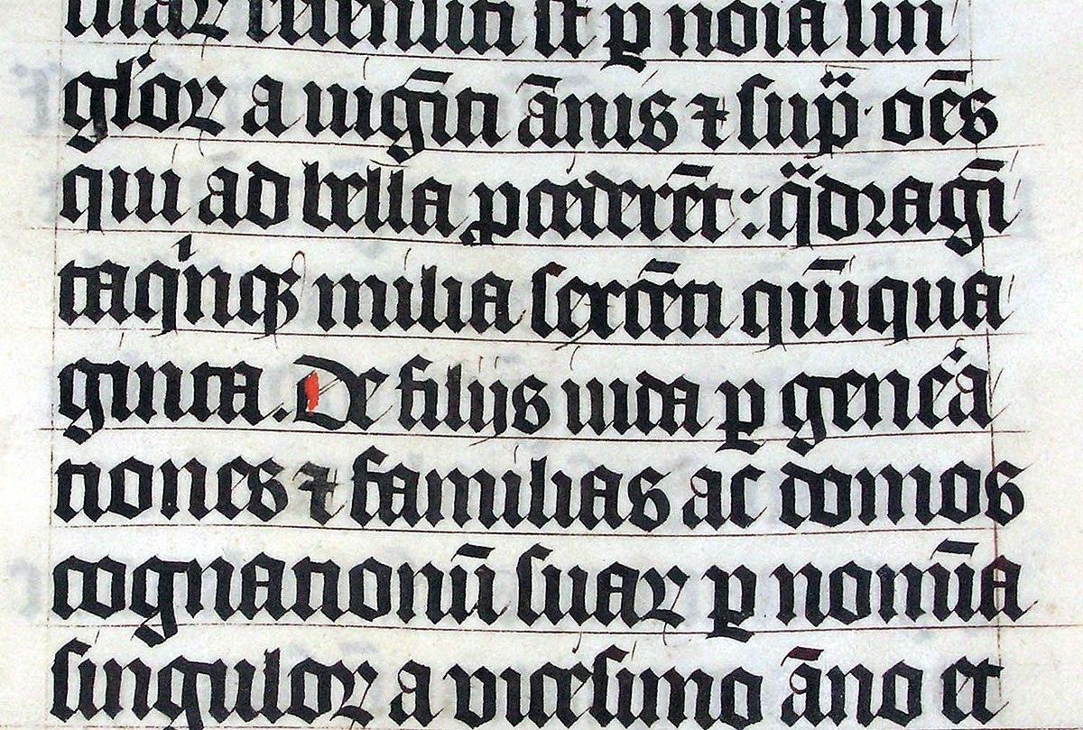
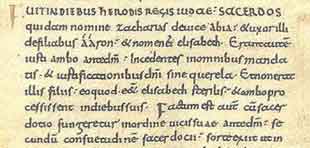
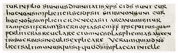
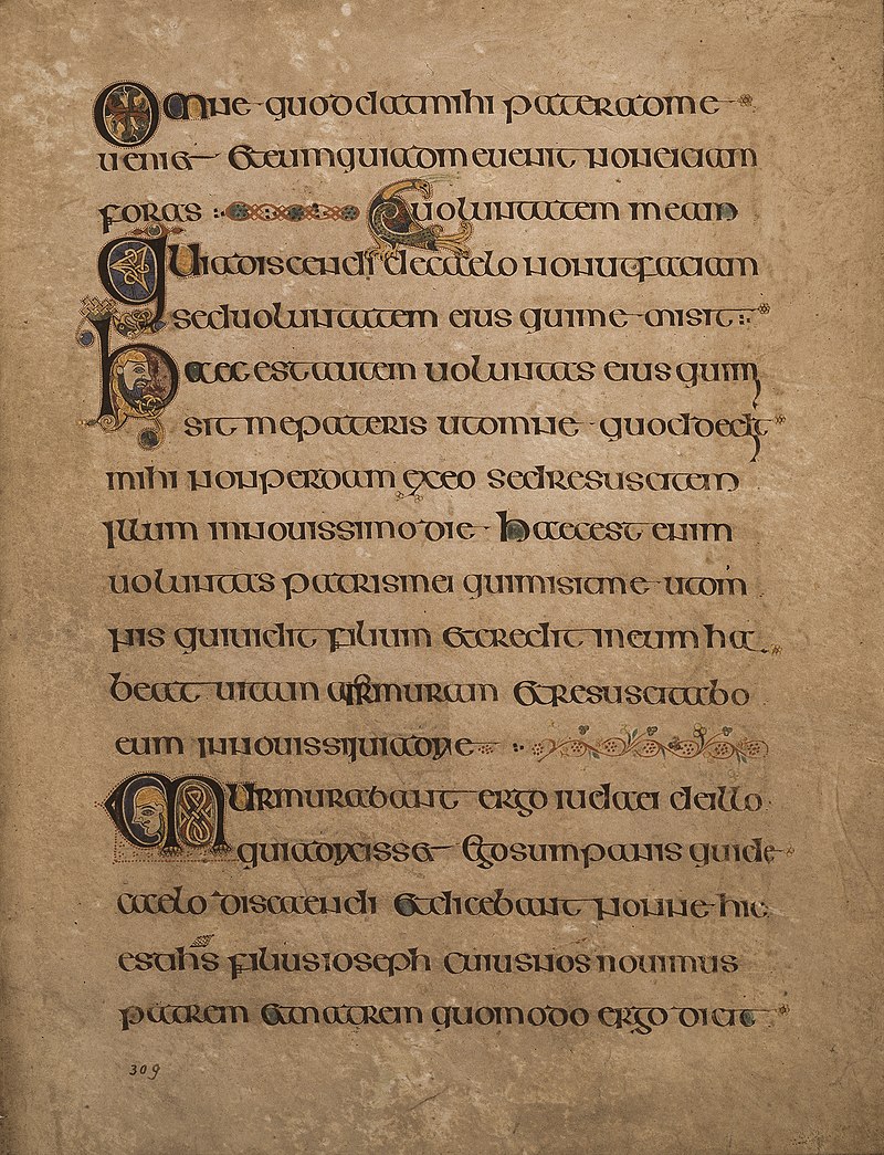
This original family of typefaces was known as “Blackletter”, aka “Gothic scripts”, with the height of popularity peaking around the 14th to 15th centuries. The ancestor of the Blackletter was called the Carolingian minuscule, a calligraphic standard of handwriting widely used in the medieval period, when literacy began increasing and a need for books in a wide range of subjects began to be in demand. It is thought to have been developed in the mid-770s by Benedictine monks north of Paris in the Corbie Abbey, famous for its scriptorium and library. The minuscule itself was derived from Roman Uncial as well as Irish Insular script, which was developed in Irish monasteries and spread throughout Europe.
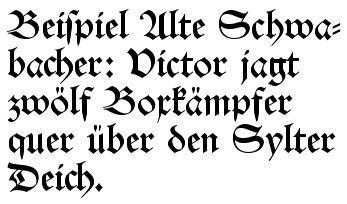
The family of Blackletter typefaces included Early Gothic, which was a transitional script between the Carolingian miniscule and Textura (the most calligraphic form of Blackletter); Schwabacher was a form popular in early German print typefaces (it became widely known with the spread of Luther Bibles from 1522), in use from the 15th century until it was eventually replaced by Fraktur around 1530, though it was still used alongside Fraktur for emphasis, much like we use bold or italic today.
Another blackletter typeface developed between 1470 and 1600: Antiqua. This typeface’s letters were designed to look like the handwriting of ancient Roman documents, with the letters flowing together, strokes connecting them in a continuous line, whereas Fraktur was distinguished by having letters “fractured” – separate from one another. The Antiqua-Fraktur Dispute deserves its own article, so stay tuned!

The Habsburg Emperor Maximillian I (1459-1519) was King of the Romans* from 1486 to 1519 [the title of king was used by the kings of East Francia, the territory later referred to as the Kingdom of Germany, from the time of Henry II (1002) to Joseph II (1764)]. The king commissioned the artist Albrecht Dürer to create a series of woodcut engravings of the Triumphal Arch [Though many are familiar with the Arc de Triomphe in Paris, it is only one example of this ancient Roman architectural feature used as a free-standing structure (rather than the Greek version, which was used within a structure such as a temple).]. These engravings would be used to create what we would recognize today as essentially wallpaper, though its purpose was more of a statement of power or propaganda (read personal marketing) commemorating his nobility, generosity, and military conquests – an incongruous combination, if you ask those conquered… The final composite of printed papers stood nearly 3 metres (12 feet) high and was only one part of a series of three enormous prints commissioned by the king.

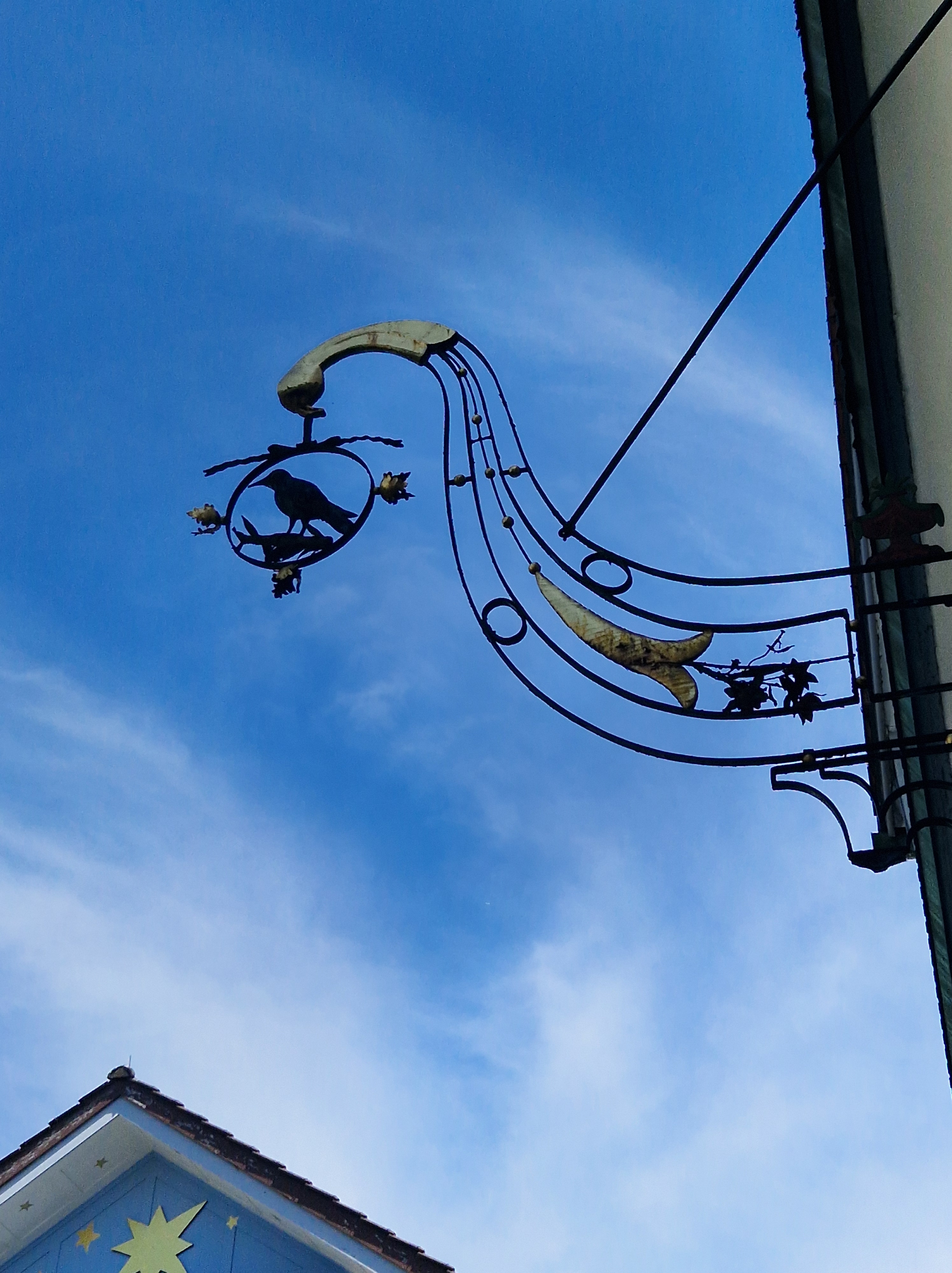
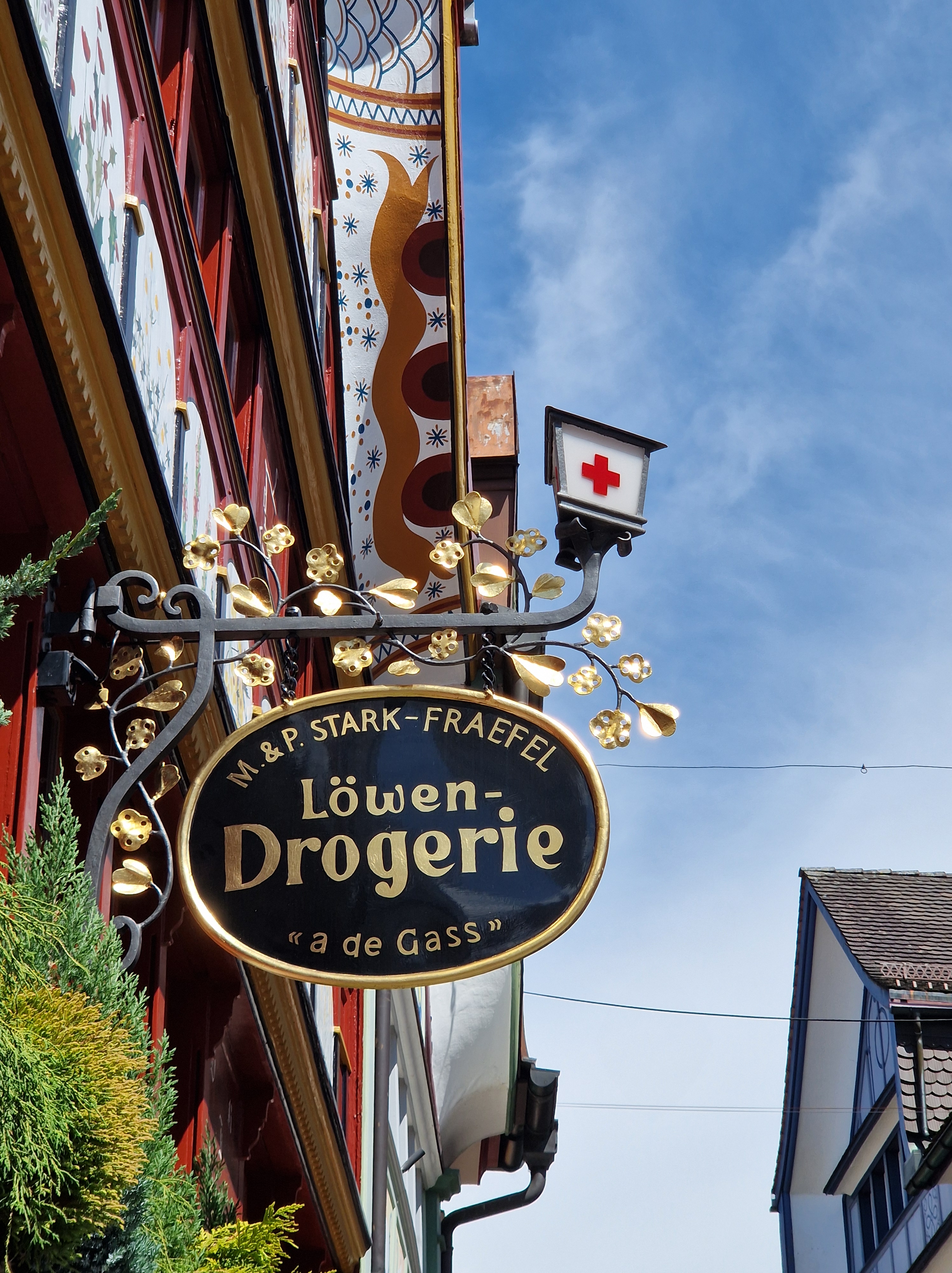
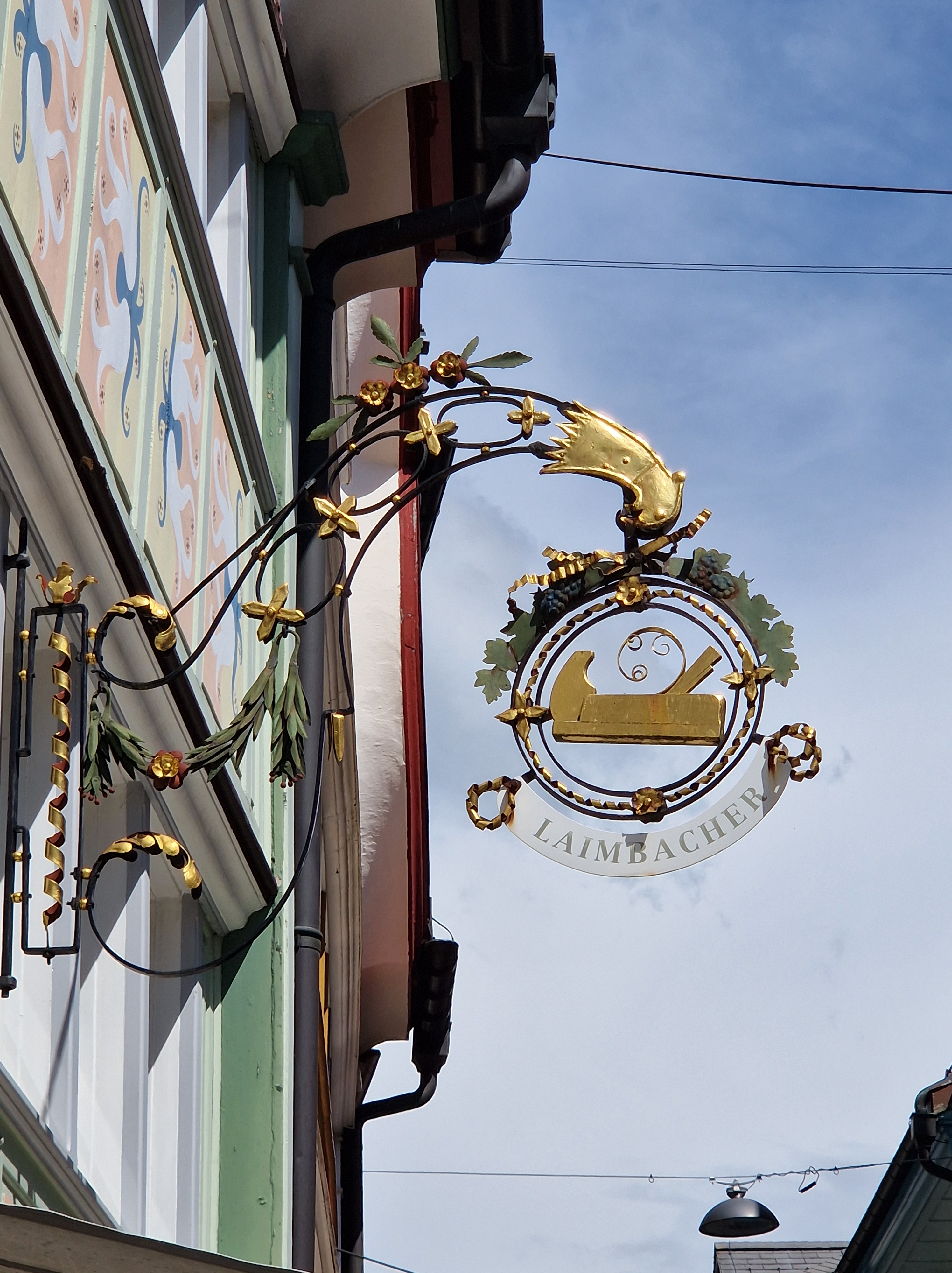
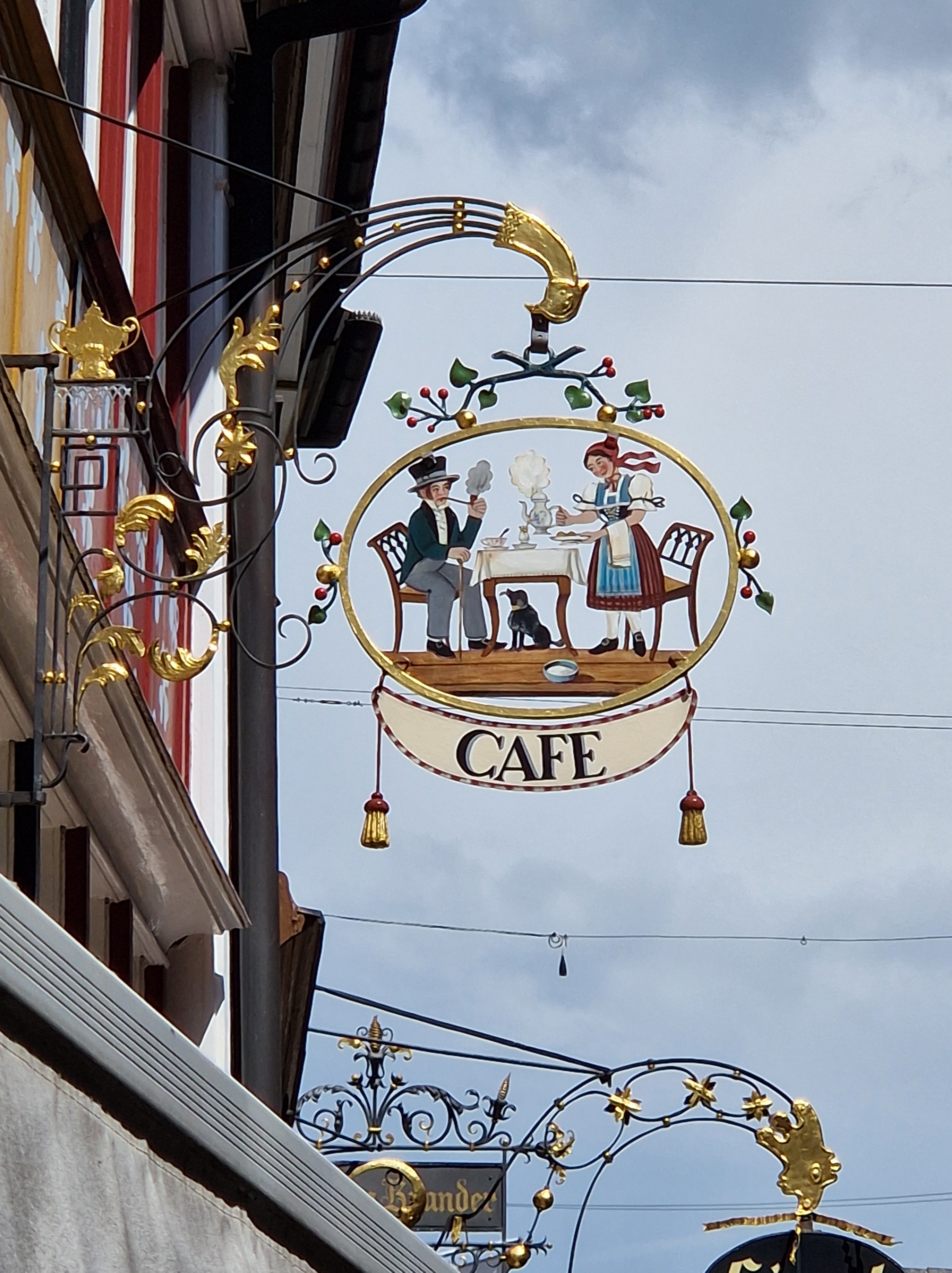
The Fraktur typeface was designed in the 1530s by Hieronymus Andreae, a German woodblock cutter, printer, publisher, and typographer closely connected to Albrecht Dürer. The typeface was made to decorate the arch, telling the stories of the figures depicted throughout. The typeface became popular in Europe and was in use in the German-speaking world, as well as areas under its influence (Scandinavia, Central Europe, and some eastern European regions), into the 20th century. Specifically, Fraktur was in use in German until 1941, when it was actually banned (which places one of the books I purchased on Sunday within one year of the end of the era of Fraktur!). The atmosphere that led to that ban arose from the dispute mentioned above. Once the Nazis were defeated, the ban was lifted, but Fraktur never regained its widespread popularity after that, though you can still see it occasionally in pub signs or various forms of ads, like beer brands.


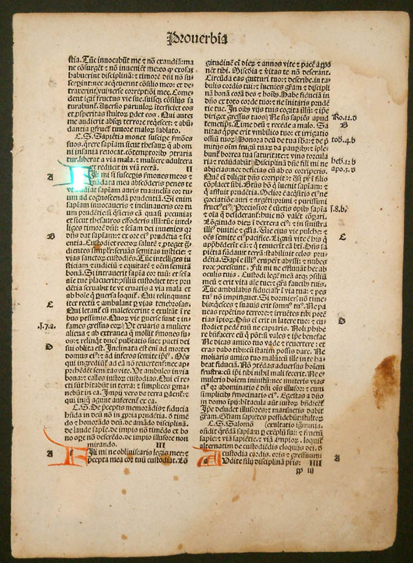
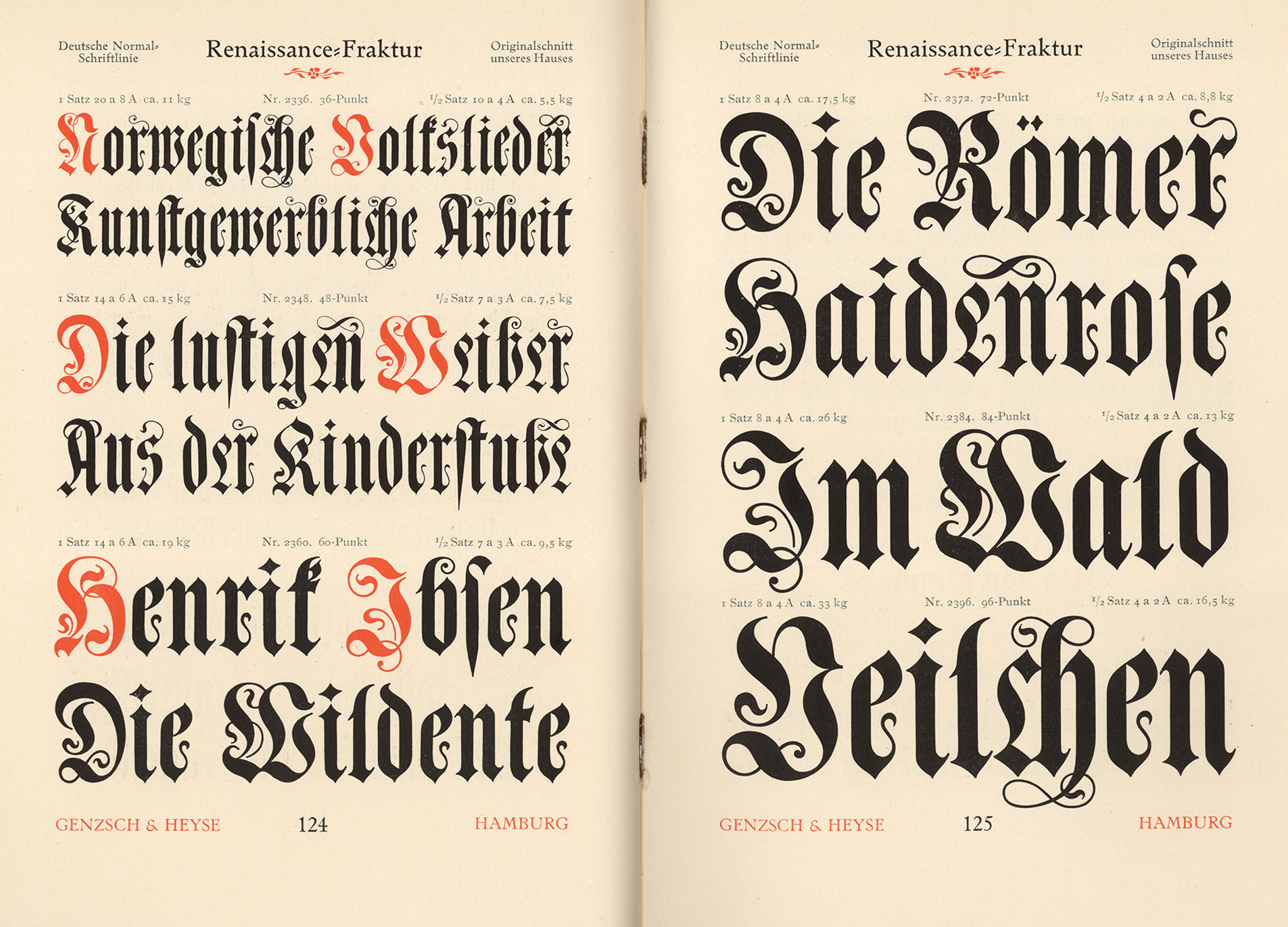
I just pulled two books from my library shelves: One is an English book originally printed in 1895, with my book being printed in 1915; the other is a German book printed in 1892. The typefaces are widely different: The English text likely used the French Oldstyle, while the German book uses Renaissance Fraktur for the text body, while the end pages act as indexes and use a variety of blackletter typefaces, such as Muenchner Fraktur, Antike Kanzlei, and Enge verzierte Altdeutsch. To see examples of the typefaces mentioned here, please click on the link for Fonts In Use.
I hope you enjoyed this jaunt through history! Nearly every name mentioned, every typeface, and every event deserves its own undusting. Next time, we’ll deep-dive into the dispute that lasted well over a century!


Who’s Who in Quotes: Will Rogers
Will Rogers is one of those larger-than-life characters who seemed to have had his fingers in every pie imaginable: Born in November 1879 as a Cherokee Nation citizen in the Indian Territory now known as Oklahoma, he was the youngest of eight siblings, only three of whom survived into adulthood. His mother died when he was just ten years old. By the time he was 20, he’d begun appearing in rodeos, and in 1902 at the age of 22, he and a friend moved to Argentina to find work as gauchos (a skilled horseman, hired by ranchers in many South American countries). When their adventure failed, and they’d lost all their money, Will couldn’t bear to ask for money from home, so he took a boat to South Africa, where he was hired as a ranch hand. His career as a trick roper began there, as he joined the Texas Jack’s Wild West Circus. From there, armed with a letter of reference from Texas Jack, he moved to Australia and joined the Wirth Brothers Circus as a rider and trick roper. By 1904, he’d returned to the States and performed in the St. Louis World’s Fair, then began using his riding and roping skills in the Vaudeville circuits; he was often billed as The Cherokee Kid. His natural humour hit a chord with audiences, who loved his frontier twang of an accent coupled with his off-the-cuff wit and commentary on current events; he built his later career around that talent.
In 1908, he married Betty Blake, and they had four children; three survived into adulthood, all of whom went on to have careers in the public eye in one way or another.
By 1916, Rogers was a featured star in Ziegfeld’s Follies on Broadway; from there he branched off into silent films; at that time, most films were made in or around New York, which allowed him to continue performing on Broadway. The New York Times syndicated his weekly newspaper column, “Will Rogers Says”, from 1922 to 1935; he also wrote for The Saturday Evening Post; this progressed into books – over 30 of them. He also hosted a radio program, telling jokes and discussing current events with his simple, disarming humour.
Click here to see a short, 3-minute video showcasing some of his amazing rope tricks.
He was an avid supporter of the aviation industry, and he took many opportunities to fly to his various engagements. In 1926, while touring Europe, he saw how much more advanced the commercial services were there in comparison to the States; his newspaper columns often emphasized the safety and speed of travel aeroplanes offered, which helped shape public opinion about the new mode of transport.
In 1935, Wiley Post, a famous aviator of his time, proposed flying from the West Coast to Russia to find a mail-and-passenger air route, and Rogers asked to go with him in order to find new material for his newspaper columns. Post’s plane was modified for the long flight, and floats were added for landing on water. On 15 August, they took off from Fairbanks, Alaska, for Point Barrow, a headland on the Arctic coast. Bad weather hindered their ability to calculate their position, and, after landing in a lagoon to ask directions and taking off again, the engine failed at low altitude and plunged into the lagoon, killing both men. Rogers was 55.
In such a short life, he left a huge legacy in many fields of entertainment and helped shape public perspectives on politics and civil responsibility. He was a household name in the early 20th Century and a trusted voice during the Great Depression, identifying with the struggles of the average American and holding a mirror to politics with his witty satire.
Here are a few of his famous quotes:
2 Comments
Filed under History, History Undusted, Humanity Highlights, Quotes, Snapshots in History, YouTube Link
Tagged as Alaska, Australia, Aviation, Broadway, Cherokee Nation, Circus, Entertainment, Gauchos, Great Depression, Indian Territory, New York, New York Times, Oklahoma, Politics, Quotes, Satire, Saturday Evening Post, Social Commentary, The Cherokee Kid, Trick Roper, Vaudville, Who's Who in Quotes, Will Rogers, Ziegfeld's Follies