Back in 2020, I wrote an article about preparedness in connection with lockdown, viruses, and being shut in over longer periods of time. Then life went back to normal, people came out of their caves and learned to socialise again… carefully. At a distance. Introverts mourned the passing of a perfect excuse to avoid people, and extroverts went right back to hugging everyone in sight. We may not have lockdown anymore, but we now have a more looming threat: Climate Change.
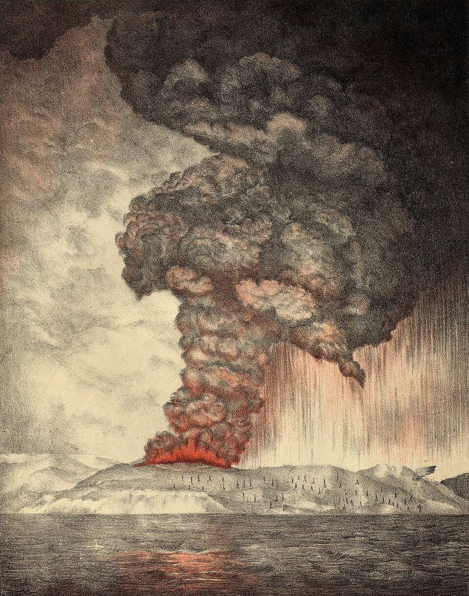
Depending on where you live in the world, you may feel different effects of the climate change and its consequences: Whether that’s increased storm violence of hurricanes, tornadoes, flooding or drought (these last two are related, as the jet stream has been disrupted; it dumps too much water in one place and leaves another place dry because it has become lethargic), or increased earthquakes and/or volcanic activity (ice melt has been linked to the destabilization of the Earth’s crust, leading to seismic and tectonic shifts; this is known as glacially-induced faulting, or bookshelf faulting).
Whatever your focus, preparation will become increasingly important (other factors may include political or social unrest). Some things are out of our control, but we can be prepared in case evacuation or hunkering down (“bug-in”) becomes necessary. Think of this as a mental exercise in preparedness; it is by no means a comprehensive list, because as I mentioned, everyone has a different focus: Those living in Tornado Alley will not have the same needs as those living along tectonic faultlines; those living in tropical cyclone basins will have a different focus than those living in places like Niscemi, Italy, or in the rumbling caldera around Naples. But whatever your individual needs are, there are some things we can all prepare. I’m sure it doesn’t need to be said, but I am no expert in emergency preparedness; everyone needs to gauge their own needs. The following points are suggestions and things to think about as you get ready to face your region’s challenges.
- Bug-Out Bags (BOBs) are bags that should be ready to go and cover your needs for around 4 days; it might be a sports bag or backpack, or a water-tight, lidded bucket – something transportable and quick to grab as you head out, up, or down.
- One rule for preparedness is the “Rule of 3s”: You can survive 3 minutes without air; 3 hours in a harsh environment without shelter; 3 days without water; 3 weeks without food.
- Air: keep air-filtering masks on hand to mitigate smoke inhalation or chemical fumes. If you don’t have access to such masks in an emergency, a damp* shirt over nose and mouth may help reduce harmful inhalation. A damp cloth over an animal’s carrier case will help them, too. [*Damp, not soaking, which can inhibit breathing. Dampness traps particulates better than a dry cloth.]
- Shelter: Clothing would fall under the rule of shelter. Keep an extra set of clothing (think seasonal/layers) in your car, as well as blankets (fire-resistant blankets if forest fires are a threat), or have a list of what to grab if you need to evacuate. In the chaos of such moments, you might not have time to think, so knowing what, where and how to pack quickly is an important skill to cultivate. If a disaster forces you out into the elements, you’ll need warm, dry clothing on hand. Other shelter items to think about might be a tent (e.g. Mylar tents are lightweight, retain heat and repel water), or a space blanket (they look like foil), which could be used as a make-shift shelter. While thinking of shelter, think of what your pets/animals might need: A carrying case ready to grab; a litter box for cats if you’re evacuating.
- Water: The recommended amount is about 4 litres (1 gallon) per person per day. Think about other things that might require water in your situation, such as pets or other animals, and even flushing toilets, cleaning, etc. and plan accordingly. Another thing to think about is accessing clean water after the event; water filter straws such as HydraMate or LifeStraw are widely available online and can be kept in your BOB.
- Medicines, First Aid kits: Ensure you have sufficient (more than minimal) medicine at home, especially if not having it could be life-threatening. Have a well-stocked First Aid box, preferably in an airtight, watertight container, with medicines, bandages, disinfectants, pain killers, burn gel, sunscreen, medical gloves, and basic first-aid instructions (CPR, using a tourniquet, how to stop bleeding, etc.).
- Foods: Keep a ready stock of food and water in your home*; if you live in areas where your home may become flooded, keep those supplies on the upper floor; if you face forest fires, take supplies like water and canned foods (with opener if needed) to your car. Think also of your pets – stock enough food for them. When a storm is coming, it’s too late to go shopping, as there are often panic-shoppers and empty shelves in such moments. [*Stock up on foods you eat, and make those choices healthy and nutrient-rich, not high-caloric, low-nutrient, or high-sodium, which will increase thirst. Rotate eating those foods and replenishing them in non-emergency times, so that what you take when you need it is fresh.]
- Vehicle: If you need to evacuate by car, think of having an extra can of petrol/gasoline either at home to take with you, or keeping one in your car. Traffic jams consume fuel.
- Power: If you can, get a portable power station. These can be kept charged and ready to go, to charge your phones, to power lights, fans or tools you may need in the aftermath of a storm. Our power station has come in handy on many occasions; due to local construction, our power line was once knocked out for several hours, and we could plug our refrigerator into the power station, preserving the food until it was restored. It’s also practical for daily things, such as charging cell phones quickly or powering our telescope on the balcony. Another “power” source is a lighter or fire-starters; these might be needed if you are without shelter, especially in colder weather. Remember your cell phone: The light could be used to signal for help. In the fires that hit Texas a few years ago, a man got turned around in the smoke. He used his phone’s light to flash SOS for help; a science drone spotted him, and he was guided to safety. If battery power on your phone needs to be conserved, a good ol’ fashioned flashlight is an essential BOB item – hand-cranked versions are available.
- Portable radio: This might be vital to keeping up with a storm’s trajectory or hearing meteorological reports. The best kind to get, if you want to be independent of battery charge levels or electricity, is a hand-cranked version (some of these have additional solar options).
- Tools: Keep a few tools in your BOB; a Swiss Army knife that has scissors, etc., will come in handy. A playing card or piece of plastic wrapped with layers of duct tape will save space in your BOB, but give you the option if you need it. A small sewing kit can be used to repair clothing or tent rips, or even for emergency medical stitches.
- Papers: Think about keeping a copy of vital information in your BOB: Insurance, bank, medical, ID… anything you might need if your home is lost. Keep it in a double-Ziplock bag-in-a-bag. Also, make a list of all addresses and phone numbers of your closest friends and family – most people don’t even know their spouse’s cell phone numbers by heart. If your cell phone dies, is lost, or is damaged, and you need to use another phone, you’ll need those numbers. And don’t forget to keep a bit of emergency cash on hand; in a wider disaster such as flood or fire, infrastructure will be knocked out – no ATMs, no credit card-reading machines…
These are just a few things to think about for your BOB preparation. I live in a stable, peaceful country with good governance and solid, maintained infrastructure, but these are blessings, and were not a “given” even a generation ago. I live in Central Europe; there are a lot of bat-ship crazy folk not all that far from our borders, and even if they do nothing, all it takes is a Krakatoa. Personally, I’m grateful that if all else fails, I can still trust Jesus – that gives me a peace that passes understanding (Philippians 4:7)!
I hope this list helps you and sparks ideas for your own BOB!