Today’s phrase, playing at / making ducks and drakes, refers to skipping stones across a water surface, much like the image of a waterbird coming in for a watery landing. By 1614, the meaning had come to be associated with squandering or throwing one’s money away needlessly, much like stones were tossed away in stone-skipping.
The first written evidence of the phrase was in 1585, The nomenclator, or remembrancer of Adrianus Junius, translated by John Higgins:
“A kind of sport or play with an oister shell or stone throwne into the water, and making circles yer it sinke, etc. It is called a ducke and a drake, and a halfe-penie cake.”
These two terms also appear in nursery rhymes; the first, found in A History of Nursery Rhymes (1899) by Percy B. Green, where he mentions that this rhyme was repeated when skimming stones:
A duck, a drake, a barley cake, A penny to pay the baker; A hop, a scotch, another notch – Slitherum, slitherum, take her.
The “barley cake” is “halfpenny cake” in this 1916 version of The Real Mother Goose:
A duck and a drake, And a halfpenny cake, With a penny to pay the old baker. A hop and a scotch Is another notch, Slitherum, slatherum, take her.
In 1626, it is mentioned in the play Dick of Devon: “The poorest ship-boy Might on the Thames make duckes and drakes with pieces Of eight fetchd out of Spayne.”
Many cultures share the simple pastime of stone tossing, with their own terms for it: American English, skipping stones; British English, skimming stones or ducks and drakes; in Scottish, Skiting or Skliffing; in Irish, stone skiffing. In French, making ricochets (faire des ricochets); in German, stone flitting (Steinehüpfen); in various languages such as Bulgarian, Greek, Latvian and Lithuanian, their terms refer to frogs rather than ducks. In Japanese, cutting water. In Norwegian, fish bounce (fiskesprett). In Portuguese, either water shearing (capar a água) or making tiny hats (fazer chapeletas). The list goes on and on!
The oldest reference to the pastime goes back to the 2nd century AD by the Greek scholar Julius Pollux; in the 3rd century, Marcus Minucius Felix (a Latin writer) mentions children skipping shells on the beach.
Today, of course, it has become a serious competition for some. According to the Guinness Book of World Records, the record for the number of skips is 88, held by Kurt Steiner; the furthest distance for men is 121.8m, made by Scotsman Dougie Isaacs, and 52.5m for women, thrown by Nina Luginbuhl from Switzerland.
The next time you’re out at a lake or shore, toss a stone and remember the long and colourful history of ducks, drakes, frogs, fish, hats and water!
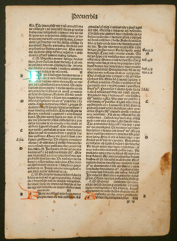
Last Sunday at church, a friend filled an entire room with her late father’s books, setting up an impromptu book shop. I chose several books, most of which are in Fraktur typeface, known to some people as “Gothic” or “Old German”. I enjoy reading such books because they offer a snapshot of a cultural way of thinking. The books I chose were printed between 1877 and 1940. The latter date is significant, as you’ll soon see.
First of all, let’s clarify a few terms: Though many people think of font and typeface as interchangeable, in fact, they refer to two different aspects of a writing style. Typeface refers to a particular style of lettering (e.g. Times New Roman), while font refers to the variations within that style, such as size and weight (CAPS, bold, italic, etc.). Another term we know but may not fully understand is Serif: This refers to the small stroke or line attached to the larger stroke of a letter; an example would be an A with “feet” at the bottom of each down-stroke. Sans Serif simply means “without Serif”.
The first moveable-type printing press, designed by Johannes Gutenberg in Germany around 1440, was based on the ancient Roman design of a screw press used to press wine or oil, which in turn went on to be used to press designs into cloths. He was likely familiar with intaglio printing and may have done some work himself in copper engraving. These designs and uses likely fermented in his inventor’s mind into what became the revolutionary turning point of literacy. Gutenberg’s original typeface was called Donatus-Kalender; the metal type design was itself a form of Textura (more on that in a moment).
Donatus Kalender
Example of Blackletter (Source: Wikipedia)
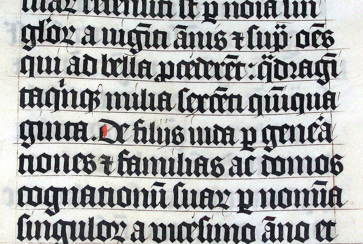
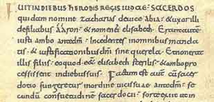
This original family of typefaces was known as “Blackletter”, aka “Gothic scripts”, with the height of popularity peaking around the 14th to 15th centuries. The ancestor of the Blackletter was called the Carolingian minuscule, a calligraphic standard of handwriting widely used in the medieval period, when literacy began increasing and a need for books in a wide range of subjects began to be in demand. It is thought to have been developed in the mid-770s by Benedictine monks north of Paris in the Corbie Abbey, famous for its scriptorium and library. The minuscule itself was derived from Roman Uncial as well as Irish Insular script, which was developed in Irish monasteries and spread throughout Europe.
Carolingian Minuscule
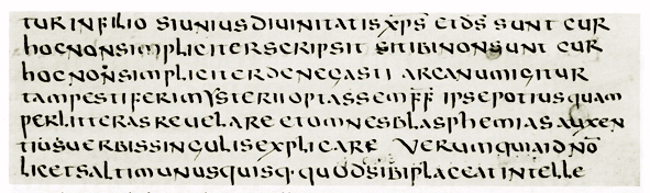
Roman Uncial
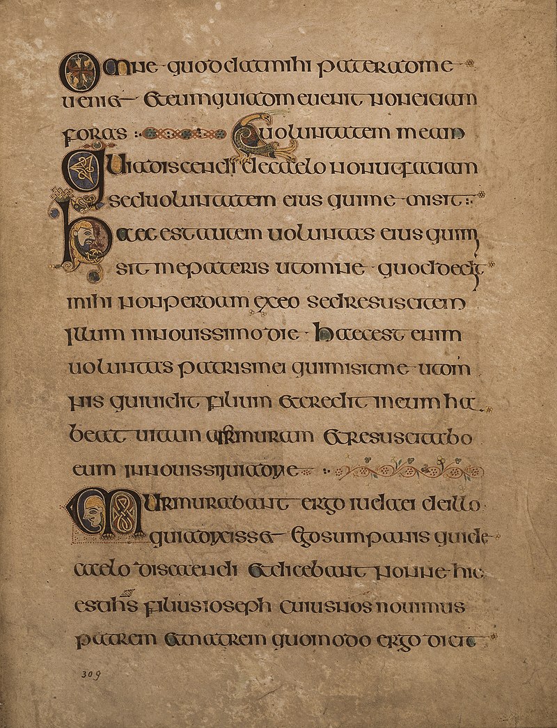
From the Book of Kells, an example of the Irish Insular script
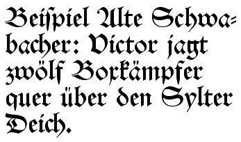
The family of Blackletter typefaces included Early Gothic, which was a transitional script between the Carolingian miniscule and Textura (the most calligraphic form of Blackletter); Schwabacher was a form popular in early German print typefaces (it became widely known with the spread of Luther Bibles from 1522), in use from the 15th century until it was eventually replaced by Fraktur around 1530, though it was still used alongside Fraktur for emphasis, much like we use bold or italic today.
Schwabacher Typeface
Textura Typeface
Another blackletter typeface developed between 1470 and 1600: Antiqua. This typeface’s letters were designed to look like the handwriting of ancient Roman documents, with the letters flowing together, strokes connecting them in a continuous line, whereas Fraktur was distinguished by having letters “fractured” – separate from one another. The Antiqua-Fraktur Dispute deserves its own article, so stay tuned!
Antiqua Typeface (Source: Wikipedia)
Fraktur Typeface (Source: Fonts in Use)
The Habsburg Emperor Maximillian I (1459-1519) was King of the Romans* from 1486 to 1519 [the title of king was used by the kings of East Francia, the territory later referred to as the Kingdom of Germany, from the time of Henry II (1002) to Joseph II (1764)]. The king commissioned the artist Albrecht Dürer to create a series of woodcut engravings of the Triumphal Arch [Though many are familiar with the Arc de Triomphe in Paris, it is only one example of this ancient Roman architectural feature used as a free-standing structure (rather than the Greek version, which was used within a structure such as a temple).]. These engravings would be used to create what we would recognize today as essentially wallpaper, though its purpose was more of a statement of power or propaganda (read personal marketing) commemorating his nobility, generosity, and military conquests – an incongruous combination, if you ask those conquered… The final composite of printed papers stood nearly 3 metres (12 feet) high and was only one part of a series of three enormous prints commissioned by the king.
Albrecht Dürer’s The Triumphal Arch, for Maximilian I
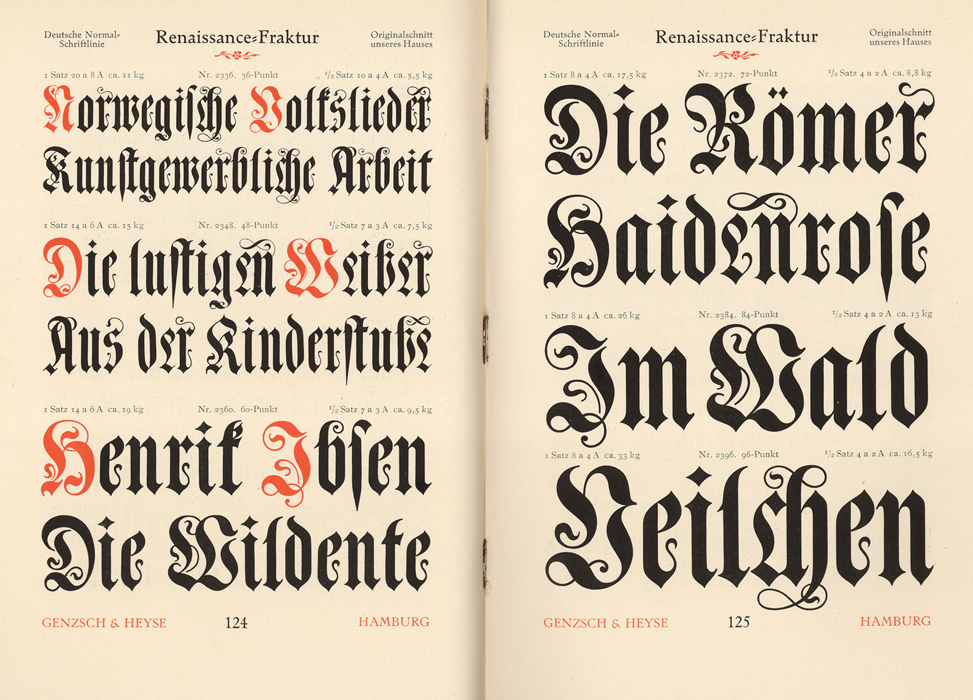
The Fraktur typeface was designed in the 1530s by Hieronymus Andreae, a German woodblock cutter, printer, publisher, and typographer closely connected to Albrecht Dürer. The typeface was made to decorate the arch, telling the stories of the figures depicted throughout. The typeface became popular in Europe and was in use in the German-speaking world, as well as areas under its influence (Scandinavia, Central Europe, and some eastern European regions), into the 20th century. Specifically, Fraktur was in use in German until 1941, when it was actually banned (which places one of the books I purchased on Sunday within one year of the end of the era of Fraktur!). The atmosphere that led to that ban arose from the dispute mentioned above. Once the Nazis were defeated, the ban was lifted, but Fraktur never regained its widespread popularity after that, though you can still see it occasionally in pub signs or various forms of ads, like beer brands.
I just pulled two books from my library shelves: One is an English book originally printed in 1895, with my book being printed in 1915; the other is a German book printed in 1892. The typefaces are widely different: The English text likely used the French Oldstyle, while the German book uses Renaissance Fraktur for the text body, while the end pages act as indexes and use a variety of blackletter typefaces, such as Muenchner Fraktur, Antike Kanzlei, and Enge verzierte Altdeutsch. To see examples of the typefaces mentioned here, please click on the link for Fonts In Use.
I hope you enjoyed this jaunt through history! Nearly every name mentioned, every typeface, and every event deserves its own undusting. Next time, we’ll deep-dive into the dispute that lasted well over a century!
Before we dive into today’s topic, let’s talk about two of my favourite words: Flotsam and Jetsam. I just love the way they sound! The way I understand them, the difference between the two is intention: Flotsam are things unintentionally donated to the sea – things washed overboard from a ship, or things blown off land by a storm. Jetsam is rather something intentionally jettisoned – if a ship needs to lighten its load to avoid sinking, for instance; in the case of the great garbage patches, it is a mixture of both: Without proper disposal systems in place, such as municipal garbage disposal, or education in ecological footprints, social debris is simply tossed and forgotten. But it ends up somewhere, often finding its way to the ocean through rivers and streams. And this leads us to the topic of ocean currents.
Today’s topic is a fascinating dive into a world of global trade; research has shown that around 90% of international trade is carried by shipping containers, and the World Bank statistics show that in 2019, nearly 800 million were shipped annually; given the increase over the past few years in online shopping, I can imagine that figure is by now significantly higher. The unit used for measuring how much a ship can carry is TEU (Twenty-foot Equivalent Unit); the chart below shows the adaptation of ship sizes over the years, driven by global trade:
Now, imagine a shipping container stacked at the top of a pile that’s the height of the actual ship; add to that ocean swells and waves. I’ve been on ships in the Atlantic facing waves so high, I could count fish through my window. I’ve been on ships in the “Sailor’s Nightmare” – the Pentland Firth passage between Scotland and the Orkney Islands – which is characterised by rough bathymetry (the underwater equivalent to topography) and extremely high currents (which also ricochet and collide off of the coasts of the islands and Scottish cliffs), tossing anything on the surface like a leaf in the wind. The World Shipping Council estimates that, over the past 16 years, an average of 1,500 containers have been lost at sea annually. Every year, the contents of those containers are carried along until the container is breached by either corrosion or impact. Then the contents are carried by ocean currents; where they finally make landfall depends on where they entered the ocean. If you were marooned on an island and tossed out an SOS in a bottle, it could make landfall anywhere between two and one hundred years – or never, if it’s caught in a gyre (more on that later). A message in a bottle was found on a beach in Norway that had been sent off 101 years earlier.
So what does that have to do with rubber ducks? In 1992, a shipping container with a consignment of what has been dubbed Friendly Floatees – 28,800 yellow rubber ducks, red beavers, blue turtles and green frogs – was washed overboard (along with 11 other containers) into the Atlantic. Because they are designed to float on water, they have survived at sea for an amazingly long time. Seattle oceanographers Curtis Ebbesmeyer and James Ingraham, who were working on an ocean current model, OSCUR (Ocean Surface Currents Simulation), began to track their progress; and those wee toys went on all kinds of adventures: Ten months after they broke free, some began showing up along the Alaskan coast; some showed up in Hawaii; some went to see the site of the Titanic sinking before getting frozen into ice, eventually emerging again and travelling to the US eastern coast, Britain and Ireland, making landfall around 2007. The researchers contacted coastal regions, asking beachcombers to report their finds; they recorded findings and began to accurately predict where landfall would occur. Over the years, the ducks and beavers had faded to white, but the blues and greens had retained their colours.
Flotsam and Jetsam have played key roles in helping researchers understand not only how ocean currents travel, but also how the areas known as garbage patches, oceanic gyres, are formed and retained by the swirl of ocean currents. Currently, five patches are known; many of the rubber ducks are likely caught in such currents, so we may hear about more white ducks finding their way to beaches in the coming years.
So the next time you see a rubber duck, think of all the adventures its siblings have been on!
If you’d like to see for yourself how ocean currents work, click here for an interactive map; just click on any area of the map to see how and where the currents carry debris from that point.
The adage “Murphy’s Law” refers to the idea that anything that can go wrong will go wrong. You forget your umbrella and it will be sure to rain; your computer crashes at the worst possible moment; your worst itch is always where you can least reach it, and so on.
Similar sentiments are centuries old: E.g. Augustus D. Morgan, a British mathematician, wrote in 1866: “Whatever can happen, will happen”; Alfred Holt, an engineer, wrote in 1877: “It is found that anything that can go wrong at sea generally does go wrong sooner or later.” British stage magician Nevil Maskelyne wrote in 1908, “Everything that can go wrong will go wrong.”
But who was Murphy? And why is it his law? I’d always assumed that Murphy was either a fictional black sheep created to blame everything on, or someone from a century or more ago, much like Hobson of the “Hobson’s Choice” idiom; but Murphy’s Law comes from the 1940s aerospace era.
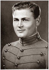
The “law” was coined by and named after Edward A. Murphy Jr. (b.11 January 1918; d.17 July 1990): Born in the Panama Canal Zone in 1918, he finished high school in New Jersey and eventually graduated from West Point in 1940, joining the Army Air Corps, serving in the Pacific Theatre of World War 2, and in the Korean War, reaching the rank of major. According to his obituary on findagrave.com, he is credited with design work on crew escape systems for some of the most famous experimental aircraft of the 20th century, including the F-4 Phantom, the SR-71 Blackbird, the X-15 rocket plane, and later the Apache helicopter. He also worked on safety and life support systems for NASA’s Apollo space missions. Although he was apparently chagrined by the namesake, he believed in the concept as a key to good defensive design – that one must always assume worst-case scenarios and work to counter them in thorough planning, engineering and execution of mechanical designs.
Around 1948, Murphy and his team were testing rocket sleds, which were used to test the acceleration of equipment deemed too hazardous to test in a piloted aircraft and also to test missile components without risking actual (more expensive) missiles in the testing. The saying arose when training his engineers to avoid designing missile components that could be confused one for another; he said, “If a part can be installed in more than one position, it will be incorrectly installed in the field.” Perhaps Murphy was familiar with the sentiment of those past engineers, given his background in engineering, but wherever it came from, his name was attached and, as they say, the rest is history.
Edward Aloysius Murphy Jr, in his West Point uniform
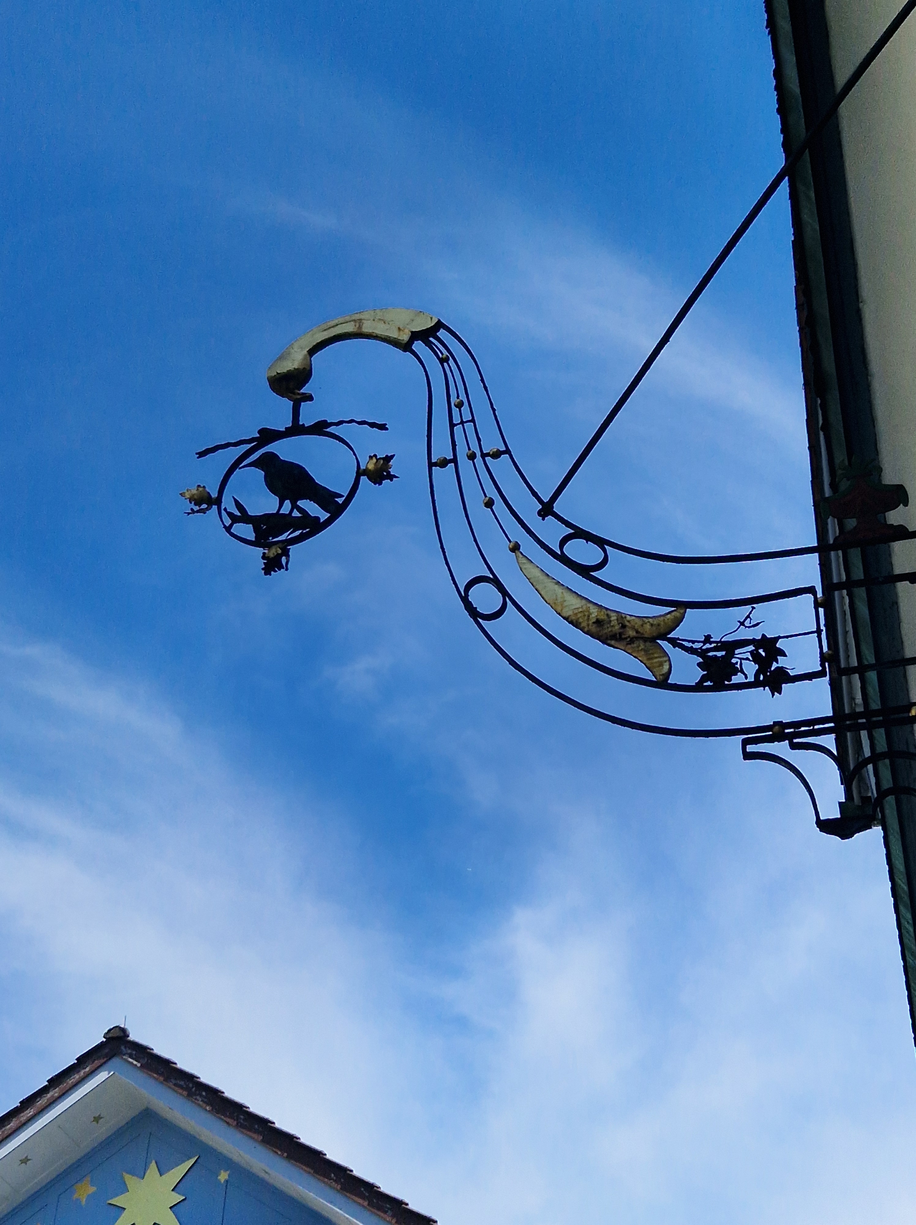
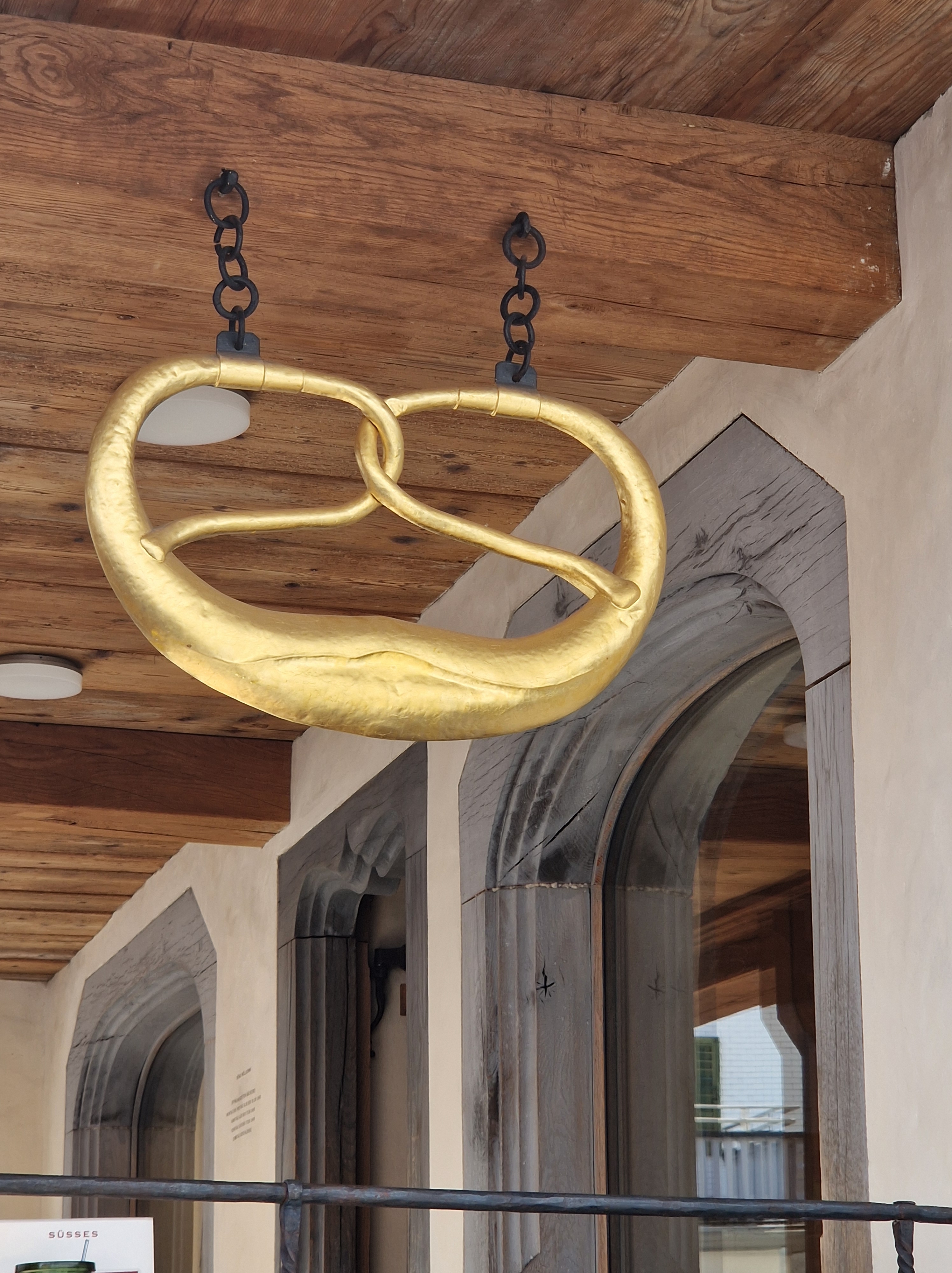
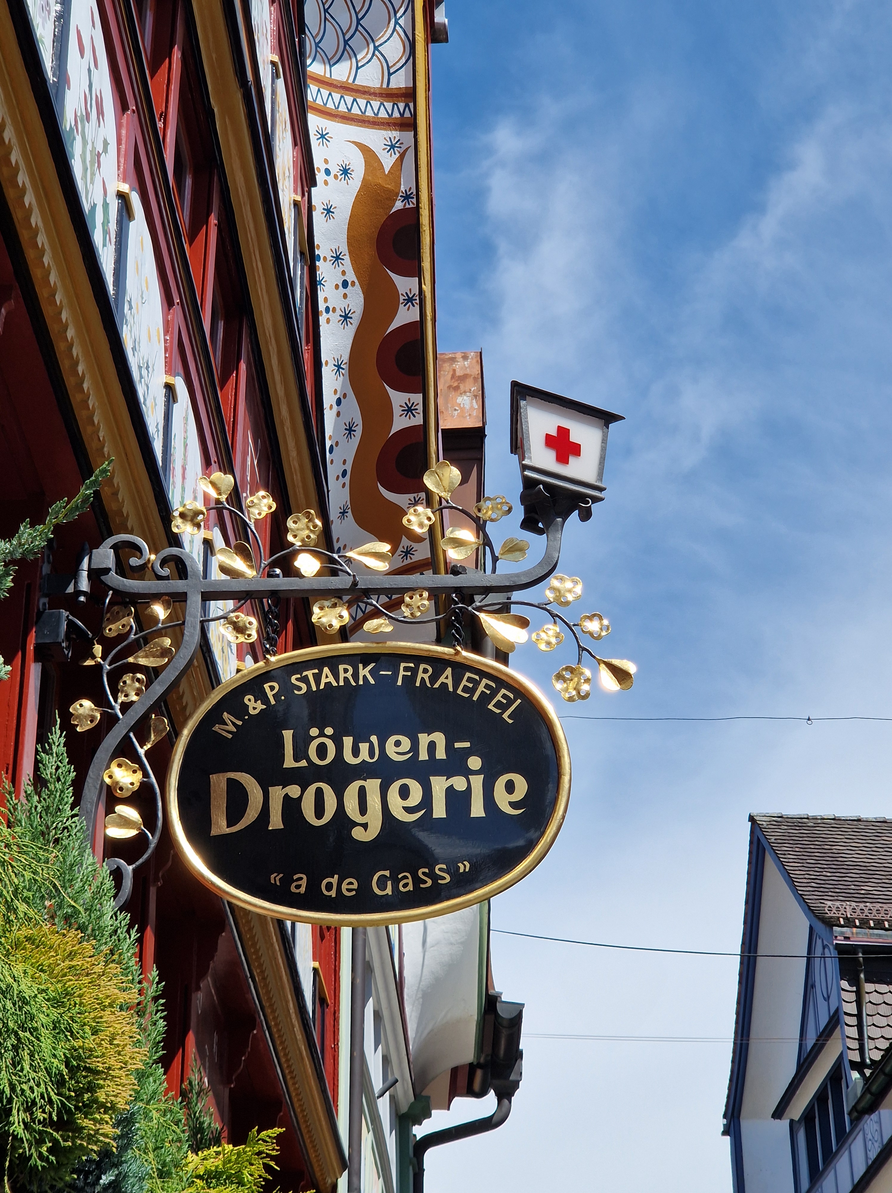
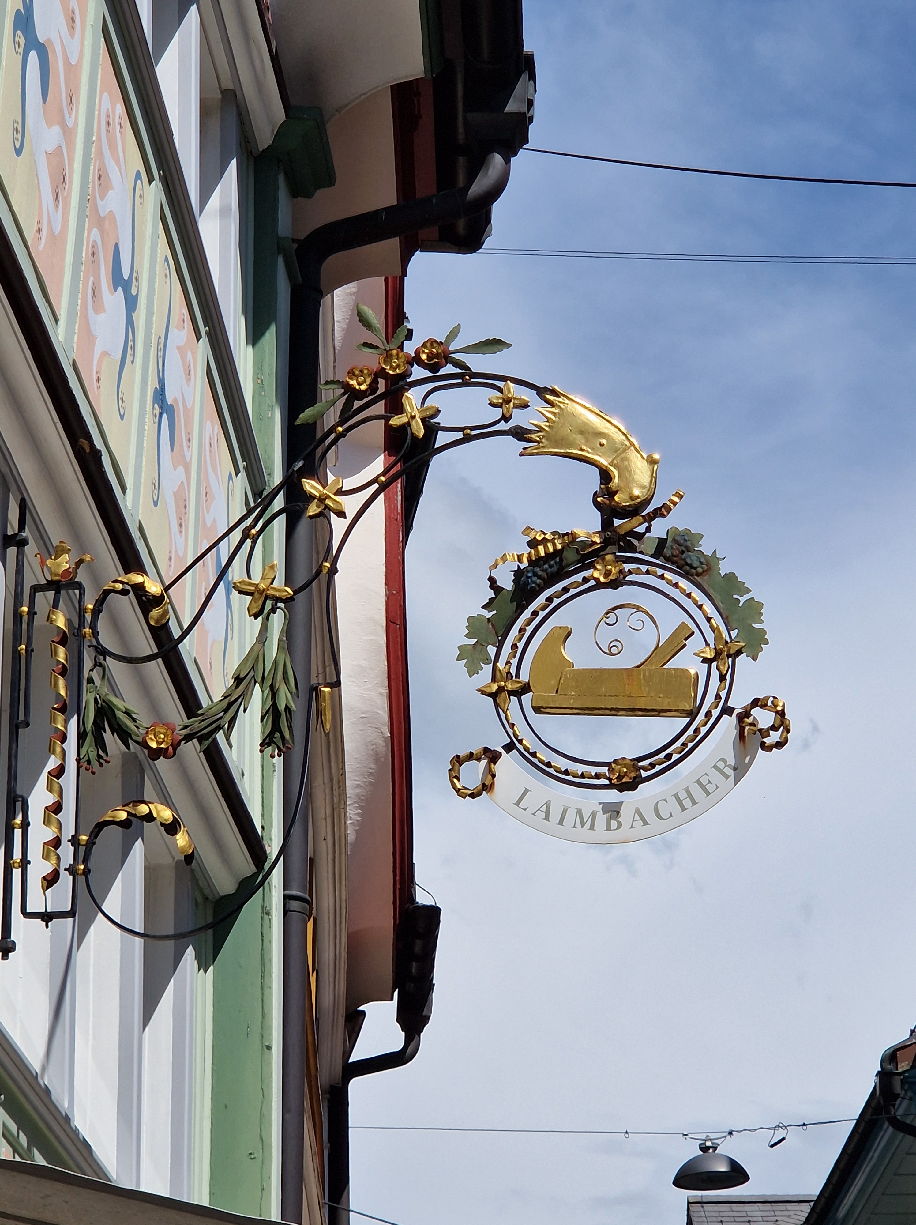
I’m fascinated by a few aspects of architecture in particular, such as doorways, knockers, unusual features such as sundials on the sides of buildings, mural paintings (here in Switzerland, these are sometimes hundreds of years old), and shop signage – you’ll see the latter even in the smallest town here.
This past summer, my husband and I rented a motorhome and travelled mostly in eastern Switzerland. I would say that 90% of my photos were of shop signs! I find that if you focus in on one topic, you’ll begin to see that thing everywhere.
Known as commercial signage or trade signs, such symbols of a shop’s products have been used as far back as ancient Egypt. As many people were illiterate, the pictorial shop sign not only advertised what was for sale in a shop but also distinguished the shops with similar items. By the mid-15th century, English laws even required shops that sold ale to hang a shop sign out; it made inspections of the quality of the ale easier. Some signs were temporary; for instance, if a woman made more ale or bread than her family could consume, she would put out a sign to sell the surplus and thus earn a bit of money. In the narrow streets of medieval towns, signs might be so large as to nearly touch the building on the other side of the lane, and they could become a hazard to passing horsemen or coachmen. By the mid-16th century, regulations were passed to limit the size of signage, and the securing of the sign to the building to avoid it endangering passersby. In Britain, hanging signs were eventually phased out in favour of what were are most familiar with – a flat sign denoting the store along the space above the front windows. But here in Switzerland, shop signage is everywhere – not just old, but also newer additions.
The development of the signs, including elements of guilds or heraldry symbols, led to competition between blacksmiths to create the most elaborate ironwork. The signs evolved from simple displays of ware to symbolic representations of a shop owner’s name or a heraldic connection or patronage of royalty (e.g. a crown). Examples might include shoemakers displaying a shoe or gilt boot, bakeries displaying bread, and haberdasheries displaying a needle and thread or a coat.
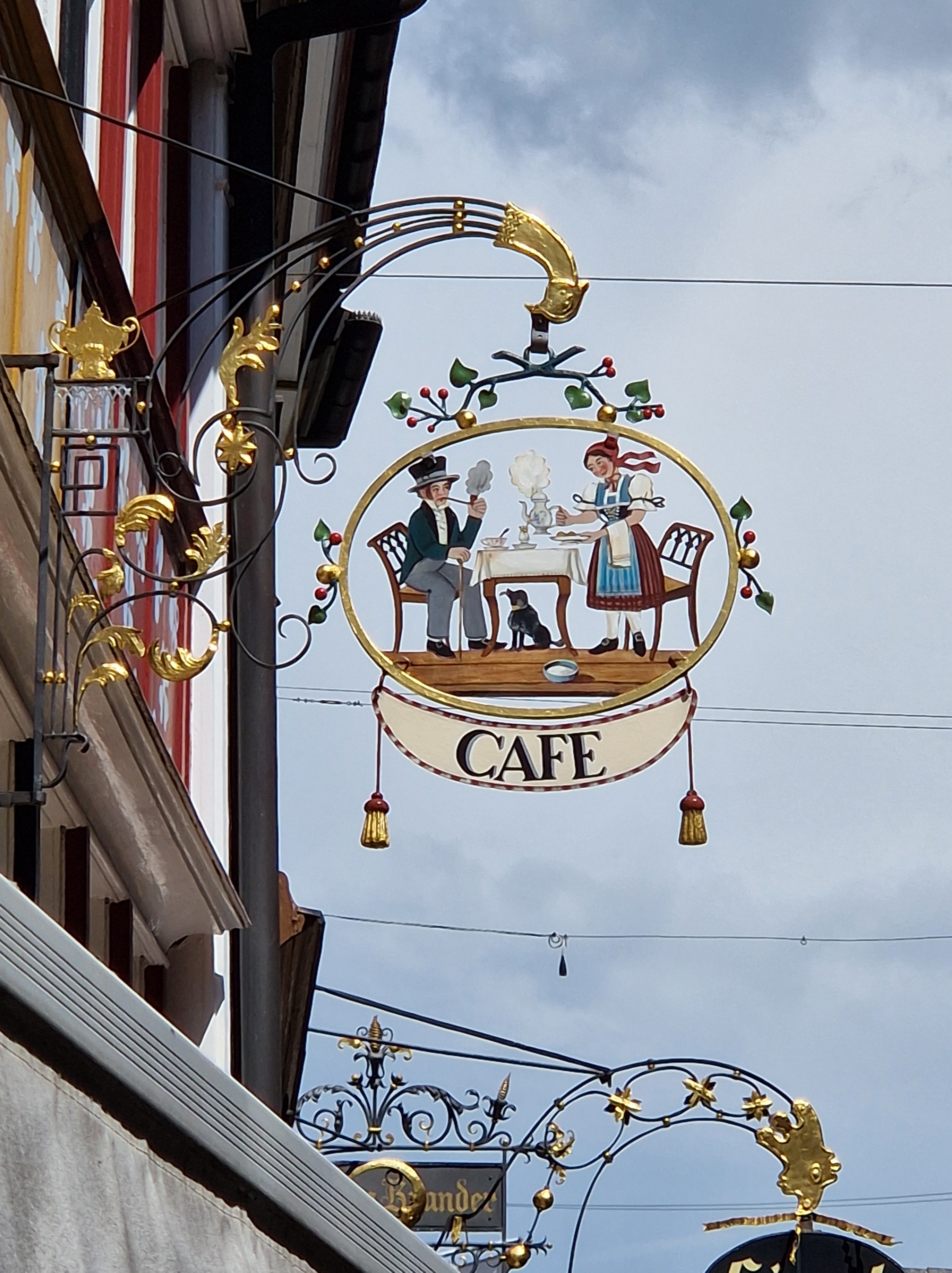
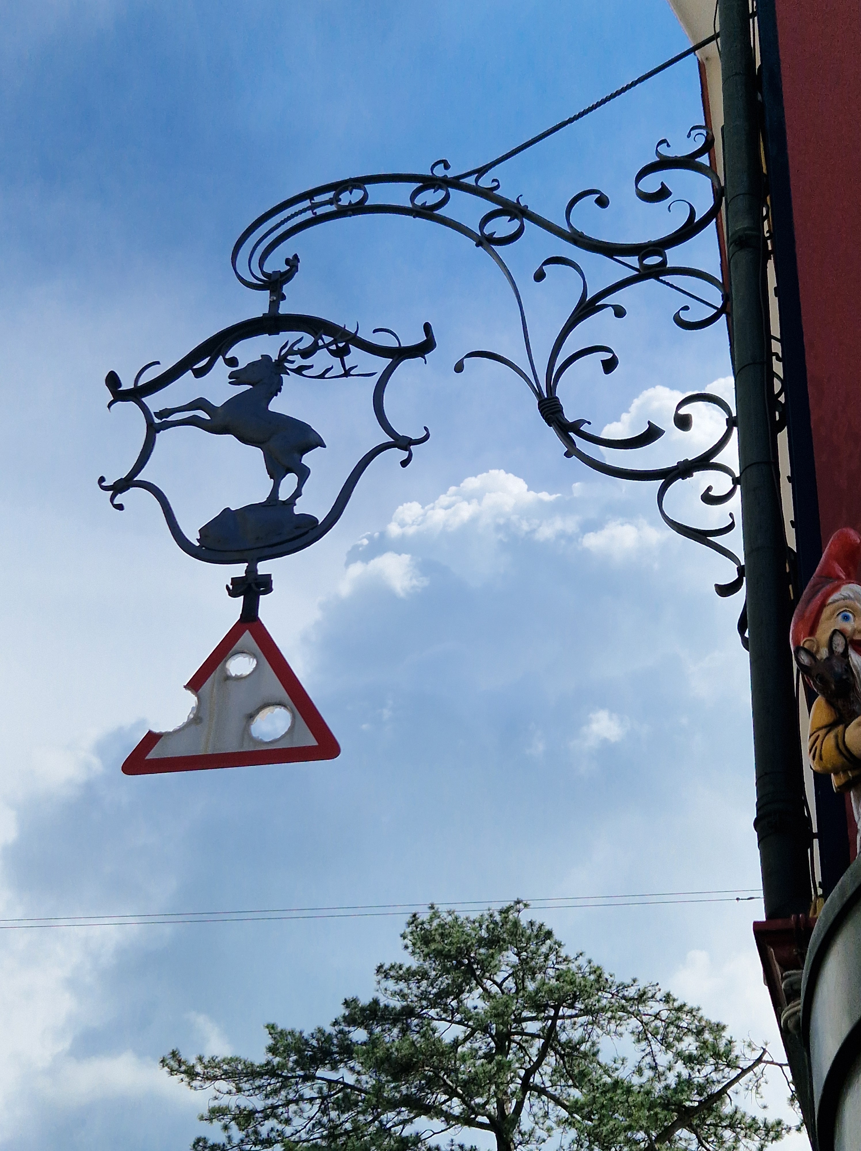
Here is just a fraction of the signs I photographed during our holidays, with brief explanations:
The building from which this sign hangs was built originally in 1664, and renovated to the current form in 1830. It was originally an inn/tavern on one side, and a forge (blacksmith) on the other. The Raven, as a tavern, took its symbol from the legend of St. Meinrad (797-861 AD); he was a hermit who rescued two young ravens from a sparrowhawk and raised them in his hut in the Finstern Wald (dark forest). In 861, he was murdered by two robbers; when they realized what they’d done, they fled to Zürich, but the crows followed them into a tavern and attacked them; the others present thought it unusual, so they took the men captive; they confessed, and were executed. The raven became a symbol of inns along a pilgrimage road; it was sometimes combined with a wine jug and bread.
The Hotel Santis sign has a few symbols: The wine is an obvious reference to a tavern, pub or inn; the pine cone is an interesting addition: It was the symbol of the field sign of the Roman legion stationed in Rhaetia in 15 BC, and hence it is used as a heraldic charge (an emblem on a shield). It may have been included in this sign to proclaim a good place for soldiers to eat or sleep, or as an advertisement that it was protected under a legion or unit of the military at a time when such protection would have been welcome. The bell symbolized a pilgrimage or an invocation of guardian angels over a premises.
I think this is fairly clear – it’s a bakery!
This building is a pharmacy; the front of the building is a beautiful example of the mural painting I mentioned earlier; these panels represent the herbs and flowers used medicinally. The saying painted toward the right side reads: Vielerlei Kraut gegen Leibesnot, aber kein einzigs wider den Tod (Many herbs against bodily pain, but none against death).
This symbol denotes a carpenter’s shop.
This café sign would be clear from any stagecoach stopping for a break and horse change what could be expected inside. The figures are dressed in traditional Appenzeller clothing.
And lastly, here’s a traditional sign with a modern addition: It’s a hunting lodge, or inn that serves wild game meat. Next to it, peeking around the corner, is a figure from a toy shop.
Do you ever have those moments where you catch yourself thinking about the simplest of things in life? Things that are common to you, yet you’ve never stopped to think about why you call something by a certain term and where those words or phrases come from? I do, with alarming frequency… I guess it’s the product of a curious mind.
I have long hair; so long that, if it’s not in a braid or some other up-do, I’d be sitting on it with ease. I braid it every day and every night – otherwise, it tangles. And thus, while brushing my hair out this morning, the word tangle tangled in my tangled mind. As someone once said, my hair isn’t messy; it’s just erupting with awesomeness.
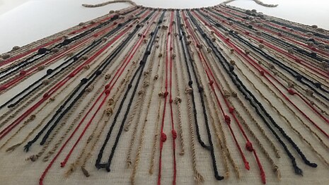
As a verb, meaning “to knit together confusedly, encumber, or enmesh”, it came into English in the mid-14th century via Old Norse þongull, meaning seaweed, from the Proto-Germanic thangul. Other Germanic languages have related words: In both Dutch and German, we find Tang (seaweed), and in Frisian we find Tung [Frisia is a cultural region that lies over the border between the Netherlands and Germany.] Looking at the image below, it’s easy to imagine a ship’s tackle becoming entangled in the tang…
Image Credit: The Norwegian Blue Forests Network
As with any useful word, it began to collect variations: The transitive sense of entrapping someone or bringing someone under one’s influence; the sense of fighting with someone; Tanglefoot was a western slang meaning strong whiskey, and tanglesome (1823), meaning complicated.
So I hope I’ve untangled the origins of this tanglesome word! Have a great, untangled week!
My husband and I were having lunch recently, and a package of Swedish crackers was on the table; I pointed to the brand name, Pågen. In English, our pronunciation of these vowels would lead us to say pagan /pæg-in/, whereas the Swedish would rather be more like /po-gen/. I just mentioned that English might have sounded similar to that before the Great Vowel Shift, which he’d never heard of (being Swiss, it’s not likely he would be familiar with this aspect of English etymology), so I promised to write a blog about it; here we go!
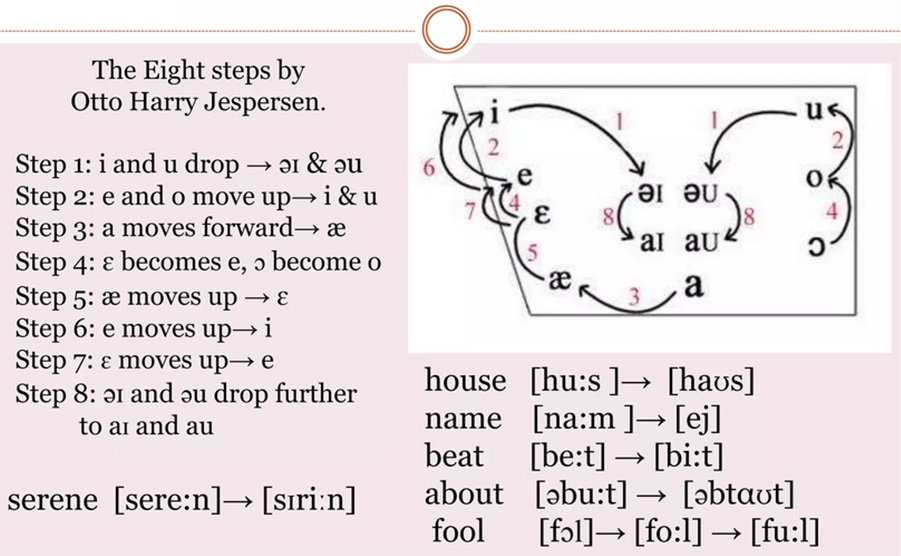
The term Great Vowel Shift was coined by the Danish linguist, Otto Jespersen (1860-1943), who specialised in the English language. Though the GVS is considered a single event (because of the changes being viewed as part of a chain reaction, with each vowel sound changing in a predictable way), the actual transition of English pronunciation was gradual, taking place over about 200 years, from ~1400 to ~1600. The shift began in Middle English, which was spoken from 1066 until the late 15th century – that form familiar to Geoffrey Chaucer (though his pronunciation would be unintelligible to us, his words still survive through his famous Canterbury Tales) – into Early Modern English (from the beginning of the Tudor period through to the Stuart Restoration period); Shakespeare would have been familiar with it. From there, English transitioned into Modern English in the mid-to-late 17th Century.
The main changes were that, from Middle to Early Modern English, the long vowels shortened; weef became wife, moos* became mice, beet became bite, and so on. (*The word moose entered English through Native American languages in 1610). I will also mention that in Scottish, a lot of the older vowel pronunciations still exist; house is still huus, full is homophonous with fool, etc.
Here’s a look at just how the English vowels shifted:
Source: SlideShare
If you’ve been paying any sort of attention to English, you’ll know that our spelling is a bit chaotic; the language is full of homonyms, which are divided into either homophones (words that sound the same but have different spellings, e.g. beet and beat; bear and bare; to, too and two), or homographs (two words with differing meanings, same spellings, but not necessarily the same pronunciation: e.g. bank [of river; finance] or agape [with mouth open; love], or entrance [a way inside; to delight]) or tear [ripping; crying]. These -graphs and -phones came into English from regional dialects that were transported as migration and cultural mixing took place, and the GVS added its two pennies to the mix. Just think of the variety we have in the sounds /ea/ (bread, beat, bear, break); /oo/ (look, spool, blood); or /gh/ (through, cough, sight).
Certain factors contributed to the speed of language shift: The Black Death (1346-1353) wiped out up to 50% of Europe’s population. Stop a minute and let that sink in. What if the population of your town were reduced by half? And the next town, and the next. That single event changed the course of history on many levels; surfs could finally demand better wages wherever they ended up settling; if you lived in a town that no longer had the skills of a baker, blacksmith, or any other trade you’d depended on, you’d move to where those services existed – and jobs existed – and that meant places that had been hit the hardest by the plague and thus where everyone else was migrating, such as London. As mass movement followed the epidemic, people brought their dialects and their spellings with them. It began to converge into a new, distinct way of speaking, thinking and spelling. The geopolitical climate of the time also influenced English; England and France have been annoying each other for over a thousand years; whenever England was enamoured by all things French, they tried to emulate their pronunciations. That influence came and went; in one such moment, the pilgrims set sail for America (1620), taking a time capsule of the language with them, while England’s English continued to be influenced by French up until the French Revolution, when it quickly fell out of favour in England, though the changes had already taken place (one example is the American /k/ in schedule, closer to the original Latin, while the English say /sch/ without the /k/, which is closer to the French cedule). This factor of influence also affected differences of speech between the lower class and upper class at that time; the upper class wanted to sound more posh, more fashionable, and above all, not like the lower class.
A major contributing factor to our chaotic spelling is that ca. 1440, the Gutenberg printing technique was introduced, and by the 1470s, William Caxton had imported the invention to England; we have him to thank for Chaucer’s Canterbury Tales being known today, as that was the first book he printed in England. We also have him to thank for the influence of Chancery English (the English used by the secretariat of King Henry VI) in the standardization of the language, as he used it as his own guidelines in printing. The vowels had already begun to shift by that time; enter the written word, a rise in literacy, and you have the jumbled effects of “mid-shift” on English spelling – people began to adapt their pronunciation to the written word, so whichever form the printer used is the one that began to prevail, even though some sounds were still in transition. Like nailing down jelly. You could say that many of our odd spellings are simply a snapshot in time.
It is also important to point out that the GVS didn’t have the same influence everywhere: The main changes occurred around London, but the farther away you move from that epicentre, the less the effects on the local dialects, which still holds true today – though gradual merging has allowed people from, say, Cornwall, to understand people from Yorkshire – which wouldn’t have been the case centuries ago. Even though they can understand each other, their dialects are still distinct. I’ve already mentioned that Scots English (as opposed to Gaelic) still retains many of the longer vowels long since lost in standardized English; being so far from London, they simply ignored them. English may be taught in their schools, but Scots dialects prevail in the home and hearth. Regional dialects in English exist the world over, and though spelling and pronunciation may differ from region to region, and the language continues to be a living, breathing, growing and changing being, it’s still a language that enables the modern world to communicate, whether English is their mother tongue or not.
Dr Samuel Johnson (1709-1784) was an English poet, playwright, essayist, moralist, literary critic, sermonist, biographer, editor, and lexicographer, and his writings have lasted the test of time. He has been called “the most distinguished man of letters in English history” (The Oxford Dictionary of National Biography). His most notable work is “A Dictionary of the English Language” (1755), though he was a prolific writer in every expression of the craft.
Based on biographies by those who knew him, such as his friend, James Boswell, his mannerisms and behaviours were so well documented that a posthumous diagnosis of Tourette’s Syndrome can be attributed to him. The most famous portrait of Johnson is the one above, painted by Joshua Reynolds, with whom he founded The Literary Club in 1764. The club would meet regularly, and included members from the literary and historical disciplines; membership was by unanimous election only; if a nominee was undesirable, a member could submit a black ball (white and black balls were likely deposited in an urn to keep the vote confidential). The term “to blackball someone” arose in 1770, and it means “to exclude from a club by adverse votes”. It may have originated at this club or simply have been a general practice employed in clubs and societies around this time.
So, without further ado, here are 10 quotes by Dr Johnson:
“I know not, Madam, that you have a right, upon moral principles, to make your readers suffer so much.”
“I never desire to converse with a man who has written more than he has read.”
“It is better to live rich than to die rich.”
“No man will be a sailor who has contrivance enough to get himself into a jail; for being in a ship is being in a jail, with the chance of being drowned. … A man in a jail has more room, better food and commonly better company.” (Boswell’s Life of Johnson)
“The chains of habit are too weak to be felt until they are too strong to be broken.”
“The use of travelling is to regulate imagination by reality, and instead of thinking how things may be, to see them as they are.”
“Great works are performed not by strength, but by perseverance.”
“In order that all men may be taught to speak truth, it is necessary that all likewise should learn to hear it.”
“When a man knows he is to be hanged in a fortnight, it concentrates his mind wonderfully.”
“The superiority of some men is merely local. They are great because their associates are little.”
The idiom “Catch-22” comes from a book of the same title by American author Joseph Heller (1923-1999). The term originally referred to a military rule whose provisions are mutually frustrating. Heller used Catch-18 instead of Catch-22 when the first chapter of his book was originally published in 1955. He changed it by the time the entire book was published in 1961 because his publisher had already published a book that year with “18” in the title (Leon Uris’ novel, Mila 18). So in 1961, the phrase Catch-22 first appeared. It was first used figuratively in 1971 in Atlantic Monthly magazine. As far as the form goes, it is usually hyphenated and with a capital C, as that is the way Heller originally wrote it.
Since the author’s first usage of the idiom, it has taken on a life of its own: Today, its broader meaning is a paradoxical situation from which an individual cannot escape because of contradictory rules or limitations. It has also been used as a mnemonic for the symptoms of DiGeorge syndrome.
One particular quote from Heller is thought-provokingly insightful: “Everyone in my book accuses everyone else of being crazy. Frankly, I think the whole society is nuts – and the question is: What does a sane man do in an insane society?” In a way, this is perhaps an example of a Catch-22 for the sane person: If they stay in an insane society, they may lose their sanity; but by leaving such a society, they throw away any chance of bringing it back to a state of reason. Social and political polarisation are both poisons that infect society.
Throughout history, languages have come and gone; an estimated 30,000 have existed at some point in time, though currently, there are roughly 6,000 to 7,000 languages in use – and most are threatened with extinction. Think about that. The impact on the loss of cultural history, connection to ways of thinking, ways of communicating, and ways of processing information; senses of humour, and national heritages will be lost.
An example of a language nearly lost, but which is now familiar to most of us by sight, is the logogram language of Egyptian hieroglyphs. The knowledge of how to interpret the symbols had been lost for centuries, until 1799, when a stone was found near Rosetta, along the Nile Delta in Egypt; the stone was a stele with a decree issued in 196 BC; the texts carved into the stone were Ancient Egyptian (“demotic” text), hieroglyphs, and Ancient Greek. Because Greek was a known language, they could use the Rosetta stone to decipher the forgotten languages.
When we think of writing, we may think of various alphabets: Greek, Roman (of which English makes use), Norse Runes, or the logographic or ideographic languages of Asia, such as Chinese or Japanese, or the cuneiform writing of the Ancient Near East. But did you know that there have been languages based on string?
Quipu in the Museo Machu Picchu, Casa Concha, Cusco. Source: Wikipedia
The Inca people, in the region of modern Peru and Chile, used knots on an elaborate system of connected strings or cords for collecting data, keeping records, recording taxes or census records, making calendars, or for military organisation. When the Spanish Conquistadors swept through, they found numerous bundles of strings, but had no idea of their significance; they destroyed many of the quipu*, not realizing that they might have held in their hands a record of an individual’s wealth in animals or crops. [*Quipu is the Spanish spelling used in English; it is also spelled khipu or kipu.] Other cultures have also used similar concepts with knotted strings to record information, unrelated to South America; these include China, Japan, Taiwan New Zealand, Hawaii, and other parts of Polynesia.
As with most textiles, they unfortunately didn’t stand the test of time very well, and only a fraction remains today. The ancient world may have taken the concept of the quipu one step further in creating the more flexible abacus, though the latter was (and is still) used for temporary calculations, while the former was rather for recording information. Whether or not there is a historical link, both are visual tools that can be used for similar functions to a certain extent.
Even with such widespread use of these knotting records, their meaning was nearly lost, until a Harvard student, Manny Madrano, had time on his hands one summer and solved a centuries-old mystery!
For an interesting video on this topic, please click here. I hope you’ve learned something! Keep being curious about our fascinating world!