Category Archives: Signs

The Fascinating History Behind the Fraktur Typeface

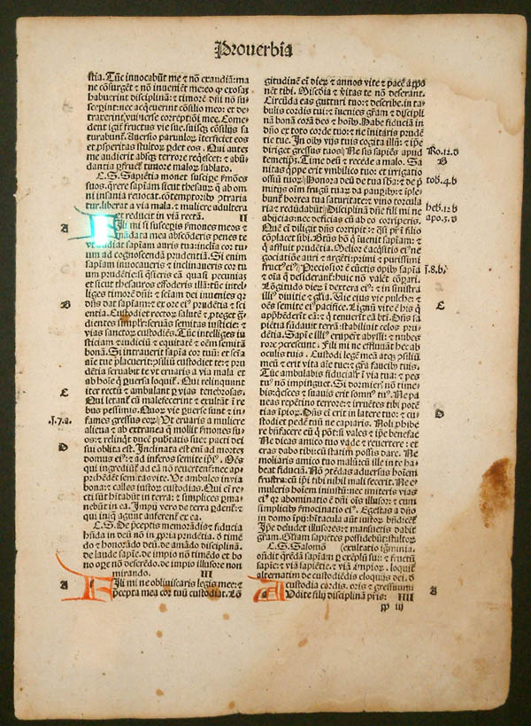
Last Sunday at church, a friend filled an entire room with her late father’s books, setting up an impromptu book shop. I chose several books, most of which are in Fraktur typeface, known to some people as “Gothic” or “Old German”. I enjoy reading such books because they offer a snapshot of a cultural way of thinking. The books I chose were printed between 1877 and 1940. The latter date is significant, as you’ll soon see.

First of all, let’s clarify a few terms: Though many people think of font and typeface as interchangeable, in fact, they refer to two different aspects of a writing style. Typeface refers to a particular style of lettering (e.g. Times New Roman), while font refers to the variations within that style, such as size and weight (CAPS, bold, italic, etc.). Another term we know but may not fully understand is Serif: This refers to the small stroke or line attached to the larger stroke of a letter; an example would be an A with “feet” at the bottom of each down-stroke. Sans Serif simply means “without Serif”.

The first moveable-type printing press, designed by Johannes Gutenberg in Germany around 1440, was based on the ancient Roman design of a screw press used to press wine or oil, which in turn went on to be used to press designs into cloths. He was likely familiar with intaglio printing and may have done some work himself in copper engraving.  These designs and uses likely fermented in his inventor’s mind into what became the revolutionary turning point of literacy. Gutenberg’s original typeface was called Donatus-Kalender; the metal type design was itself a form of Textura (more on that in a moment).

Donatus Kalender
Example of Blackletter (Source: Wikipedia)

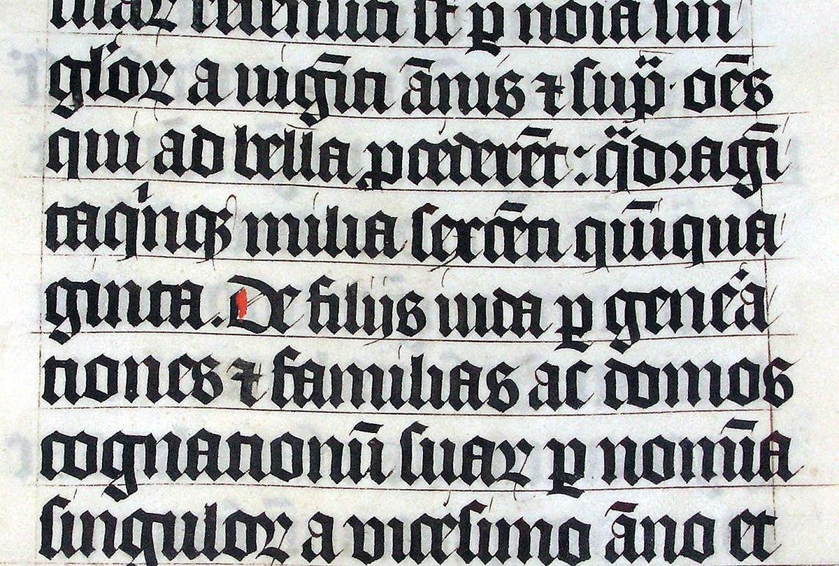
This original family of typefaces was known as “Blackletter”, aka “Gothic scripts”, with the height of popularity peaking around the 14th to 15th centuries. The ancestor of the Blackletter was called the Carolingian minuscule, a calligraphic standard of handwriting widely used in the medieval period, when literacy began increasing and a need for books in a wide range of subjects began to be in demand. It is thought to have been developed in the mid-770s by Benedictine monks north of Paris in the Corbie Abbey, famous for its scriptorium and library. The minuscule itself was derived from Roman Uncial as well as Irish Insular script, which was developed in Irish monasteries and spread throughout Europe.

Carolingian Minuscule
Roman Uncial
From the Book of Kells, an example of the Irish Insular script

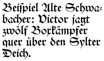
The family of Blackletter typefaces included Early Gothic, which was a transitional script between the Carolingian miniscule and Textura (the most calligraphic form of Blackletter); Schwabacher was a form popular in early German print typefaces (it became widely known with the spread of Luther Bibles from 1522), in use from the 15th century until it was eventually replaced by Fraktur around 1530, though it was still used alongside Fraktur for emphasis, much like we use bold or italic today.

Schwabacher Typeface
Textura Typeface

Another blackletter typeface developed between 1470 and 1600: Antiqua. This typeface’s letters were designed to look like the handwriting of ancient Roman documents, with the letters flowing together, strokes connecting them in a continuous line, whereas Fraktur was distinguished by having letters “fractured” – separate from one another. The Antiqua-Fraktur Dispute deserves its own article, so stay tuned!

Antiqua Typeface (Source: Wikipedia)
Fraktur Typeface (Source: Fonts in Use)

The Habsburg Emperor Maximillian I (1459-1519) was King of the Romans* from 1486 to 1519 [the title of king was used by the kings of East Francia, the territory later referred to as the Kingdom of Germany, from the time of Henry II (1002) to Joseph II (1764)]. The king commissioned the artist Albrecht Dürer to create a series of woodcut engravings of the Triumphal Arch [Though many are familiar with the Arc de Triomphe in Paris, it is only one example of this ancient Roman architectural feature used as a free-standing structure (rather than the Greek version, which was used within a structure such as a temple).]. These engravings would be used to create what we would recognize today as essentially wallpaper, though its purpose was more of a statement of power or propaganda (read personal marketing) commemorating his nobility, generosity, and military conquests – an incongruous combination, if you ask those conquered… The final composite of printed papers stood nearly 3 metres (12 feet) high and was only one part of a series of three enormous prints commissioned by the king.

Albrecht Dürer’s The Triumphal Arch, for Maximilian I

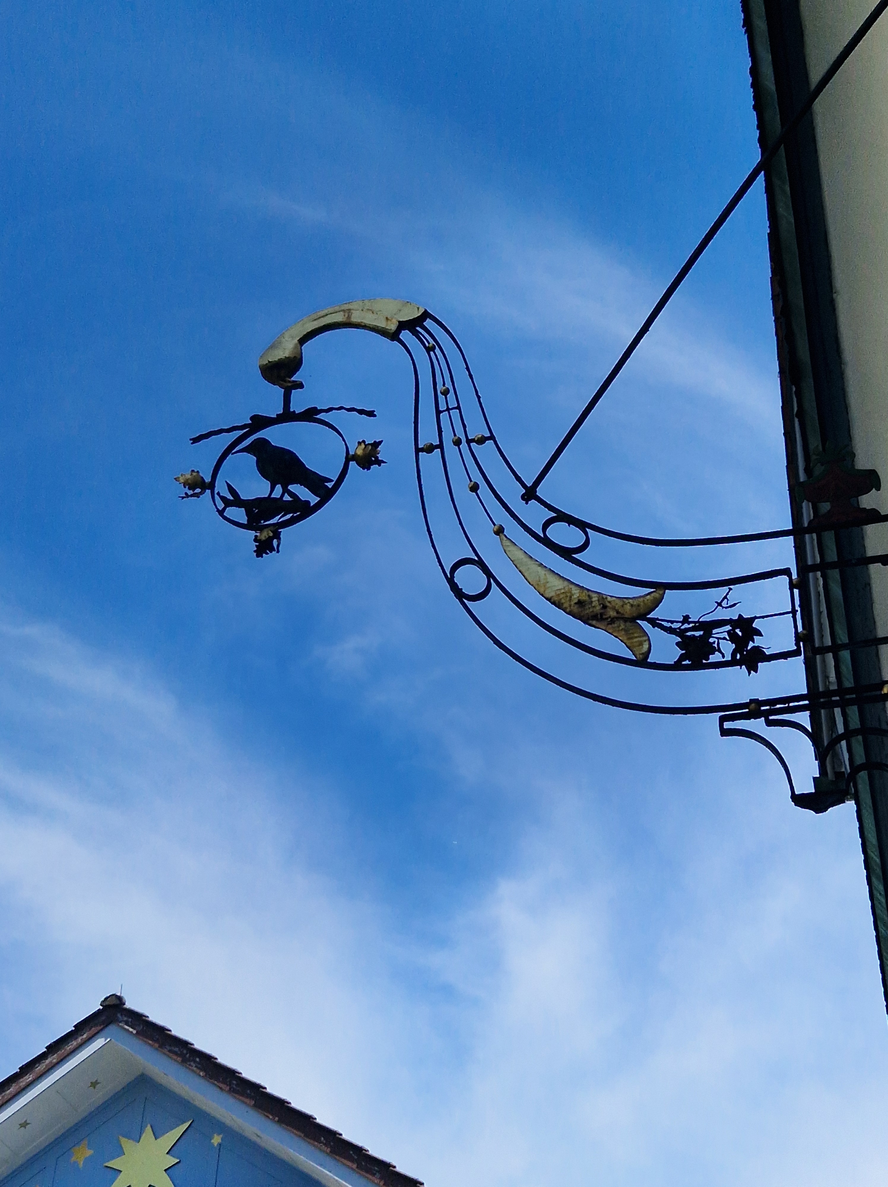
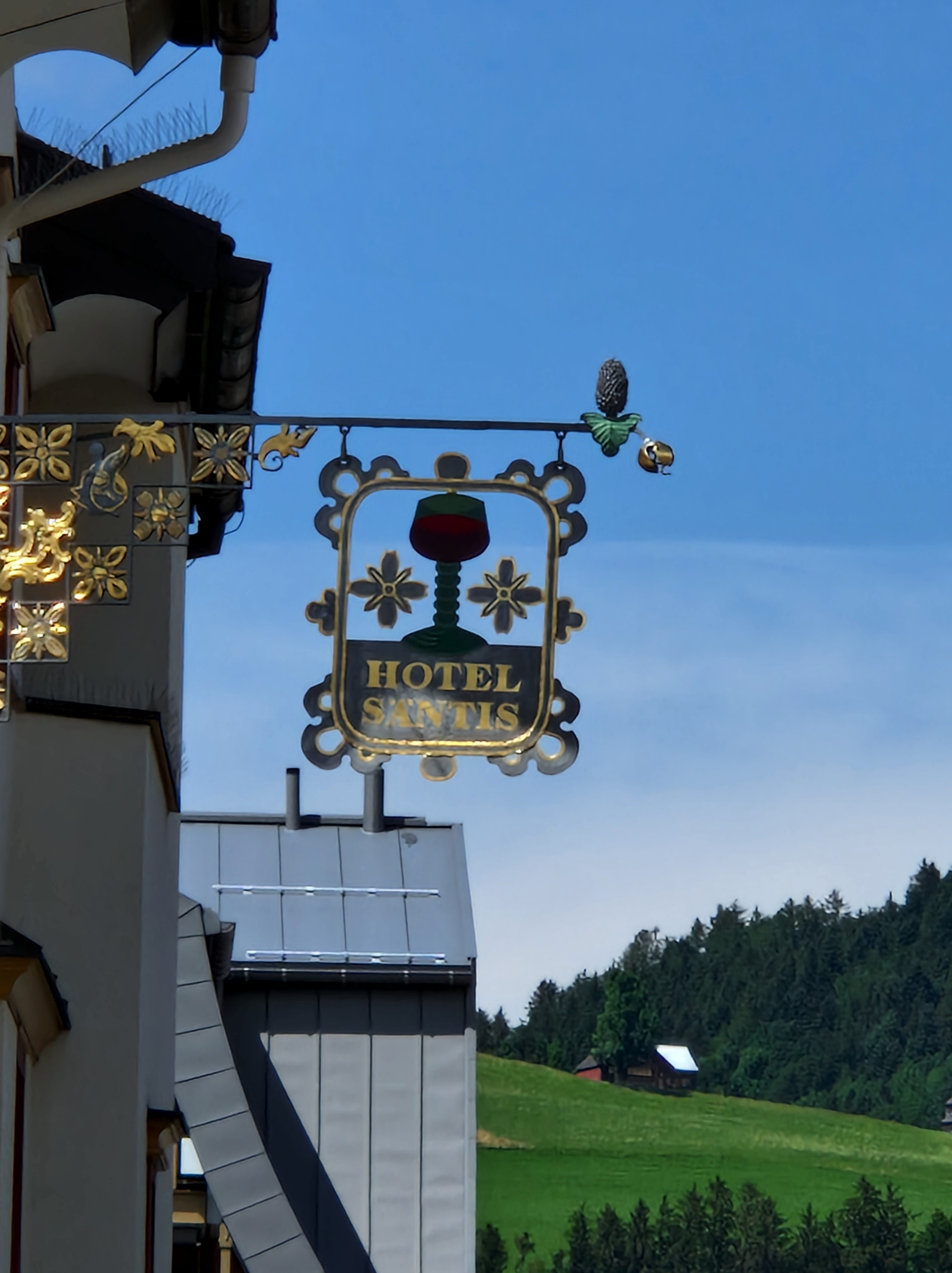
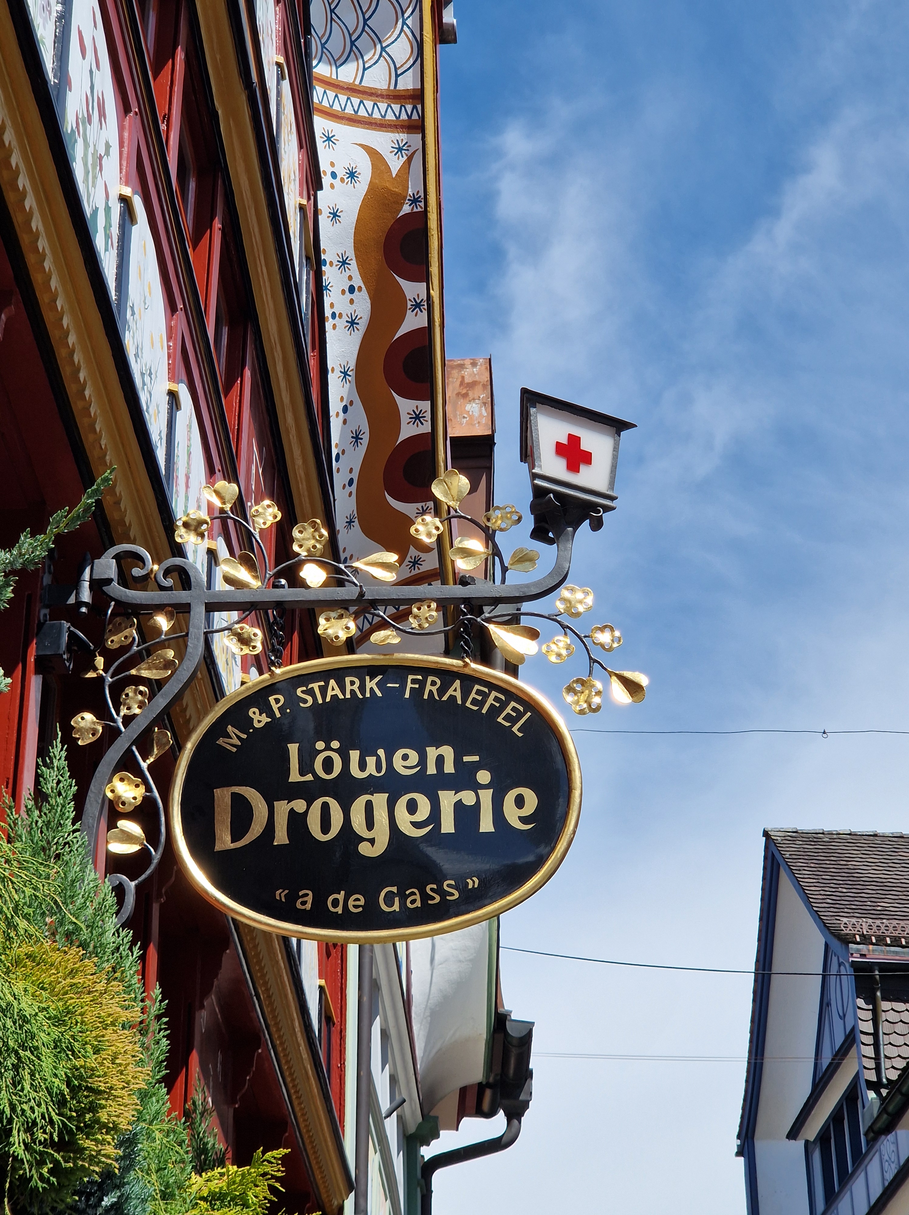
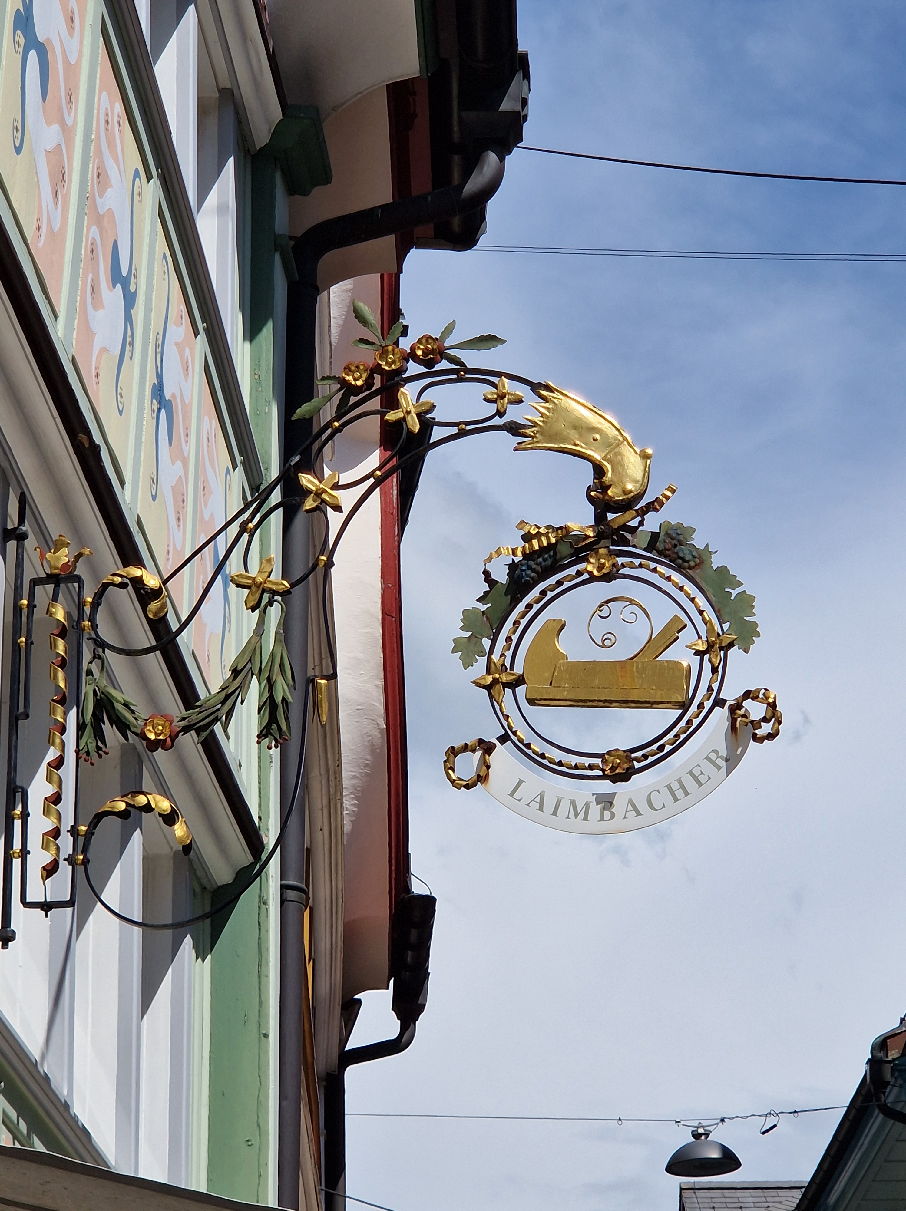
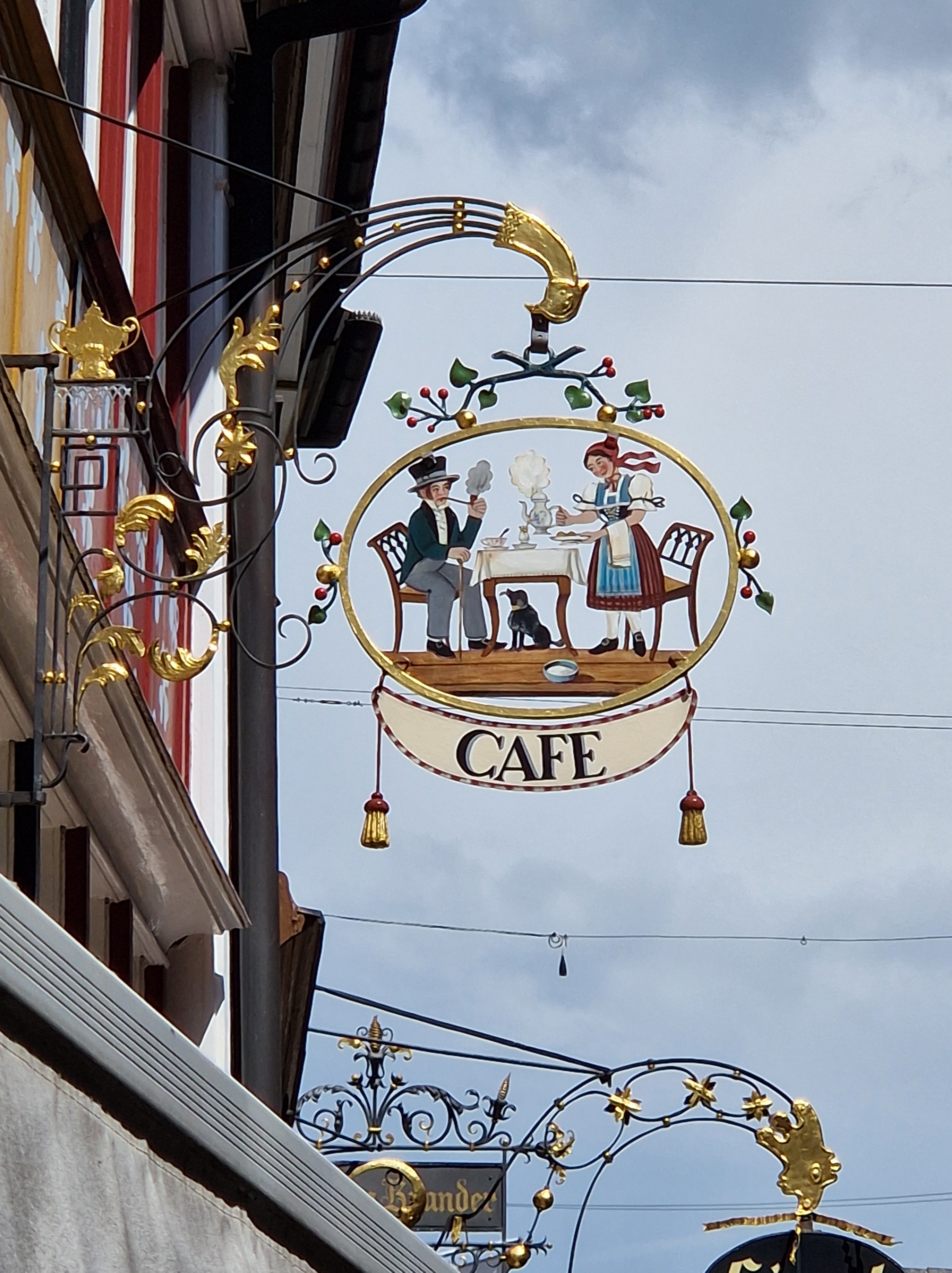
 The Fraktur typeface was designed in the 1530s by Hieronymus Andreae, a German woodblock cutter, printer, publisher, and typographer closely connected to Albrecht Dürer. The typeface was made to decorate the arch, telling the stories of the figures depicted throughout. The typeface became popular in Europe and was in use in the German-speaking world, as well as areas under its influence (Scandinavia, Central Europe, and some eastern European regions), into the 20th century. Specifically, Fraktur was in use in German until 1941, when it was actually banned (which places one of the books I purchased on Sunday within one year of the end of the era of Fraktur!). The atmosphere that led to that ban arose from the dispute mentioned above. Once the Nazis were defeated, the ban was lifted, but Fraktur never regained its widespread popularity after that, though you can still see it occasionally in pub signs or various forms of ads, like beer brands.

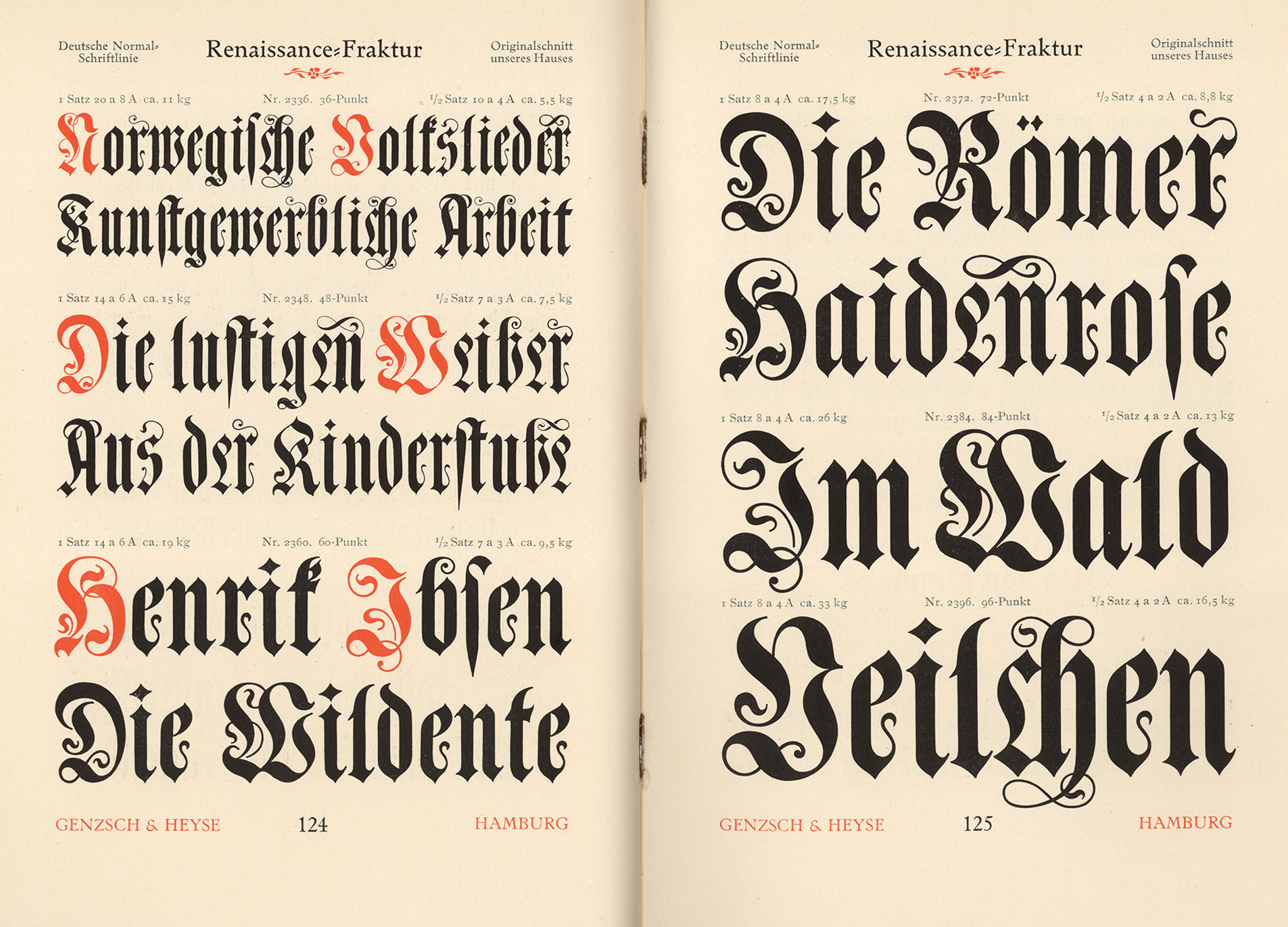
I just pulled two books from my library shelves: One is an English book originally printed in 1895, with my book being printed in 1915; the other is a German book printed in 1892. The typefaces are widely different: The English text likely used the French Oldstyle, while the German book uses Renaissance Fraktur for the text body, while the end pages act as indexes and use a variety of blackletter typefaces, such as Muenchner Fraktur, Antike Kanzlei, and Enge verzierte Altdeutsch. To see examples of the typefaces mentioned here, please click on the link for Fonts In Use.

I hope you enjoyed this jaunt through history! Nearly every name mentioned, every typeface, and every event deserves its own undusting. Next time, we’ll deep-dive into the dispute that lasted well over a century!

3 Comments

Filed under Articles, Etymology, History, History Undusted, Humanity Highlights, Images, Liguistics, Linguistics, Links to External Articles, Military History, Signs, Snapshots in History

History Undusted: Shop Signage

I’m fascinated by a few aspects of architecture in particular, such as doorways, knockers, unusual features such as sundials on the sides of buildings, mural paintings (here in Switzerland, these are sometimes hundreds of years old), and shop signage – you’ll see the latter even in the smallest town here.

This past summer, my husband and I rented a motorhome and travelled mostly in eastern Switzerland. I would say that 90% of my photos were of shop signs! I find that if you focus in on one topic, you’ll begin to see that thing everywhere.

Known as commercial signage or trade signs, such symbols of a shop’s products have been used as far back as ancient Egypt. As many people were illiterate, the pictorial shop sign not only advertised what was for sale in a shop but also distinguished the shops with similar items. By the mid-15th century, English laws even required shops that sold ale to hang a shop sign out; it made inspections of the quality of the ale easier. Some signs were temporary; for instance, if a woman made more ale or bread than her family could consume, she would put out a sign to sell the surplus and thus earn a bit of money. In the narrow streets of medieval towns, signs might be so large as to nearly touch the building on the other side of the lane, and they could become a hazard to passing horsemen or coachmen. By the mid-16th century, regulations were passed to limit the size of signage, and the securing of the sign to the building to avoid it endangering passersby. In Britain, hanging signs were eventually phased out in favour of what were are most familiar with – a flat sign denoting the store along the space above the front windows. But here in Switzerland, shop signage is everywhere – not just old, but also newer additions.

The development of the signs, including elements of guilds or heraldry symbols, led to competition between blacksmiths to create the most elaborate ironwork. The signs evolved from simple displays of ware to symbolic representations of a shop owner’s name or a heraldic connection or patronage of royalty (e.g. a crown). Examples might include shoemakers displaying a shoe or gilt boot, bakeries displaying bread, and haberdasheries displaying a needle and thread or a coat.

Here is just a fraction of the signs I photographed during our holidays, with brief explanations:

The building from which this sign hangs was built originally in 1664, and renovated to the current form in 1830. It was originally an inn/tavern on one side, and a forge (blacksmith) on the other. The Raven, as a tavern, took its symbol from the legend of St. Meinrad (797-861 AD); he was a hermit who rescued two young ravens from a sparrowhawk and raised them in his hut in the Finstern Wald (dark forest). In 861, he was murdered by two robbers; when they realized what they’d done, they fled to Zürich, but the crows followed them into a tavern and attacked them; the others present thought it unusual, so they took the men captive; they confessed, and were executed. The raven became a symbol of inns along a pilgrimage road; it was sometimes combined with a wine jug and bread.

The Hotel Santis sign has a few symbols: The wine is an obvious reference to a tavern, pub or inn; the pine cone is an interesting addition: It was the symbol of the field sign of the Roman legion stationed in Rhaetia in 15 BC, and hence it is used as a heraldic charge (an emblem on a shield). It may have been included in this sign to proclaim a good place for soldiers to eat or sleep, or as an advertisement that it was protected under a legion or unit of the military at a time when such protection would have been welcome. The bell symbolized a pilgrimage or an invocation of guardian angels over a premises.

I think this is fairly clear – it’s a bakery!

This building is a pharmacy; the front of the building is a beautiful example of the mural painting I mentioned earlier; these panels represent the herbs and flowers used medicinally. The saying painted toward the right side reads: Vielerlei Kraut gegen Leibesnot, aber kein einzigs wider den Tod (Many herbs against bodily pain, but none against death).

This symbol denotes a carpenter’s shop.

This café sign would be clear from any stagecoach stopping for a break and horse change what could be expected inside. The figures are dressed in traditional Appenzeller clothing.

And lastly, here’s a traditional sign with a modern addition: It’s a hunting lodge, or inn that serves wild game meat. Next to it, peeking around the corner, is a figure from a toy shop.

 I hope you enjoyed this little excursion!

10 Comments

Filed under Articles, Etymology, History, History Undusted, Linguistics, Military History, Signs, Snapshots in History, Translations, Virtual Tours

Just for Fun: 100%

Leave a comment

August 12, 2024 · 12:15 AM

History Undusted: Burma-Shave

For those outside of the US and/or Millennials, the term “Burma-Shave” might be new to you – which is why I’d like to “undust” this fascinating little piece of history.

The 1920s was a time of change; World War 1 was over, and the following Spanish flu had wiped out more people than the war itself; the survivors just wanted to celebrate life. Out went the starchy mentality of Victorian dresses and in came the flappers; innovations and scientific breakthroughs fed the hunger for the new and anything that made life easier.

At the time, men shaved themselves with shaving cream applied to the face with a brush and a straight razor blade (still common into the 1950s, when the double-edged safety razor began to gradually take over).

Enter, the Burma-shave brushless shaving cream: Introduced in 1925 by the Burma-Vita Company in Minneapolis, Minnesota, it was purported to have come from “the Malay Peninsula and Burma.” It was, in fact, a result of chemical experiments by chemist Carl Noren. The monicker was a marketing gimmick, much like products touting to be “Swiss” that are unknown here (even “Swiss cheese” – which one of the hundreds is meant?). The cream didn’t really take off, and while other similar products were coming out of larger companies such as Barbasol and Gilette, Burma-Shave managed to beat the odds when their clever advertising campaign was hit upon.

Around this time, the Ford Model T had become a huge success, with millions of new automobiles on ever-expanding road systems. Roadside signage was taking off, and the advertising gimmick was destined to go down in history as one of the quirkiest success stories.

Burma-Shave ads were a series of signs along the road that concluded in the sign saying “Burma-Shave”. The first couple of years, the signs were rather prosaic ads for the company; but as they began bringing in repeat customers, the signs became bolder and more experimental. They became more humorous rhymes – usually five signs, with a sixth ending the series as “Burma-Shave”.

Here are a few examples:

  • Shaving brushes / you’ll soon see ’em / on the shelf / in some / museum / Burma-Shave (1943)
  • Uncle Rube / buys tube / one week / looks sleek / like sheik / Burma-Shave (1930)
  • A shave / that’s real / no cuts to heal / a soothing / velvet after-feel / Burma-Shave (1932)
  • Shaving brush / and soapy smear / went out of / style with / hoops my dear / Burma-Shave (1936)
  • The Burma girls / in Mandalay / dunk bearded lovers / in the bay / who don’t use / Burma-Shave (1937)

As cars began to speed up, safety messages increased around 1939:

  • Hardly a driver / Is now alive / Who passed / On hills / At 75 / Burma-Shave (1939)
  • If you dislike / big traffic fines / slow down / ‘till you / can read these signs / Burma-Shave (1939)
  • At crossroads / don’t just / trust to luck / the other car / may be a truck / Burma-Shave (1939)
  • Don’t pass cars / on curve or hill / if the cops / don’t get you / morticians will / Burma-Shave (1940)
  • At intersections / look each way / a harp sounds nice / but it’s / hard to play / Burma-Shave (1941)

When World War 2 came around, the signs reflected the social conscience:

  • Maybe you can’t / shoulder a gun / but you can shoulder / the cost of one / buy defence bonds / Burma-Shave (1942)
  • Shaving brush / in army pack / was straw that broke / the rookie’s back / use brushless / Burma-Shave (1942)
  • Slap / the Jap / with / iron / scrap / Burma-Shave (1943)
  • Tho tough / and rough / from wind and wave / your cheek grows sleek / with / Burma-Shave (1943)

A few humorous signs:

  • She kissed / the hairbrush / by mistake / she thought it was / her husband Jake / Burma-Shave (1941)
  • We know / how much / you love that gal / but use both hands / for driving pal / Burma-Shave (1947)
  • I use it too / the bald man said / it keeps my chin / just like / my head / Burma-Shave (1947)
  • Road was slippery / curve was sharp / white robe, halo / wings and harp / Burma-Shave (1948)
  • If you think / she likes / your bristles / walk bare-footed / through some thistles / Burma-Shave (1948)
  • A man / a miss / a car – a curve / he kissed the miss / and missed the curve / Burma-Shave (1948)
  • Our fortune / is your / shaven face / it’s our best / advertising space / Burma-Shave (1963)

Toward the latter part of the signage, they began recycling earlier messages. Road signs and maintenance became increasingly expensive, and cars sped by faster than ever. The signs disappeared from the roads in 1963 when the company was sold to Phillip Morris and they discontinued the marketing campaign, which turned out to be a mistake; sold once again, the product eventually disappeared, but the term “Burma-Shave” can still be heard, referring to short, quirky rhymes.

To read more about this topic:

Route Magazine: Defining the American Dream, One Sign at a Time

I hate to end / this fun article / but time is short / so here’s what’s possible / Burma-Shave examples from Pinterest:

This illustration is from “A History of the Burma-Vita Company”, written by Frank Rowsome Jr. and illustrated by Carl Rose (published by the Stephen Greene Press in 1963).

12 Comments

Filed under Articles, History, History Undusted, Links to External Articles, Lists, Military History, Quotes, Signs, Snapshots in History

History Undusted: The Atrocities of the Milan Conference

The topic of this article has been on my mind for the past two weeks; last week flew by so fast I barely had time to blink, let alone order my thoughts into coherent sentences. The topic was sparked by coming across an article online about what is known as the “Milan Conference” or “The Second International Congress on Education of the Deaf” (though it was, in fact, the first), held in Milan, Italy in 1880.

To give you a bit of my personal background, I learned BSL (The Glaswegian dialect) and translated for the deaf when I lived in Scotland. Being as close to that community as I was, I’d shockingly never heard about the Milan Conference until a fortnight ago.

When I first moved to Switzerland, I wanted to continue working with the deaf and began taking Swiss German sign classes. I immediately began hitting brick walls: The crux of the matter was spelled out – they didn’t want hearing people in their world. It made little sense to me back then, and it was frustrating. Also at that time, my husband wasn’t yet hearing impaired – which would have made a difference in their attitude toward me, as people with family members affected by hearing loss were more acceptable to them. In light of the Milan Conference, their reticence makes perfect sense. I never was able to break that barrier, and I’ve lost much of the sign language I once used fluently.

The conference was an international gathering of (hearing – with only ONE exception) educators of the deaf and mute. The imperialist arrogance of the discriminating resolutions passed profoundly wounded and damaged the deaf community for nearly 100 years.

To sum up the conference’s resolutions briefly, the majority decided that sign language was disadvantageous to integrating the deaf into the hearing world, and they banned – yes, banned – sign language from the education of the deaf in favour of “oralism” – forcing the deaf to read lips to make them assimilate to the hearing world’s culture. Deaf teachers lost their jobs, and an overall decline of deaf professionals resulted – they were no longer allowed the tools to communicate in their own language, and communication professions such as artists, lawyers and writers fell silent. Here in Switzerland, there was a two-fold impact: Deaf children were forced to sit on their hands and learn to lip-read from High German-speaking teachers; but when they went home on holidays, they couldn’t lip-read their own family’s dialects of Swiss German, and so they were isolated from society both in school and at home. The anger and resentment to the hearing world still runs deep.

Most disturbing for me is the fact that Alexander Graham Bell, whose own mother and wife were deaf and who worked with the deaf throughout his life – including helping bring Helen Keller out of her silent world as a blind and deaf girl – was one of the strongest proponents for oralism at the conference. The most famous picture of Bell and Keller is one in which Keller is finger-spelling on Bell’s hand. It is a form of sign language. Yet he advocated to eradicate it.

The resolutions of 1880 held their ground until they were overturned in 2013 when an official apology was issued to the deaf community. Eleven years ago. Let that sink in. Inroads were made to teach sign in pockets here and there; in America, most schools for the deaf only began teaching sign language again in the 1960s; in the UK it was around a decade later. Generations suffered under the restriction. [For those who have been deaf their whole lives – what’s known as pre-lingually deaf – it means that sign language is their first language, while spoken English is their second; this can lead to difficulties in understanding complex or abstract messages in English. Imagine being denied your own native language…] Only in 2003, the British government recognised BSL as a minority language – but so far, Scotland is the only country in the UK that has given BSL legal recognition. The shift in understanding and recognition had already been set in motion by the time I’d moved to the UK, which is perhaps why the Milan Conference was no longer a topic when I was involved in the deaf community.

The ban is the main reason there are so many regional dialects today: Even though sign language was officially banned, the deaf still needed to communicate among themselves, and so signs evolved “under the table” within each pocket of deaf students. There was no exchange of information; for example, “bread” took on the shape of the local speciality, so in the French part it looks like a long baguette, while in the Zurich region, it looks more like a half-sphere. There are 5 major Swiss-German dialects; in Scotland, there were at least 7.

Please click here to watch a ~13-minute video by Storied about the history of sign language and the Milan Conference. If you’d like to learn more about the timeline of sign language in Britain, please click here to visit University College London’s website, and to learn more about BSL in Scotland, click here to read the Scottish Parliament’s article.

ASL, American Sign Language, also has a forgotten predecessor that was largely written out of history: The Plains Indian Sign Language, also known as “hand talk”. For an interesting video about that history, click here.

 I hope you’ve enjoyed this brief insight into a long and tangled topic, and that it encourages you to look into it more.

Just as a parting trivia: Everyone recognizes the sign for phone; but did you know that it became a euphemism in some deaf communities for the restroom/loo? Back when restaurants had their public phones near the “small closets”, the Deaf would sign “phone” as a polite, covert way of saying they were going to the restroom/loo.

Below are the British Sign Language and the American Sign Language alphabets; I’d encourage you to learn one or the other and stretch those grey cells a wee bit!

7 Comments

Filed under Articles, Etymology, Grammar, History, History Undusted, Humanity Highlights, Links to External Articles, Signs, Translations, YouTube Link

Just for Fun: Nothing Happened

I don’t know where this is, or who took the photo, but someone’s got a great sense of humour!

5 Comments

Filed under Humor, Just for Fun, Signs

Wordless Wednesday #55: Meanwhile, Somewhere in Alaska…

Children, Dog Teams & Aircraft Use these Roads

5 Comments

December 5, 2018 · 6:33 AM

One Job…

Two years ago, I ran a series of articles about odd jobs – or what you might also call just downright weird jobs, like worm farmers and paint-drying watchers (yes, they’re actually paying jobs).  I also enjoy coming across photos of simple jobs gone wrong – whether or not they’re messed up out of inattention, ignorance, laziness, or just attempts to get fired or get even. Here are a few such photos, just for fun.  Enjoy!

This slideshow requires JavaScript.

2 Comments

Filed under Humor, Images, Signs

Wordless Wednesday no. 5

7 Comments

Filed under Humor, Images, Signs, Wordless Wednesday

Wordless Wednesday no.3

pun11

17 Comments

September 21, 2016 · 12:14 AM