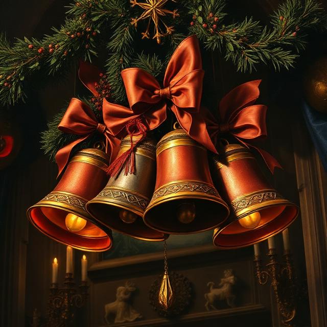
I hope you all had a refreshing Christmas and are about to have a great start to the coming new year! If you’re like me, Christmas songs have been playing for the past few weeks; and if you stop to think about it, every song we know and sing has an origin story: “Amazing Grace” was written by John Newton (an English slave trader-turned-abolitionist); the hymn “It Is Well With My Soul” was written by Horatio Spafford as his ship passed over the place where his four daughters had drowned in a shipwreck. Every song has a story, and the Carol of the Bells is no different.
The Carol of the Bells has been recorded well over a hundred times in the past decades, and it is one of the “classic” and loved Christmas carols – except that it didn’t start out as a Christmas song, but rather a spring song. I don’t usually like to offer little more than links, but explaining the history of the song and the fate of its Ukrainian composer is best told in the following video:
As explaining a song without singing or playing it is a bit like explaining a story with no details, I would rather leave you with a few music video links to my favourite versions:
My quirky brain went down a rabbit hole last week; as I was putting away groceries into glass jars (for that explanation, please click here), I wondered who had been the genius behind the thread around canning jar lids, or, as most of my jars use, the bail closure.
Just to clarify terminology: Here is a threaded jar, a type of screw-on lid that is either one part or two:
Here is a jar with a bail closure, aka flip-tops, lightning jars, known also by their various brand names, e.g. Fido, Le Parfait, Kilner:
A third type of jar, German-made, is the Weck jar, with metal clips and a glass lid. I don’t like using these, so you won’t find them in our house.
5000-Year-Old Pharaonic wine jars found intact at Abydos – Egypt Museum
Closures have been an issue for thousands of years; ancient amphoras, which were used to transport wines and oils, were sealed with wood, cork, or a ceramic or pottery lid sealed with a type of mortar. Archaeology has many examples of clay or pottery pots with lids, Norse ornate metal containers with lids, and even ancient Egypt’s canopic jars, with their ornate lids. Another variety of closure is found on wooden barrels, which have side holes called bungholes, plugged with a cork or other wood.
The threaded jar lid was invented by the tinsmith John Landis Mason in 1858. Prior to his invention, a glass lid was laid atop an un-threaded canning jar and sealed with hot wax. It was messy, and if it wasn’t done right every time, it could allow dangerous bacteria into foods. Before refrigeration, the only way to preserve garden produce was basically to can with a wax seal and take your life into your hands. There were other preservation methods, such as drying, salting, smoking or pickling, but the new way of preserving offered a convenient, faster alternative; Mason’s threaded lids, combined with a rubber ring and a threaded glass jar, revolutionised canning. Unfortunately, he was not a savvy businessman, and though he filed a patent for the threaded screw-top jars, he failed to patent the rest of the invention, such as the rubber gaskets. He let the patent expire in 1879, and manufacturers took the idea and ran with it. Mason never made a fortune; in fact, he died in poverty in 1902. But his name lives on in the common term, “Mason Jars”. The concept is now used with countless products, from drinks to shampoos to household cleaners.
The invention of the bail closure design is a bit murkier: In the early 1840s, the Yorkshireman John Kilner invented the Kilner jar, using the rubber seal and wire bail closure.
In 1893, beverage bottles began using the Hutter stopper – a porcelain plug with a rubber gasket held in place with a metal strap.
In the 1930s, the La Parfait jars began production in Reims, France, by Verreries Mécaniques Champenoises, a historic French glassmaker.
The Bormioli family is an Italian name associated with glass-blowing since the Middle Ages; among their many brands is the Fido airtight jar, using the bail closure, which began production in 1968.
I personally have Kilner, La Parfait and Fido bail-closure jars, as well as many screw-top jars similar to Mason from these companies.
Do you use any such jars for storage in your home? Do you use them for canning or storing dried goods, or both? Please comment below!
To me, the word Zarf sounds like a sci-fi comedy name for an inept villain. But, in fact, it’s a word that entered English in 1836, and is the Arabic word for “vessel”. It describes an object that you’ve seen or have likely had in your hand at some point. I will freely admit that the zarfs we know today have fallen a long way from their original forms: A zarf is the holder of a coffee cup. That sounds fairly straightforward. You may have instantly pictured a highly decorative, precious metal jewelled… no? Are those crickets I hear chirping in the vast silence of confusion? Or maybe you pictured the cardboard contraption around a hot cup of Starbucks coffee. Fallen a long way, indeed. (Camps are divided on whether the latter constitutes a zarf… for good reason: I think they would be better referred to as sleeves, as to put them on par with the bejewelled masterpieces would be an insult to the artisans of bygone days.)
Zarfs arose out of the necessity of protecting one’s hands from a hot cup; before the monster of plastic reared its ugly head, cups were made from metal or glass, often without handles. Further back, they might have been made from plant products such as coconut shells. The oldest known cups were found in Gough’s Cave in Cheddar Gorge, Somerset, England, and dated to 14,700 years ago; they were made of cannibalised human skulls.
During the 16th century, coffee gained popularity throughout the Ottoman Empire. It led to the popularity of coffee paraphernalia and coffee houses, which eventually spread worldwide and remain popular to this day. In Britain, for instance, a coffee-house culture arose in the 17th century; by the end of the century, there were over 3,000. Such venues became known as penny universities, because, for the price of a cup of coffee, men could join in the hubs of intellectual exchange and debate. Artists, journalists, poets and writers gathered to discuss God and the world; the Inklings, a literary group including C.S. Lewis and JRR Tolkien, met regularly at the Eagle and Child in St Giles’, Oxford.
By the 19th century, the goldsmiths of Switzerland had become leaders in the production and export of ornate zarfs, made of precious metals and inlaid with precious stones or small hand-painted medallions. They were often made in fine filigree, with a smaller cup, known as a fincan, made of ceramic or glass, slipped inside to hold the coffee. A modern version of this is still widely used, called a demitasse (French for half cup), in which espresso is often served.
Without further ado, here are a few examples of zarfs and fincans, along with demitasses:
Source: Sothebys.com
A Swiss musical box zarf, ca. 1840 – Metropolitan Museum of Art
Deciding who to highlight here in this space sometimes comes down to a moral choice; some of the people I’ve investigated as a result of a quote from my collection have turned out to have lived lives that are, frankly, not worthy of my spending time and effort to share their history. One was a multi-billionaire who was a womanizer and a miser who loved tormenting people under his control. He lived a miserable life and died a lonely death. As Jesus said, “What good is it for someone to gain the whole world, yet forfeit their soul?” (Mark 8:36). Others, while they may have lived lives worth remembering, made strings of unwise choices that led to scandals and/or dodgy associations with corrupt foreign powers. While a quote or two from such a person might hold a grain of truth or wit, I personally find it difficult to un-see the stains behind the curtain, as it were, and so I choose to highlight lives that have something worth learning from or from those people who’ve done something worthy of our respect.
The person I’d like to highlight today is John Bertram Philips (1906-1982), best known for his translation of the New Testament and part of the Old Testament into modern English. This work wasn’t done in a stuffy theologian’s office, but in the bomb shelters of the London Blitz of World War 2. During that war, he was the Anglican vicar of the Church of the Good Shepherd in Lee, London, and he realized that the young people in his church had difficulty relating to, or understanding, the Authorized Version of the Bible, aka the King James Bible, which was first published in 1611*. By the mid-1940s, English had changed fundamentally, and it has continued to grow and adapt; the older version of the biblical translation was and is (for most people) stuffy and unrelatable. [For those of you wondering which version of the Bible is most accurately translated from the original Greek, Hebrew and Aramaic texts, the NIV Bible adheres most closely to them; 2011 saw a major revision to the NIV translation, based on recently published critical editions from biblical scholars.]
[*The history of how The King James Bible came to be the king’s Bible is long and sordid, littered with spies, political intrigue and betrayal, ending in the gruesome martyrdom of William Tyndale, whose translation was basically appropriated after his death, which is ironic, as he was tried because his translation was illegal…”unauthorized” by the Holy Roman Empire political elite… but that’s another story.]
Encouraged by his friend, C.S. Lewis, Philips published the first section of the New Testament, starting with Paul’s letters to the churches, in 1947, with the Gospels following in 1952. The final compilation of the New Testament was published in 1958. In the 1960s, he translated and published parts of the Old Testament, though this was never finished within his lifetime.
As a minister and translator, a communicator at heart, it’s no wonder that there are numerous quotes taken from his writings, sermons, and letters written during his lifetime; in some ways, like Tyndale, he was ahead of his time in his understanding of God and our relationship with Him. As the saying goes, we today see further because we stand on the shoulders of giants. Whether or not you believe in God, if you live in any nation with Judeo-Christian foundations, you benefit from those shoulders in more ways than you know.
If you’d like to read more about the life of this complex man, who struggled with clinical depression most of his life and yet remained firm in his faith, please click on the link to an article titled, A Bruised Reed Firmly Planted.
Without further ado, here is a selection of quotes from John Bertram Phillips:
“The refusal to be committed and the attitude of indifference can, in fact, never be neutral.”
“Christianity is not a religion at all but a way of life, a falling in love with God, and through him a falling in love with our fellows (fellow man).”
“Christ is the aperture through which the immensity and magnificence of God can be seen.”
“God is not discoverable or demonstrable by purely scientific means, unfortunately for the scientifically minded. But that really proves nothing. It simply means that the wrong instruments are being used for the job.”
“All poetry and music, and art of every true sort, bears witness to man’s continual falling in love with beauty and his desperate attempt to induce beauty to live with him and enrich his common life.”
“It is refreshing and salutary to study the poise and quietness of Christ. His task and responsibility might well have driven a man out of his mind. But He was never in a hurry, never impressed by numbers, never a slave of the clock.”
“You can throw the whole weight of your anxieties upon him, for you are his personal concern.” (from his NT translation)
“There is… no easy answer to the evil and suffering problem and no easy road to its solution. But Christ tackled the matter radically and realistically by winning the allegiance of a few men and women to a new way of living…They were to be the spearhead of good against evil.”
“Love knows no limit to its endurance, no end to its trust, no fading of its hope; it can outlast anything. It is, in fact, the one thing that still stands when all else has fallen.” (from his NT translation)
Today’s phrase, playing at / making ducks and drakes, refers to skipping stones across a water surface, much like the image of a waterbird coming in for a watery landing. By 1614, the meaning had come to be associated with squandering or throwing one’s money away needlessly, much like stones were tossed away in stone-skipping.
The first written evidence of the phrase was in 1585, The nomenclator, or remembrancer of Adrianus Junius, translated by John Higgins:
“A kind of sport or play with an oister shell or stone throwne into the water, and making circles yer it sinke, etc. It is called a ducke and a drake, and a halfe-penie cake.”
These two terms also appear in nursery rhymes; the first, found in A History of Nursery Rhymes (1899) by Percy B. Green, where he mentions that this rhyme was repeated when skimming stones:
A duck, a drake, a barley cake, A penny to pay the baker; A hop, a scotch, another notch – Slitherum, slitherum, take her.
The “barley cake” is “halfpenny cake” in this 1916 version of The Real Mother Goose:
A duck and a drake, And a halfpenny cake, With a penny to pay the old baker. A hop and a scotch Is another notch, Slitherum, slatherum, take her.
In 1626, it is mentioned in the play Dick of Devon: “The poorest ship-boy Might on the Thames make duckes and drakes with pieces Of eight fetchd out of Spayne.”
Many cultures share the simple pastime of stone tossing, with their own terms for it: American English, skipping stones; British English, skimming stones or ducks and drakes; in Scottish, Skiting or Skliffing; in Irish, stone skiffing. In French, making ricochets (faire des ricochets); in German, stone flitting (Steinehüpfen); in various languages such as Bulgarian, Greek, Latvian and Lithuanian, their terms refer to frogs rather than ducks. In Japanese, cutting water. In Norwegian, fish bounce (fiskesprett). In Portuguese, either water shearing (capar a água) or making tiny hats (fazer chapeletas). The list goes on and on!
The oldest reference to the pastime goes back to the 2nd century AD by the Greek scholar Julius Pollux; in the 3rd century, Marcus Minucius Felix (a Latin writer) mentions children skipping shells on the beach.
Today, of course, it has become a serious competition for some. According to the Guinness Book of World Records, the record for the number of skips is 88, held by Kurt Steiner; the furthest distance for men is 121.8m, made by Scotsman Dougie Isaacs, and 52.5m for women, thrown by Nina Luginbuhl from Switzerland.
The next time you’re out at a lake or shore, toss a stone and remember the long and colourful history of ducks, drakes, frogs, fish, hats and water!
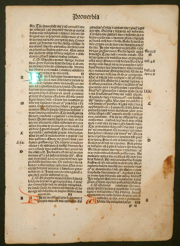
Last Sunday at church, a friend filled an entire room with her late father’s books, setting up an impromptu book shop. I chose several books, most of which are in Fraktur typeface, known to some people as “Gothic” or “Old German”. I enjoy reading such books because they offer a snapshot of a cultural way of thinking. The books I chose were printed between 1877 and 1940. The latter date is significant, as you’ll soon see.
First of all, let’s clarify a few terms: Though many people think of font and typeface as interchangeable, in fact, they refer to two different aspects of a writing style. Typeface refers to a particular style of lettering (e.g. Times New Roman), while font refers to the variations within that style, such as size and weight (CAPS, bold, italic, etc.). Another term we know but may not fully understand is Serif: This refers to the small stroke or line attached to the larger stroke of a letter; an example would be an A with “feet” at the bottom of each down-stroke. Sans Serif simply means “without Serif”.
The first moveable-type printing press, designed by Johannes Gutenberg in Germany around 1440, was based on the ancient Roman design of a screw press used to press wine or oil, which in turn went on to be used to press designs into cloths. He was likely familiar with intaglio printing and may have done some work himself in copper engraving. These designs and uses likely fermented in his inventor’s mind into what became the revolutionary turning point of literacy. Gutenberg’s original typeface was called Donatus-Kalender; the metal type design was itself a form of Textura (more on that in a moment).
Donatus Kalender
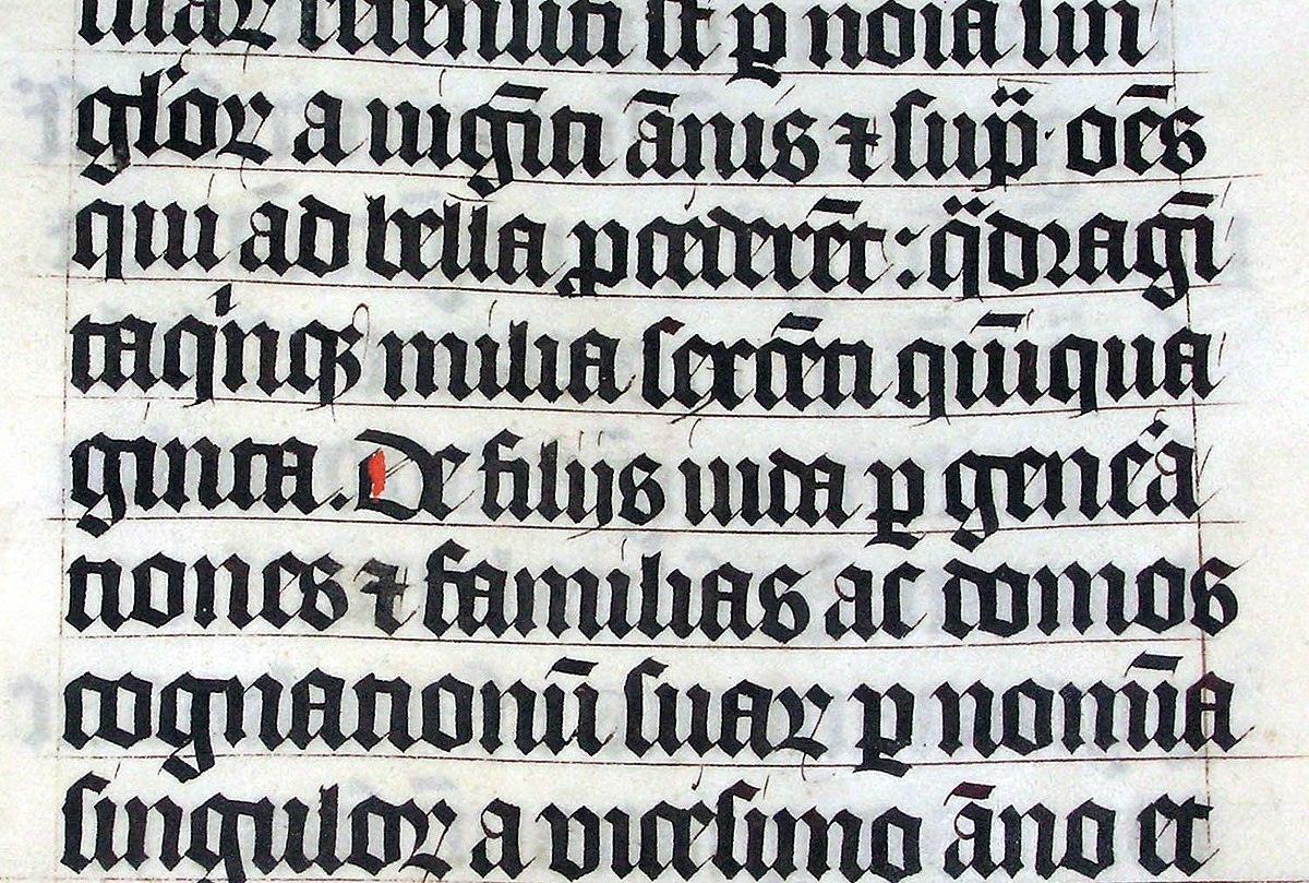
Example of Blackletter (Source: Wikipedia)
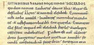
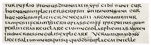
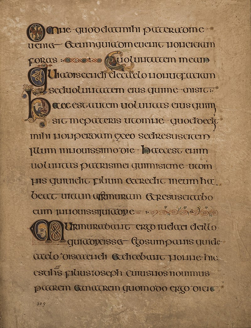
This original family of typefaces was known as “Blackletter”, aka “Gothic scripts”, with the height of popularity peaking around the 14th to 15th centuries. The ancestor of the Blackletter was called the Carolingian minuscule, a calligraphic standard of handwriting widely used in the medieval period, when literacy began increasing and a need for books in a wide range of subjects began to be in demand. It is thought to have been developed in the mid-770s by Benedictine monks north of Paris in the Corbie Abbey, famous for its scriptorium and library. The minuscule itself was derived from Roman Uncial as well as Irish Insular script, which was developed in Irish monasteries and spread throughout Europe.
Carolingian Minuscule
Roman Uncial
From the Book of Kells, an example of the Irish Insular script
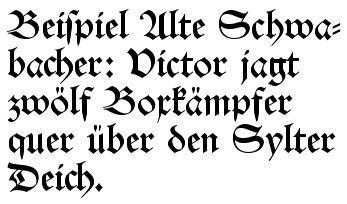
The family of Blackletter typefaces included Early Gothic, which was a transitional script between the Carolingian miniscule and Textura (the most calligraphic form of Blackletter); Schwabacher was a form popular in early German print typefaces (it became widely known with the spread of Luther Bibles from 1522), in use from the 15th century until it was eventually replaced by Fraktur around 1530, though it was still used alongside Fraktur for emphasis, much like we use bold or italic today.
Schwabacher Typeface
Textura Typeface
Another blackletter typeface developed between 1470 and 1600: Antiqua. This typeface’s letters were designed to look like the handwriting of ancient Roman documents, with the letters flowing together, strokes connecting them in a continuous line, whereas Fraktur was distinguished by having letters “fractured” – separate from one another. The Antiqua-Fraktur Dispute deserves its own article, so stay tuned!
Antiqua Typeface (Source: Wikipedia)
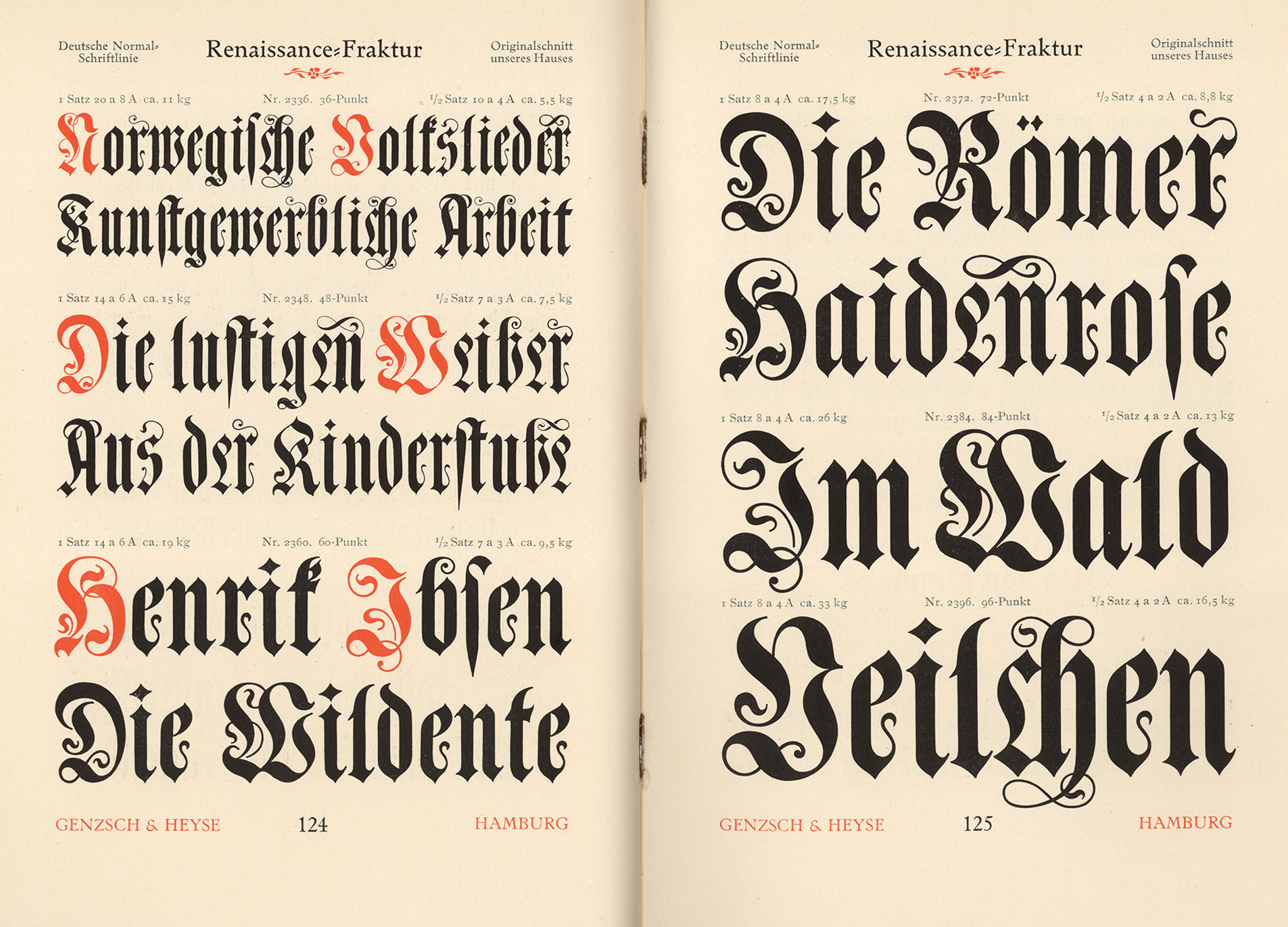
Fraktur Typeface (Source: Fonts in Use)
The Habsburg Emperor Maximillian I (1459-1519) was King of the Romans* from 1486 to 1519 [the title of king was used by the kings of East Francia, the territory later referred to as the Kingdom of Germany, from the time of Henry II (1002) to Joseph II (1764)]. The king commissioned the artist Albrecht Dürer to create a series of woodcut engravings of the Triumphal Arch [Though many are familiar with the Arc de Triomphe in Paris, it is only one example of this ancient Roman architectural feature used as a free-standing structure (rather than the Greek version, which was used within a structure such as a temple).]. These engravings would be used to create what we would recognize today as essentially wallpaper, though its purpose was more of a statement of power or propaganda (read personal marketing) commemorating his nobility, generosity, and military conquests – an incongruous combination, if you ask those conquered… The final composite of printed papers stood nearly 3 metres (12 feet) high and was only one part of a series of three enormous prints commissioned by the king.
Albrecht Dürer’s The Triumphal Arch, for Maximilian I
The Fraktur typeface was designed in the 1530s by Hieronymus Andreae, a German woodblock cutter, printer, publisher, and typographer closely connected to Albrecht Dürer. The typeface was made to decorate the arch, telling the stories of the figures depicted throughout. The typeface became popular in Europe and was in use in the German-speaking world, as well as areas under its influence (Scandinavia, Central Europe, and some eastern European regions), into the 20th century. Specifically, Fraktur was in use in German until 1941, when it was actually banned (which places one of the books I purchased on Sunday within one year of the end of the era of Fraktur!). The atmosphere that led to that ban arose from the dispute mentioned above. Once the Nazis were defeated, the ban was lifted, but Fraktur never regained its widespread popularity after that, though you can still see it occasionally in pub signs or various forms of ads, like beer brands.
I just pulled two books from my library shelves: One is an English book originally printed in 1895, with my book being printed in 1915; the other is a German book printed in 1892. The typefaces are widely different: The English text likely used the French Oldstyle, while the German book uses Renaissance Fraktur for the text body, while the end pages act as indexes and use a variety of blackletter typefaces, such as Muenchner Fraktur, Antike Kanzlei, and Enge verzierte Altdeutsch. To see examples of the typefaces mentioned here, please click on the link for Fonts In Use.
I hope you enjoyed this jaunt through history! Nearly every name mentioned, every typeface, and every event deserves its own undusting. Next time, we’ll deep-dive into the dispute that lasted well over a century!
I’m fascinated by a few aspects of architecture in particular, such as doorways, knockers, unusual features such as sundials on the sides of buildings, mural paintings (here in Switzerland, these are sometimes hundreds of years old), and shop signage – you’ll see the latter even in the smallest town here.
This past summer, my husband and I rented a motorhome and travelled mostly in eastern Switzerland. I would say that 90% of my photos were of shop signs! I find that if you focus in on one topic, you’ll begin to see that thing everywhere.
Known as commercial signage or trade signs, such symbols of a shop’s products have been used as far back as ancient Egypt. As many people were illiterate, the pictorial shop sign not only advertised what was for sale in a shop but also distinguished the shops with similar items. By the mid-15th century, English laws even required shops that sold ale to hang a shop sign out; it made inspections of the quality of the ale easier. Some signs were temporary; for instance, if a woman made more ale or bread than her family could consume, she would put out a sign to sell the surplus and thus earn a bit of money. In the narrow streets of medieval towns, signs might be so large as to nearly touch the building on the other side of the lane, and they could become a hazard to passing horsemen or coachmen. By the mid-16th century, regulations were passed to limit the size of signage, and the securing of the sign to the building to avoid it endangering passersby. In Britain, hanging signs were eventually phased out in favour of what were are most familiar with – a flat sign denoting the store along the space above the front windows. But here in Switzerland, shop signage is everywhere – not just old, but also newer additions.
The development of the signs, including elements of guilds or heraldry symbols, led to competition between blacksmiths to create the most elaborate ironwork. The signs evolved from simple displays of ware to symbolic representations of a shop owner’s name or a heraldic connection or patronage of royalty (e.g. a crown). Examples might include shoemakers displaying a shoe or gilt boot, bakeries displaying bread, and haberdasheries displaying a needle and thread or a coat.
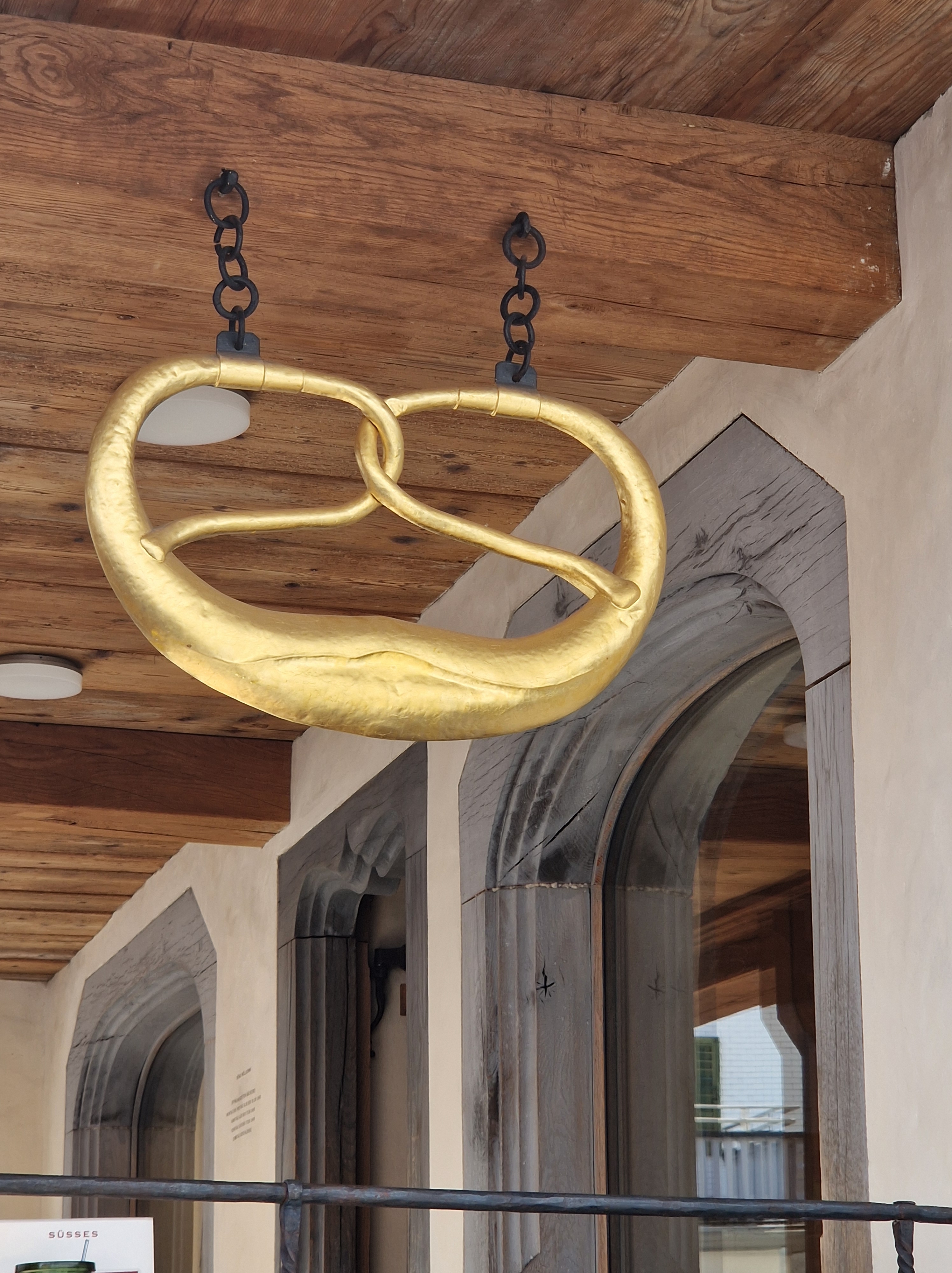
Here is just a fraction of the signs I photographed during our holidays, with brief explanations:
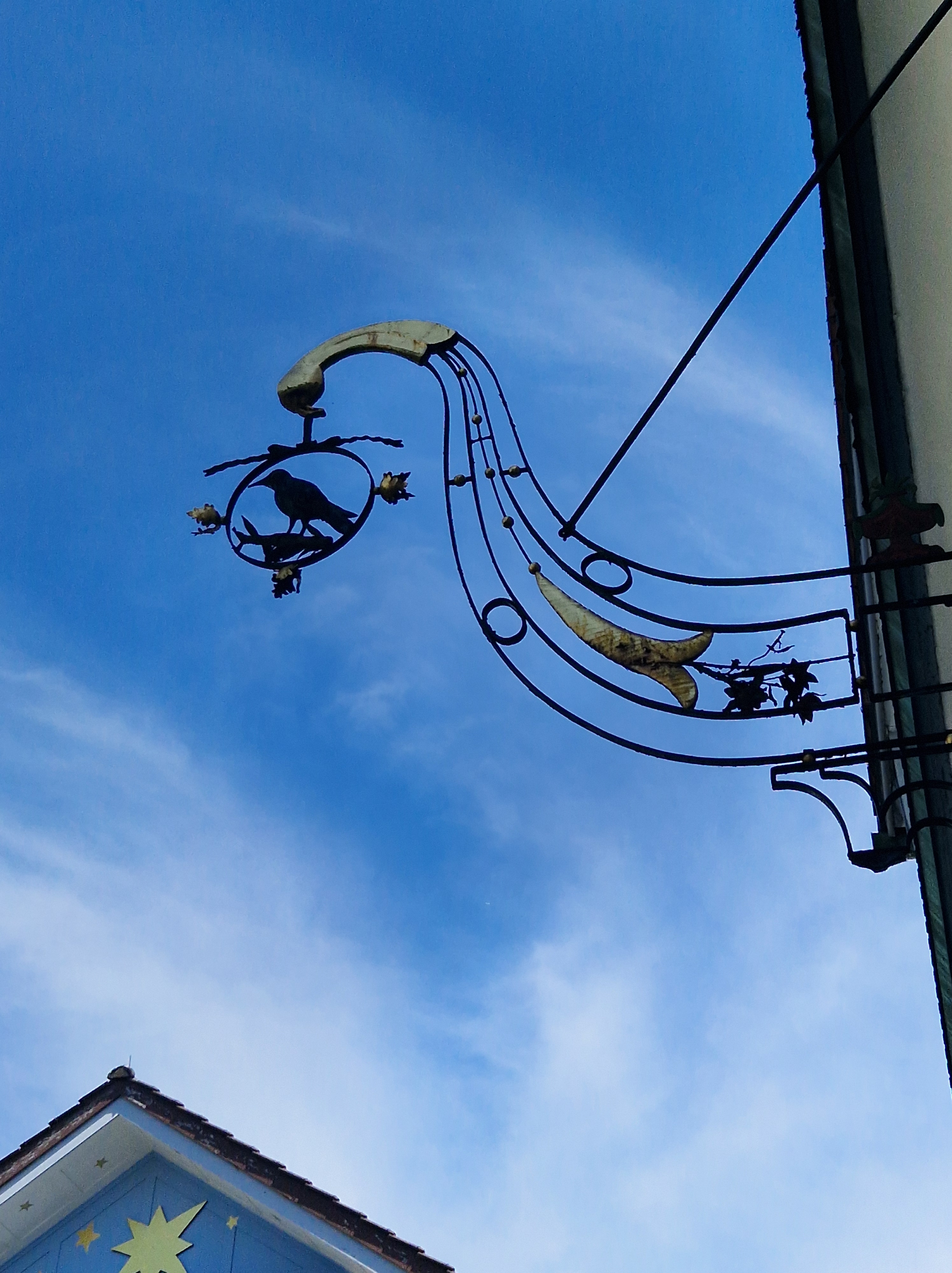
The building from which this sign hangs was built originally in 1664, and renovated to the current form in 1830. It was originally an inn/tavern on one side, and a forge (blacksmith) on the other. The Raven, as a tavern, took its symbol from the legend of St. Meinrad (797-861 AD); he was a hermit who rescued two young ravens from a sparrowhawk and raised them in his hut in the Finstern Wald (dark forest). In 861, he was murdered by two robbers; when they realized what they’d done, they fled to Zürich, but the crows followed them into a tavern and attacked them; the others present thought it unusual, so they took the men captive; they confessed, and were executed. The raven became a symbol of inns along a pilgrimage road; it was sometimes combined with a wine jug and bread.
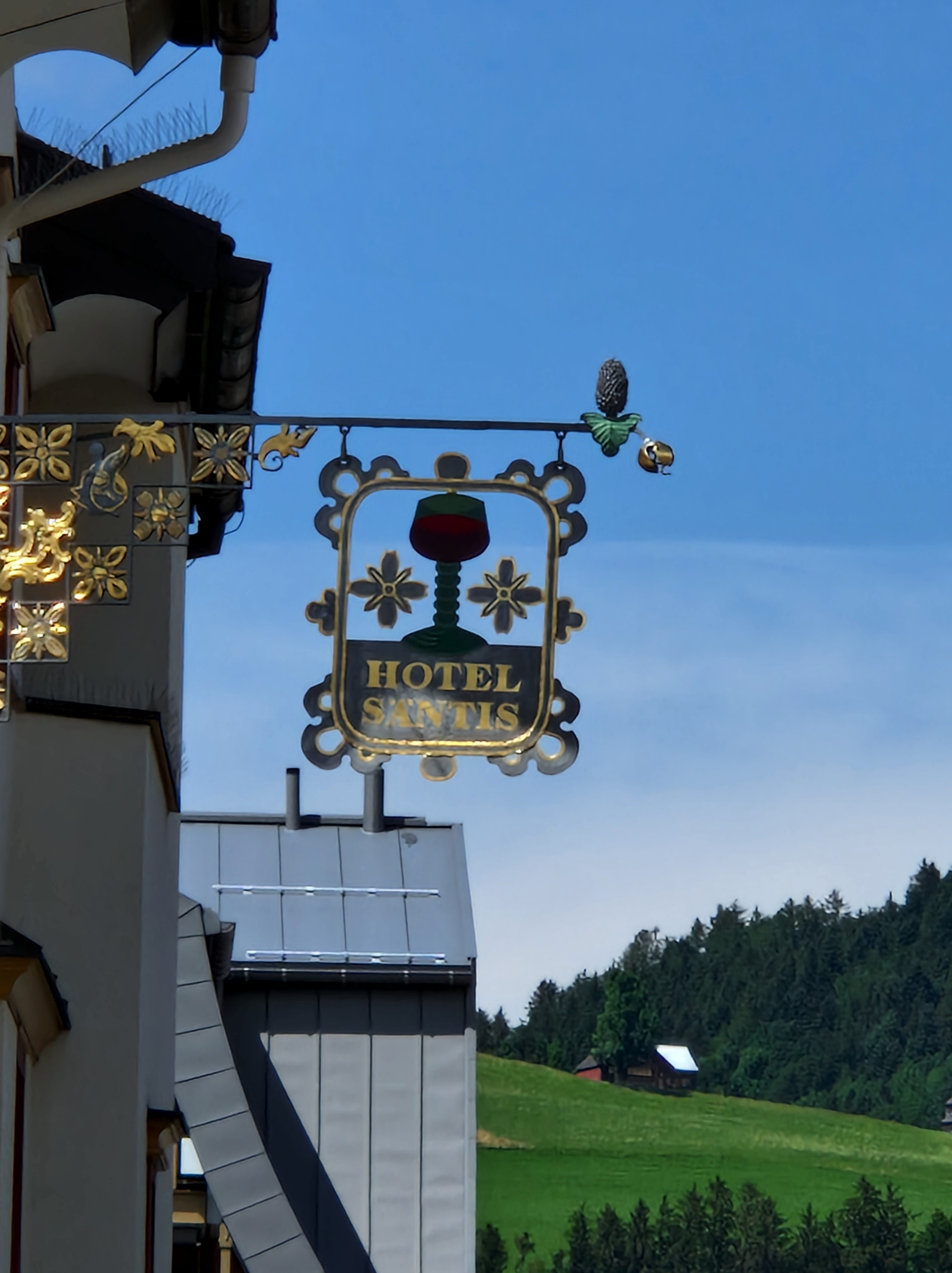
The Hotel Santis sign has a few symbols: The wine is an obvious reference to a tavern, pub or inn; the pine cone is an interesting addition: It was the symbol of the field sign of the Roman legion stationed in Rhaetia in 15 BC, and hence it is used as a heraldic charge (an emblem on a shield). It may have been included in this sign to proclaim a good place for soldiers to eat or sleep, or as an advertisement that it was protected under a legion or unit of the military at a time when such protection would have been welcome. The bell symbolized a pilgrimage or an invocation of guardian angels over a premises.
I think this is fairly clear – it’s a bakery!
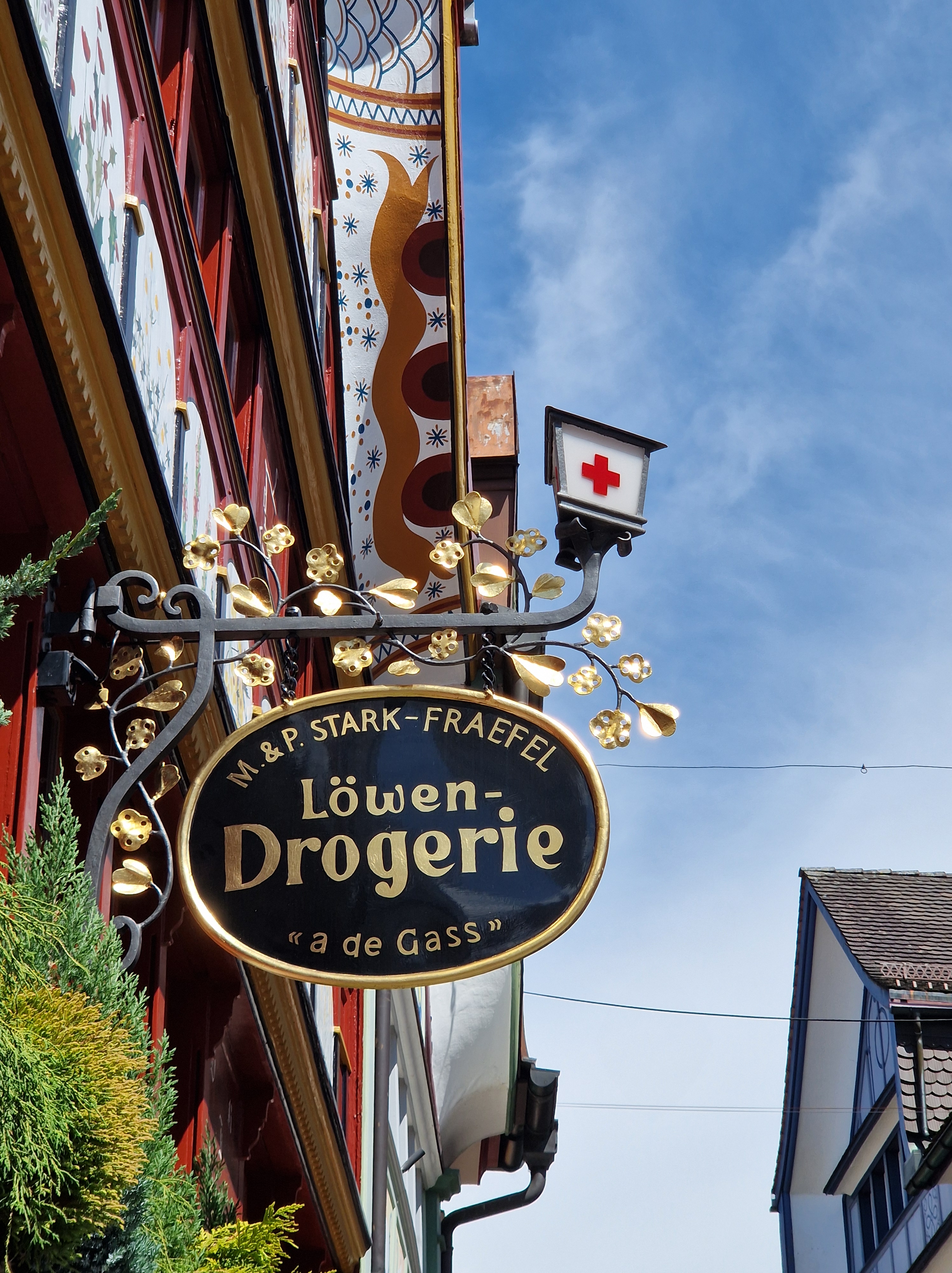
This building is a pharmacy; the front of the building is a beautiful example of the mural painting I mentioned earlier; these panels represent the herbs and flowers used medicinally. The saying painted toward the right side reads: Vielerlei Kraut gegen Leibesnot, aber kein einzigs wider den Tod (Many herbs against bodily pain, but none against death).
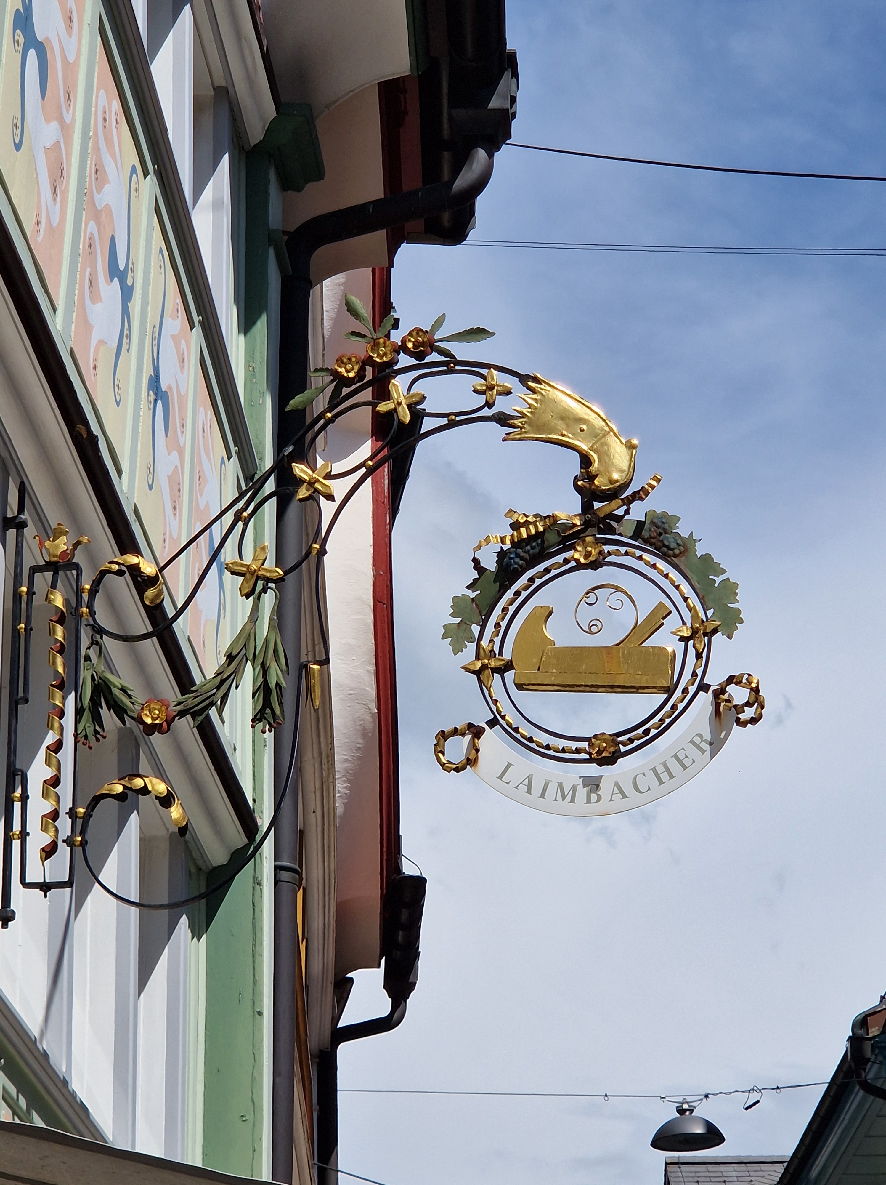
This symbol denotes a carpenter’s shop.
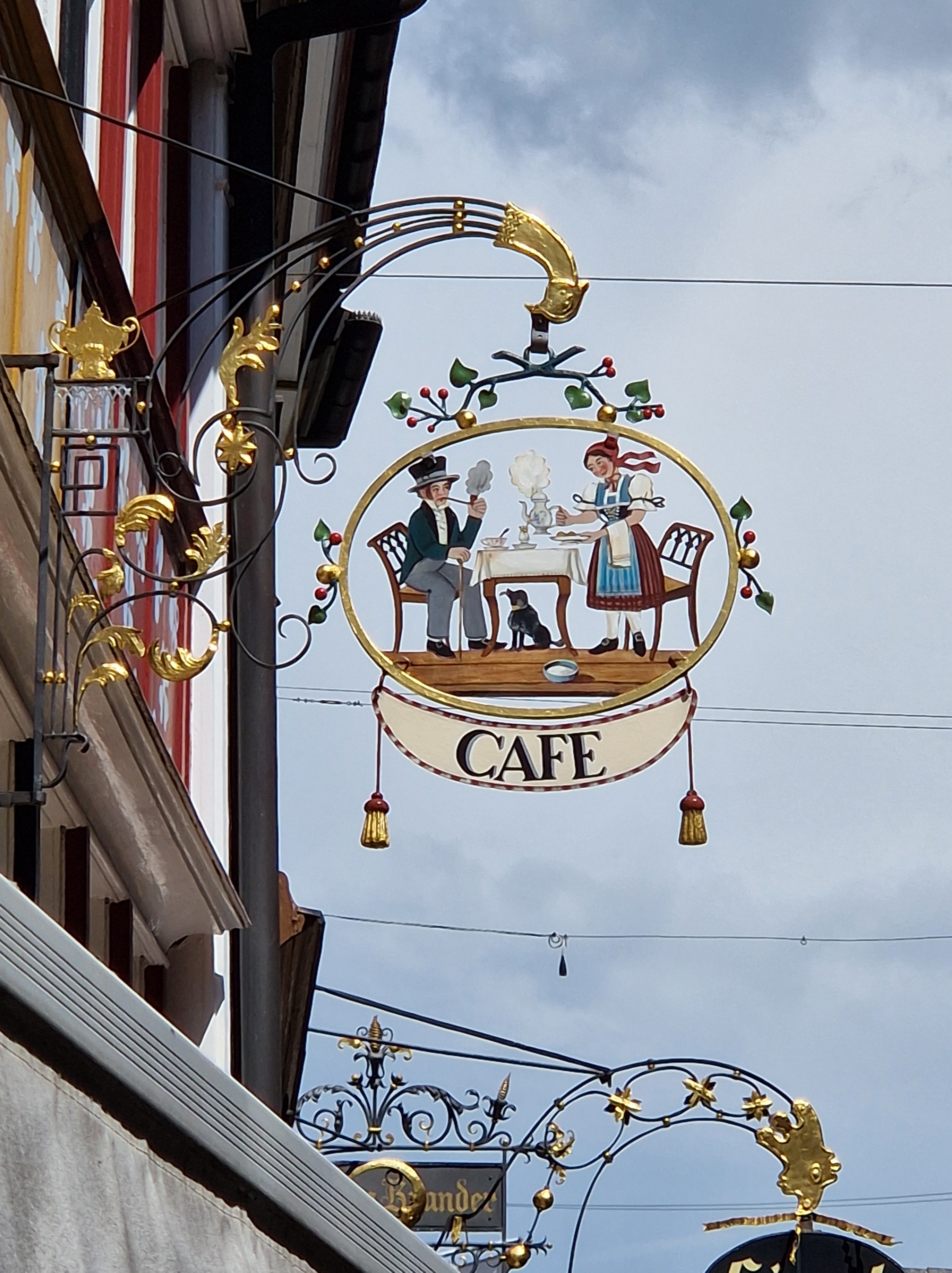
This café sign would be clear from any stagecoach stopping for a break and horse change what could be expected inside. The figures are dressed in traditional Appenzeller clothing.
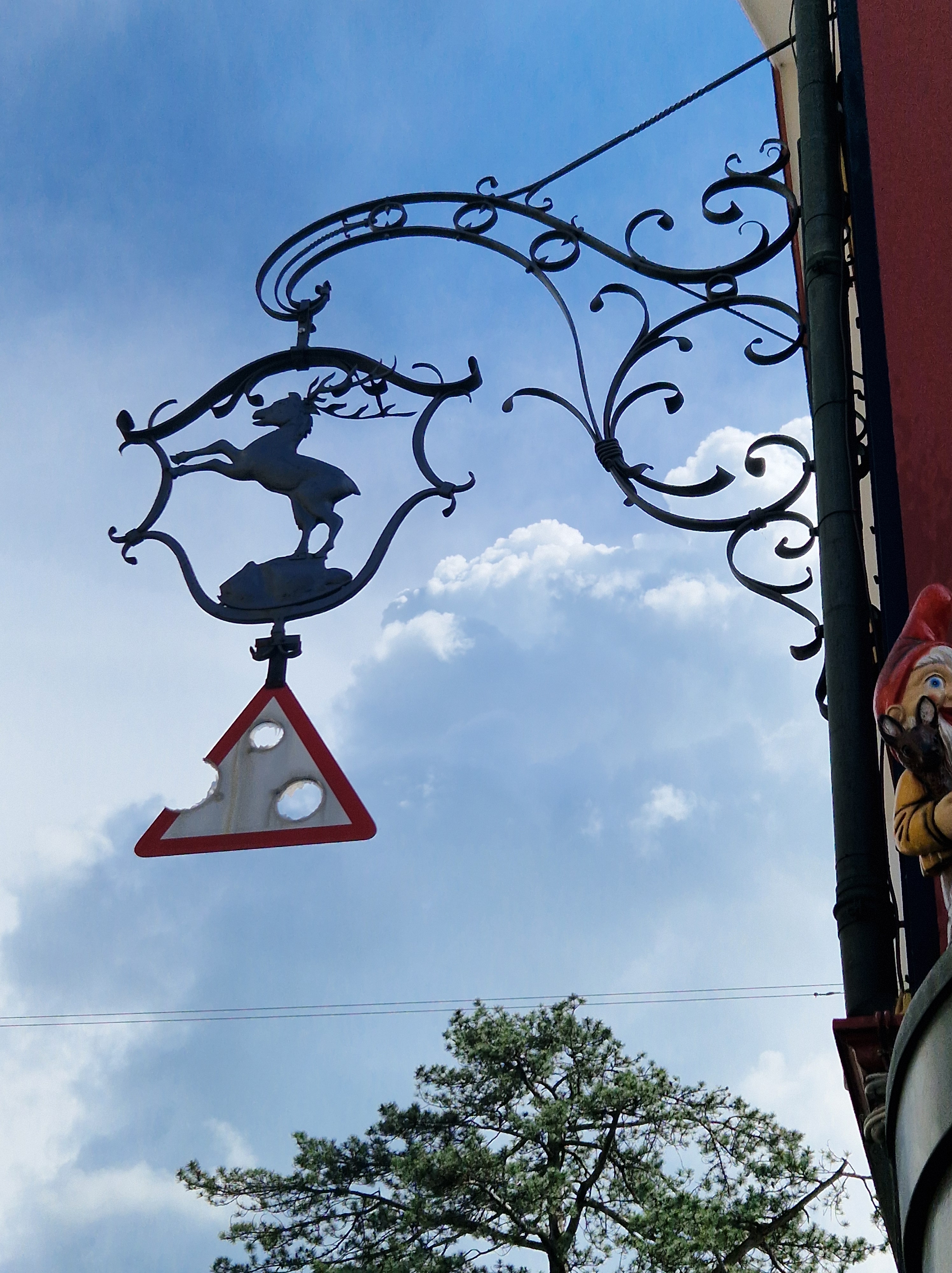
And lastly, here’s a traditional sign with a modern addition: It’s a hunting lodge, or inn that serves wild game meat. Next to it, peeking around the corner, is a figure from a toy shop.
Unless you’ve been busier than I‘ve been, you’ll have realized that half of January 2025 is already gone. The end of 2024 was crazy busy, and after the dust of the Christmas holidays settled, life was about getting caught up with all of those little things that had been neglected for a couple of months.
I’ve thought about how I want to go forward with this blog in the coming year; I enjoy having this platform to dive into topics I might not otherwise encounter in my day-to-day life, but life in the real world has many facets that keep me busy, too. I’ve decided to post roughly once per fortnight, giving me time to live, write/edit/publish, and research topics of interest. I’ve always tried to write quality above quantity, and I want to share things that interest me, grab my imagination, or give me a good laugh. If you feel the same, sit back and enjoy the ride!
Since this is mid-January, let’s take a look at some of the highlights of history on this day, the 15th of January:
1541: A commission to settle New France (Canada) was granted by King Francis I of France.
1559: Queen Elizabeth I was crowned Queen of England in Westminster Abbey, London.
1759: The British Museum opened to the public for the first time.
1777: In the American Revolutionary War, New Connecticut (Vermont) declares its independence.
1782 – The U.S. Congress was petitioned to establish a national mint and decimal coinage.
1870 – For the first time, a political cartoon symbolizes the Democratic Party with a donkey (“A Live Jackass Kicking a Dead Lion” by Thomas Nast for Harper’s Weekly).
1889 – The Pemberton Medicine Company (later to become known as the Coca-Cola Company) is incorporated in Atlanta.
1908 – The Alpha Kappa Alpha sorority becomes the first Greek-letter organization founded and established by African American college women.
1919 – Great Molasses Flood (a wave of molasses ejected from an exploding storage tank) sweeps through Boston, Massachusetts.
1943 – The Pentagon is dedicated in Arlington County, Virginia.
2001 – Wikipedia, a free Wiki content encyclopedia, is launched (Wikipedia Day).
2009 – US Airways Flight 1549 ditches safely in the Hudson River after the plane collides with birds less than two minutes after take-off. This became known as “The Miracle on the Hudson” as all 155 people on board were rescued. This story was adapted for the “Sully” film in 2016.
2015 – The Swiss National Bank abandons the cap on the Swiss franc’s value relative to the euro, causing turmoil in international financial markets.
2022 – The Hunga Tonga-Hunga Haʻapai volcano erupts, cutting off communications with Tonga and causing a tsunami across the Pacific. It was the largest volcanic eruption since the 1991 eruption of Mt. Pinatubo (Philippines).
Which of these events do you find most interesting? Please comment below and let us know! For me personally, it’s the opening of the British Museum. What was it like back in 1759, and how has it evolved into the massive collection it is today? I’ve been there a few times, but I have yet to see it all!
This is AI’s interpretation of “ancient scroll rolled up”. No idea where the man came into that result, but his longsuffering expression is apt!
My husband and I were having lunch recently, and a package of Swedish crackers was on the table; I pointed to the brand name, Pågen. In English, our pronunciation of these vowels would lead us to say pagan /pæg-in/, whereas the Swedish would rather be more like /po-gen/. I just mentioned that English might have sounded similar to that before the Great Vowel Shift, which he’d never heard of (being Swiss, it’s not likely he would be familiar with this aspect of English etymology), so I promised to write a blog about it; here we go!
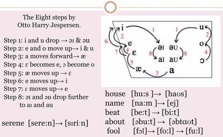
The term Great Vowel Shift was coined by the Danish linguist, Otto Jespersen (1860-1943), who specialised in the English language. Though the GVS is considered a single event (because of the changes being viewed as part of a chain reaction, with each vowel sound changing in a predictable way), the actual transition of English pronunciation was gradual, taking place over about 200 years, from ~1400 to ~1600. The shift began in Middle English, which was spoken from 1066 until the late 15th century – that form familiar to Geoffrey Chaucer (though his pronunciation would be unintelligible to us, his words still survive through his famous Canterbury Tales) – into Early Modern English (from the beginning of the Tudor period through to the Stuart Restoration period); Shakespeare would have been familiar with it. From there, English transitioned into Modern English in the mid-to-late 17th Century.
The main changes were that, from Middle to Early Modern English, the long vowels shortened; weef became wife, moos* became mice, beet became bite, and so on. (*The word moose entered English through Native American languages in 1610). I will also mention that in Scottish, a lot of the older vowel pronunciations still exist; house is still huus, full is homophonous with fool, etc.
Here’s a look at just how the English vowels shifted:
Source: SlideShare
If you’ve been paying any sort of attention to English, you’ll know that our spelling is a bit chaotic; the language is full of homonyms, which are divided into either homophones (words that sound the same but have different spellings, e.g. beet and beat; bear and bare; to, too and two), or homographs (two words with differing meanings, same spellings, but not necessarily the same pronunciation: e.g. bank [of river; finance] or agape [with mouth open; love], or entrance [a way inside; to delight]) or tear [ripping; crying]. These -graphs and -phones came into English from regional dialects that were transported as migration and cultural mixing took place, and the GVS added its two pennies to the mix. Just think of the variety we have in the sounds /ea/ (bread, beat, bear, break); /oo/ (look, spool, blood); or /gh/ (through, cough, sight).
Certain factors contributed to the speed of language shift: The Black Death (1346-1353) wiped out up to 50% of Europe’s population. Stop a minute and let that sink in. What if the population of your town were reduced by half? And the next town, and the next. That single event changed the course of history on many levels; surfs could finally demand better wages wherever they ended up settling; if you lived in a town that no longer had the skills of a baker, blacksmith, or any other trade you’d depended on, you’d move to where those services existed – and jobs existed – and that meant places that had been hit the hardest by the plague and thus where everyone else was migrating, such as London. As mass movement followed the epidemic, people brought their dialects and their spellings with them. It began to converge into a new, distinct way of speaking, thinking and spelling. The geopolitical climate of the time also influenced English; England and France have been annoying each other for over a thousand years; whenever England was enamoured by all things French, they tried to emulate their pronunciations. That influence came and went; in one such moment, the pilgrims set sail for America (1620), taking a time capsule of the language with them, while England’s English continued to be influenced by French up until the French Revolution, when it quickly fell out of favour in England, though the changes had already taken place (one example is the American /k/ in schedule, closer to the original Latin, while the English say /sch/ without the /k/, which is closer to the French cedule). This factor of influence also affected differences of speech between the lower class and upper class at that time; the upper class wanted to sound more posh, more fashionable, and above all, not like the lower class.
A major contributing factor to our chaotic spelling is that ca. 1440, the Gutenberg printing technique was introduced, and by the 1470s, William Caxton had imported the invention to England; we have him to thank for Chaucer’s Canterbury Tales being known today, as that was the first book he printed in England. We also have him to thank for the influence of Chancery English (the English used by the secretariat of King Henry VI) in the standardization of the language, as he used it as his own guidelines in printing. The vowels had already begun to shift by that time; enter the written word, a rise in literacy, and you have the jumbled effects of “mid-shift” on English spelling – people began to adapt their pronunciation to the written word, so whichever form the printer used is the one that began to prevail, even though some sounds were still in transition. Like nailing down jelly. You could say that many of our odd spellings are simply a snapshot in time.
It is also important to point out that the GVS didn’t have the same influence everywhere: The main changes occurred around London, but the farther away you move from that epicentre, the less the effects on the local dialects, which still holds true today – though gradual merging has allowed people from, say, Cornwall, to understand people from Yorkshire – which wouldn’t have been the case centuries ago. Even though they can understand each other, their dialects are still distinct. I’ve already mentioned that Scots English (as opposed to Gaelic) still retains many of the longer vowels long since lost in standardized English; being so far from London, they simply ignored them. English may be taught in their schools, but Scots dialects prevail in the home and hearth. Regional dialects in English exist the world over, and though spelling and pronunciation may differ from region to region, and the language continues to be a living, breathing, growing and changing being, it’s still a language that enables the modern world to communicate, whether English is their mother tongue or not.
Throughout history, languages have come and gone; an estimated 30,000 have existed at some point in time, though currently, there are roughly 6,000 to 7,000 languages in use – and most are threatened with extinction. Think about that. The impact on the loss of cultural history, connection to ways of thinking, ways of communicating, and ways of processing information; senses of humour, and national heritages will be lost.
An example of a language nearly lost, but which is now familiar to most of us by sight, is the logogram language of Egyptian hieroglyphs. The knowledge of how to interpret the symbols had been lost for centuries, until 1799, when a stone was found near Rosetta, along the Nile Delta in Egypt; the stone was a stele with a decree issued in 196 BC; the texts carved into the stone were Ancient Egyptian (“demotic” text), hieroglyphs, and Ancient Greek. Because Greek was a known language, they could use the Rosetta stone to decipher the forgotten languages.
When we think of writing, we may think of various alphabets: Greek, Roman (of which English makes use), Norse Runes, or the logographic or ideographic languages of Asia, such as Chinese or Japanese, or the cuneiform writing of the Ancient Near East. But did you know that there have been languages based on string?
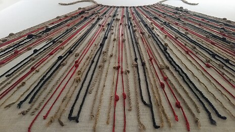
Quipu in the Museo Machu Picchu, Casa Concha, Cusco. Source: Wikipedia
The Inca people, in the region of modern Peru and Chile, used knots on an elaborate system of connected strings or cords for collecting data, keeping records, recording taxes or census records, making calendars, or for military organisation. When the Spanish Conquistadors swept through, they found numerous bundles of strings, but had no idea of their significance; they destroyed many of the quipu*, not realizing that they might have held in their hands a record of an individual’s wealth in animals or crops. [*Quipu is the Spanish spelling used in English; it is also spelled khipu or kipu.] Other cultures have also used similar concepts with knotted strings to record information, unrelated to South America; these include China, Japan, Taiwan New Zealand, Hawaii, and other parts of Polynesia.
As with most textiles, they unfortunately didn’t stand the test of time very well, and only a fraction remains today. The ancient world may have taken the concept of the quipu one step further in creating the more flexible abacus, though the latter was (and is still) used for temporary calculations, while the former was rather for recording information. Whether or not there is a historical link, both are visual tools that can be used for similar functions to a certain extent.
Even with such widespread use of these knotting records, their meaning was nearly lost, until a Harvard student, Manny Madrano, had time on his hands one summer and solved a centuries-old mystery!
For an interesting video on this topic, please click here. I hope you’ve learned something! Keep being curious about our fascinating world!