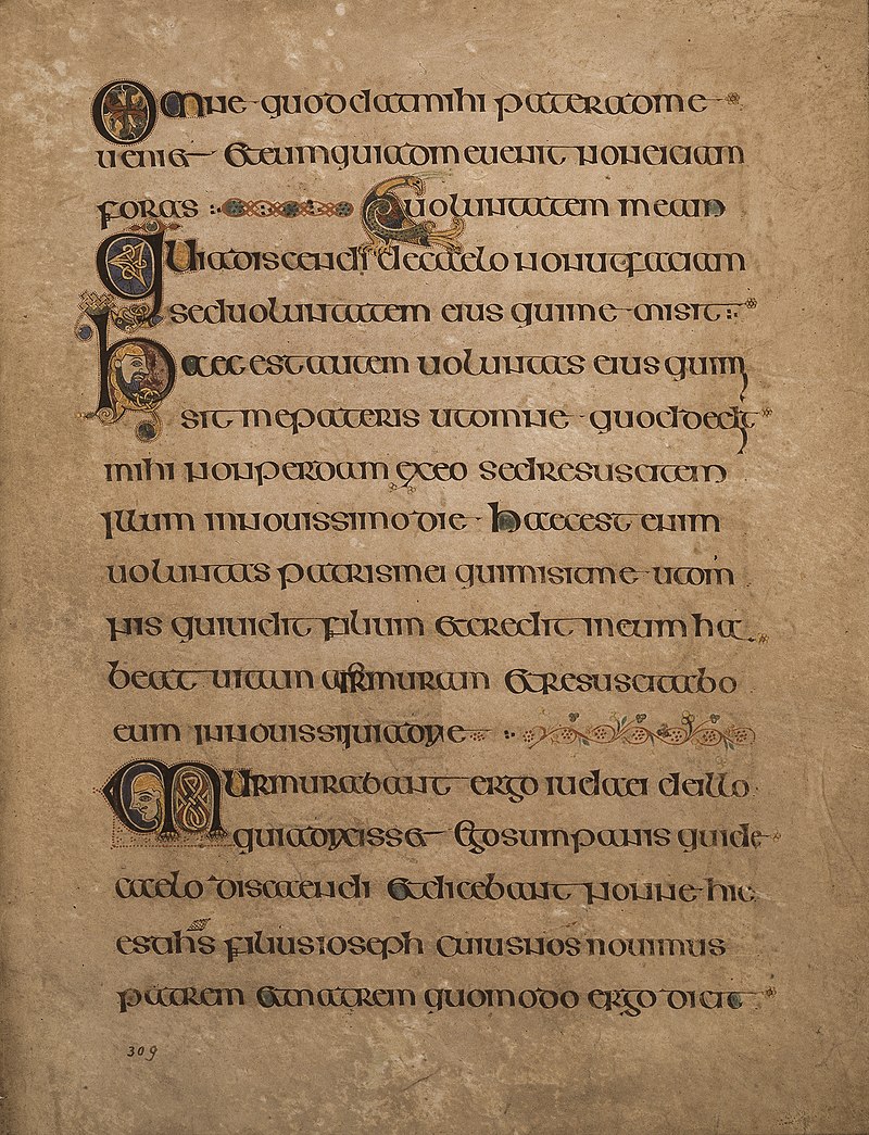
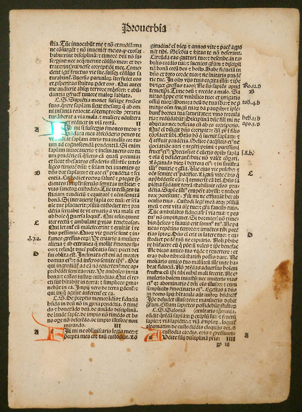
English is relatively young, as languages go. Like a sponge, it absorbs words and meanings from other languages, then squeezes them out in a similar (or widely different) form. In other words, English is a survivor; it has survived the attempts to destroy it by the Danish Vikings, the French (Normans, aka Vikings disguised as French), and the Germans. These historical encounters give me high hopes that it will survive the age of the Cell Phone. With each skirmish, it has come out stronger, more versatile and more flexible. When the Pilgrims packed up English and crated it off to the New World, it was locked, as it were, in a time capsule. British English absorbed a few bad habits from the French before they thought better of it and distanced themselves during the French Revolution, but in the meantime, contentious pronunciation differences to that time-capsule relative over the Pond had crept in and persist to this day. One example: The American pronunciation of schedule (/skedju(e)l/) is from the original Greek pronunciation, which was used in Britain for onk-years until they took on the fancier French-ified pronunciation of /shedju(e)l/. For a fascinating glimpse into how Modern English was formed, William Caxton (~1422-~1491) is your man.
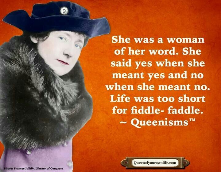
While English pilled through the pockets of invaders stealing loose grammar, we also lost a few words along the way: Some words are known to us in one form but not the other, while other words have been lost altogether due to a more convenient absorption or form arising. You know of disgruntled (adj.), but what about gruntle (v.) or disgruntle (v.)? And dis– in this particular case is not used to form the antonym of gruntle, but means exceedingly gruntled. And I don’t know about you, but conject as a verb makes more sense than “conjecture” to me. And shall we vote to bring back “Oliphant,” as J.R.R. Tolkien saved it from extinction through his use of it in Lord of the Rings? What about pash (n.), contex (v.), or spelunk (n.)? We know of fiddle-faddle, but what about plain ol’ “faddle” (to trifle)? Some, admittedly, are not missed; toforan is better served with heretofore, in my humble opinion (IMHO). Needsways is a Scottish word, obsolete in England and America perhaps, but alive and well north of the Border. There are some deliciously eccentric words which deserve resuscitation, such as loblolly, bric-a-brac, sulter, pill (v., to plunder, pillage – ought to come in handy, that), quib, bugbear, uptake (as a verb), wist (intent), or sluggy. If Sir Walter Scott can save words such as doff and don from extinction, so can we.
Oh, and if you’re wondering about the word archaism, it means “retention of what is old and obsolete.” So twinge your language to include these mobile words and their meanings, and revelate your intelligence! And if you’re curious, yes, Grammarly and spellcheck were going batship crazy with this post!😎